A bathroom can look clean and still drain a home if the corners carry the wrong color weight.
The Hidden Truth About colors to avoid in bathroom feng shui
People obsess over the wall color, then ignore the place where the eye actually lands first: the dark corner behind the toilet, the strip beside the shower screen, the ceiling line above the vanity. That hierarchy matters because corners collect and hold the room's most sluggish visual charge, while the center of the room keeps moving. Paint a ceiling blue and you may feel calm; put the same blue in a cramped rear corner and it can make the room feel colder, smaller, and oddly unfinished.
I once watched a homeowner repaint a guest bath in pale mint because every forum said it would feel fresh. The room was neat, the towels matched, the mirror sparkled. Still, the first thing people noticed was the shadowy corner behind the door, where a green bath mat, a teal waste bin, and a eucalyptus print all piled color into one dead end. The result was not freshness. It felt like a basin with the plug half in.
That is the mechanism most guides miss. Color in a bathroom does not work as a single verdict; it behaves like water pressure. The center distributes; the corners concentrate. Dark tones, icy whites, muddy grays, and overbright reds do different kinds of damage depending on where they sit, because a corner with little light turns them into a visual stoppage. The same shade in the middle of a bright room may read as balance. Tucked into the left rear corner, it can make the whole room feel like it is retreating.
So the question is not only which colors to avoid. It is where the color is doing the most work. That shift in perspective changes everything.
Once you start reading the room that way, the advice becomes less mystical and more mechanical. The sink wall can carry a lighter tone because movement happens there: hands, soap, towels, daily attention. The farthest corner asks for restraint because it already receives less light, less airflow, and less visual traffic. Put heavy black, dense burgundy, or a saturated navy in that zone and the corner becomes the strongest object in the room, even if it is physically the smallest. That is why a tiny patch can dominate an entire bathroom.
Center the eye, and the room breathes. Load the edge, and the room stalls.
Watch a bathroom at dusk and you can see this happen in real time. The center stays legible for a few more minutes, while the corners blur first. If your color choice deepens the blur, you get the feeling that the room is shrinking around the edges. That is not just a mood problem; people linger less, rush more, forget small tasks, and leave the space looking tired by morning.
The fix begins with hierarchy. Keep the center clean, bright, and uncomplicated. Save stronger tones for items that can move or be replaced: a hand towel, a soap dish, a framed print near the entry, not the recessed corner opposite the door. If a bathroom already has a stubborn dark corner, lighten that exact zone with a pale accessory or better lighting before you blame the entire palette. The eye follows relief first, then color. In a room built around flushing and draining, you want the visual field to release, not clamp down.
Notice how this differs from the usual advice. People love rules like "avoid blue" or "never use black in a bathroom," but those statements are too blunt to be useful. Blue on a shower curtain that hangs in the center line is one thing; blue pooling in the rear corner beside a low shelf is another. One sits in motion. The other sits in stillness. Those are not the same energy conditions at all.
How the Color Mechanism Works Room by Room
The sequence is simple once you stop treating the bathroom as a flat box. First, light enters. Second, the eye chooses a center path. Third, the corners absorb what the eye cannot resolve quickly. That last step is where trouble starts, because saturated or murky colors make those corners feel deeper than they are. The room then reads as if part of it has gone missing.
Think about a narrow powder room with one overhead bulb and a matte charcoal wastebasket tucked under the vanity on the back left. The wall color may be a soft shell white, but the charcoal will still pull attention because it sits in the least supported position. Add a black-framed mirror and you have created a triangular trap at the far end. People feel it without naming it. They leave the door slightly ajar. They do not linger. Small, but real.
That same mechanism explains why high-gloss finishes can rescue a difficult bathroom while flat, absorbing finishes can worsen it. Gloss reflects what little light exists, which helps the center claim space again. Matte dark paint on a rear cabinet does the opposite: it eats the dimmest part of the room and turns the corner into a sinkhole. In feng shui terms, that is where qi slows. In plain language, the room starts to feel like it is collecting neglect.
For a fuller map of room relationships, see how to map energy in your home without overthinking it. Bathrooms are rarely judged in isolation, because what happens at the edge of one room affects the next threshold too.
Here is where people get surprised. They assume the sink wall is the problem because it is the most used surface. Usually it is not. The sink wall can carry a little more color because movement keeps it active. The back wall, the far corner, and the area behind the door are the zones that need the most care. Those spots already receive less attention, so a heavy tone there reads as abandonment rather than style.
If you are choosing among bathroom colors, start by asking where the darkest corner sits relative to the door. A rear right corner can feel more closed than a side wall because it disappears from view as soon as you step in. A color that seems mild in a paint card can turn oppressive there. That is why sample boards placed in the center of the room often mislead. They do not show you what the corner will become.
I have seen this mistake in a small en suite with white tile, brushed brass fixtures, and a deep plum laundry hamper shoved beside the toilet. The owner had spent good money on calm, spa-like accessories. Yet every time she walked in before bed, her eye hit the plum first, then the black vent cover above it, then the dim corner where damp towels sat. Sleep got lighter, not deeper. The room was tidy. The corner was not.
Never trust a color swatch alone.
Which Shades Create the Most Trouble
Very dark shades create the strongest drag when they sit in a corner with poor light. Black, charcoal, deep espresso, and dense indigo can all work elsewhere, but in a bathroom corner they compress depth and make the perimeter feel heavier than the center. That matters because bathrooms are already transitional spaces; they are supposed to clear out quickly. A corner that visually anchors the room slows that clearing.
Cold whites can also be a problem, though people usually praise them. In a small bathroom with cool lighting, a stark white corner can go chalky and sterile, especially if the opposite wall has no warmth at all. The room stops feeling clean and starts feeling brittle. You see every edge. You feel every draft. That may sound refined on a design blog, but in daily life it reads as tension.
Then there are saturated reds, hot pinks, and aggressively orange accents. Used sparingly in the center, they can wake a room up. Pushed into a corner, they keep demanding attention from the least breathable spot in the room. The effect is strange: instead of energizing the space, they make it nervous. You catch the color out of the corner of your eye and feel the room pulse when it should settle.
For another lens on this imbalance, compare it with how too much yang at home makes it hard to relax. A bathroom corner loaded with hot color can behave like a tiny flare in an otherwise cooling room.
Soft greens and watery blues are not automatically safe either. That sounds like heresy to people who love spa imagery, but I have seen enough bathrooms to know better. A pale aqua on the main wall can feel open; the same aqua packed into a back corner beside a dull drain cover can turn milky and stagnant. The issue is not the hue by itself. It is whether the color lives in motion or gets trapped where the room already loses momentum.
Texture changes the outcome too. A matte maroon towel hanging in the middle of a bright room may look rich. The same maroon in a shadowed corner beside a laundry basket reads as delay. Color and position never arrive alone. The light level, the reflectivity of nearby surfaces, and the object's scale all decide whether the shade supports the room or drags it down.
That is why blanket rules fail. They flatten context, and bathrooms are all context. A large window on the east side, a mirrored cabinet, and a white floor tile can absorb colors that would wreck a basement bath. A tiny interior powder room with one bulb cannot. Anyone who tells you the same color is always good or always bad is skipping the part that actually matters.
How to Choose What Stays, and What Moves
Use the corners as low-noise zones. That means pale, reflective, or nearly invisible surfaces near the edges, especially behind the door and beside the toilet. Keep bolder shades on movable objects in the center lane where they can be seen, used, and then removed from attention. A hand towel in moss green is one thing. A moss-green corner cabinet under a weak bulb is another.
Try this in a bathroom with only one window: stand at the threshold and name the first three things your eye hits. If the darkest object appears second or third and sits in a corner, lighten it. You might swap a black bin for woven natural fiber, replace a navy rug with bone or sand, or move a glossy white tray to that spot so the corner stops swallowing light. Small shift. Large difference.
One practical rule holds up well: the farther from the door, the lighter the treatment should be. That is not about superstition. It is about perception. The farther corner has less support from the entry path, so any heavy color there feels stranded. A lighter tone keeps the wall from falling away visually. If the bathroom is large, you have more room to play. If it is a compact ensuite, restraint matters more than style points.
Choose detail pieces with the room's axis in mind. Towels hung near the sink can carry a deeper tone because they sit in active territory. A soap pump in amber glass near the basin can ground the center without pinning the perimeter. Meanwhile, the rear shelf should stay quiet. Leave the farthest corner for the least visual friction you can manage: white ceramic, clear glass, pale wood, or an almost invisible storage basket.
And yes, sometimes you do need to move the object rather than change its color. A dark hamper left in the back left corner will keep speaking louder than the paint around it. Relocate it toward the door-side wall, where it shares the room's movement, and the same hamper becomes far less intrusive. Placement can outperform renovation. People resist that idea because it is not glamorous. It works anyway.
For homeowners deciding what to buy instead of repainting, coin placements that make money feel managed, not chaotic show a similar principle: small objects change a room when they are placed where the eye can read them cleanly. Hidden objects do the opposite.
If you want a more structural fix, adjust the lighting before the palette. Warm-white bulbs with better diffusion can soften a corner that otherwise turns blue-gray or green-black by late evening. A single sconce or a mirrored reflection can rescue the back wall far faster than a full repaint. The point is not to decorate harder. The point is to reduce visual dead ends.
Common Mistakes People Make Without Noticing
One mistake is choosing the bathroom color from the vanity alone. The vanity is a center object, so the shade looks balanced in the store and then behaves badly in the back corner at home. Another is pairing too many cool tones together: white tile, gray grout, silver fixtures, pale blue towels. Each piece seems clean by itself. Together they can leave the room feeling like it has had the warmth rinsed out of it.
Another trap shows up when people use dark accessories to "ground" the room. That idea sounds sensible, and sometimes it is. Yet if the dark accessory sits at the farthest corner, all it does is anchor the room's stillest point. Now the eye rests there and stays there. That can show up as a bathroom you use quickly, without much comfort, and a vague resistance to keeping it truly tidy.
Mirror placement matters too. A mirror that reflects a dark corner doubles the problem because the corner is visually repeated, not relieved. In a narrow guest bath, I have seen a black towel ring, a gray bin, and a reflected shadow line create a stripe of heaviness that made the room feel half its actual size. Nothing was physically wrong. The arrangement was wrong.
For adjacent room issues that often amplify bathroom problems, compare the patterns in bedroom rules that affect both sleep and relationships. Rooms adjacent to a bathroom can inherit the same overcool, overhard mood if the colors are fighting the layout.
People also forget the ceiling. A bathroom with a low ceiling painted in a cool white can feel larger, but if the corners are dark and the ceiling line is sharp, the room can start to press downward. Softening the transition with a slightly warmer paint or a gentler trim color helps the upper edge release. That matters because corners are not only horizontal. They exist where surfaces meet, and those junctions carry more visual weight than most homeowners expect.
Final trap: confusing cleanliness with visual relief. A spotless room can still feel pinched if the color hierarchy is wrong. I have seen immaculate bathrooms with folded towels, polished fixtures, and a lone deep green cabinet at the back wall that made the entire space feel over-managed. The room looked disciplined. It did not feel restful. Those are not the same result.
When the Bathroom Starts Behaving Better
Once the corners quiet down, you notice the center breathing again. Towels stop looking like props. The sink area feels usable instead of tense. Even the smell of the room changes a little, because a space that reads as open tends to get aired out more often and cleaned with less resistance. That is the output people are chasing when they ask about bathroom colors, even if they call it harmony or balance.
The good news is that you do not need a perfect palette to get there. You need a better hierarchy. Let the center carry the color story. Let the edges stay light enough that the eye does not snag. If a room still feels off after that, look for the object occupying the farthest corner before you repaint the whole space. Often that one item is the real culprit.
There is a similar logic in the threshold patterns that shape a front entry and in the way a room handles flow at its margins. Corners are thresholds inside the room. Treat them like dead storage, and they behave that way. Treat them like quiet breathing space, and they stop arguing with the center.
So the next time a bathroom feels strangely tired, do not start with a paint fan deck. Start at the farthest corner and look at what color is living there. Is it supporting the room, or trapping it? That answer tells you more than the label on the can ever will.
And if the corner is the part that keeps pulling your eye, what does that say about the rest of the room?
FAQ
Is conventional colors to avoid in bathroom feng shui advice reliable?
Often not on its own. The advice becomes much more useful when you ask where the color sits, because a shade in the center behaves differently from the same shade trapped in a dim corner. That positional difference changes how the room feels in daily use.
What color should I avoid first in a small bathroom?
Start with the darkest object in the farthest corner. In a tight room, black, charcoal, and heavy navy are the fastest to dominate when light is limited. If you can only change one thing, lighten that corner before worrying about the rest of the palette.
Can I keep dark towels or accessories in a bathroom at all?
Yes, if they stay in active zones near the sink or on the center wall. A dark towel used and replaced daily does not behave like a dark cabinet stuck in the rear corner. Motion softens the effect.
Do mirrors help if a bathroom corner feels heavy?
They can, but only when the mirror reflects light or openness. A mirror that doubles a shadowed corner makes the problem louder, not smaller. Aim it toward brightness, not toward the darkest patch in the room.
Mei Chen
Traditionally informed guidance • Cross-referenced with classical Chinese source texts
Content draws from both Compass (Luopan) and Form (Xingshi) school traditions. Illustrative examples are composites based on consultation experiences.
Practitioner-Selected Tools for This Topic
Items our team has tested and found effective for the principles discussed above. Individual results may vary.
 -19%
-19%Wind Chimes for Outside with 5 Bell Unique Copper Musical Chimes Feng Shui Wi...
 -5%
-5%YU FENG Evil Eye Money Tree, Blue Feng Shui Decor with Golden Buddha
 -29%
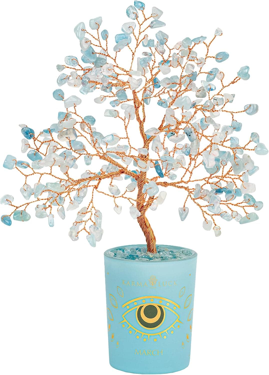
-29%Karma and Luck March Birthstone Crystal Tree of Life, Aquamarine Gemstone Fen...
 -29%
-29%Karma and Luck July Birthstone Crystal Tree of Life, Ruby Gemstone Feng Shui ...
As an Amazon Associate, we earn from qualifying purchases. We only recommend items our practitioners have personally tested.
Continue Your Journey
Explore these related guides to deepen your understanding:


Ready for Deeper Guidance?
Try our free I Ching reading for personalized wisdom, or explore our curated Feng Shui essentials.