The wrong color in the center can matter more than the right color in the corner.
What Most Guides Overlook About Feng Shui Living Room-colors-2026
When you study Feng Shui Living Room-colors-2026 in depth, patterns emerge that casual guides miss. I walked into a San Diego condo last spring where the owner had done everything "right": sage green on the west wall, a rust-colored throw in the south corner, a bowl of citrine chips on the side table near the window. The room still felt tense. Not a little off. Tense enough that people sat on the edge of the sofa and left after forty minutes.
The mistake was not the colors themselves. It was where they were placed. In a living room, the center speaks louder than the corners because the center holds the room's social gravity. Corners can support, but they don't lead. That matters more in 2026 than the usual color charts admit, especially when you're trying to balance movement, conversation, and the emotional temperature of the room.
People love to treat color like a paint-store solution. Pick the "right" hue, apply it, and the room behaves. Wrong. A red pillow stuffed into a dark back corner will not rescue a room whose middle feels shut down by a heavy coffee table, a black rug, and a television dominating the main sightline. The eye lands in the center first. So does the body.
I've seen dozens of living rooms where the supposed wealth corner looked lovely while the middle of the room quietly sabotaged everything. One retiree in Portland had a blue-and-white porcelain vase placed in the southeast corner, a classic move. But the rug under her main seating area was charcoal, the lamps were dim, and the central area was crowded with stacked magazines. Guests sat down, then shifted forward like they were preparing to leave. That room needed lift in the middle, not another pretty object at the edge.
Big difference. The center is the stage.
Why the center outruns the corners
Think about how a living room actually works. People enter, glance across the middle, decide where to sit, then relax or brace themselves. That first sweep of the room takes in brightness, contrast, and openness before it notices a decorative bowl tucked near a plant. The room's center either invites the body to settle or keeps it alert.
That is why the conventional advice persists: corners are easy to talk about. They are tidy. They let people feel precise without having to confront the harder question of circulation. A red lamp in the south corner sounds specific. A centered beige sofa arrangement that fixes the whole mood takes more thought.
Still, corners are not useless. They matter when they are connected to a larger pattern. In a room with strong central earth energy, a corner can anchor excess movement. In a room that feels flat and cold, a warm accent in the southeast can help the wealth mood wake up. But if the core of the room is dull, cluttered, or visually heavy, corner adjustments become decoration wearing a metaphysical costume.
That is why I tell people to read the room from the middle out. Start at the coffee table, the rug, the main seating axis, the largest wall, then examine the corners. Not the other way around.
Colors that work when they hold a position, not a slogan
Red can energize a living room, but it belongs in the room's active field, not stuffed into every shadow. A small red ceramic lamp near the conversation area can sharpen warmth between chairs. A red curtain in a shaded corner? Often too much. It can make the edge feel hot while the center still feels absent.
Earth tones do their best work when they stabilize the main gathering zone. Think oatmeal, sand, clay, mushroom, muted gold. Put those on the largest rug, the primary sofa, or a central ottoman, and the room settles. Put them only in a corner and the center can still feel underfed. Metal tones—white, ivory, brushed silver, pale gray—clean up visual noise, but they need breathing room. Overloading every surface with bright white objects makes a room feel sterile rather than clear.
Blue and black are trickier. They can cool a space beautifully, especially if your living room gets blasted by afternoon light. Yet if you place them in the center of a room that already feels closed, you get more withdrawal. I watched this happen in a narrow apartment in Chicago: navy cushions, a black media console, and a dark blue rug all sat in the middle of the room. The owner complained that everyone kept leaving early. We changed the rug to a lighter weave and moved the darker objects to the perimeter. Conversations lasted longer that same week.
And yes, green still has a role, but not as a reflex. A plant in the east or southeast can bring forward growth, especially if the room needs freshness. A forest-green sofa in the center of a cramped living room can feel like a hedge. That's not nurturing. That's blockage.
What happens when you ignore this hierarchy? The room starts splitting in two: pretty corners, dead center. People feel that split even if they can't name it.
The story people don't expect
In one Denver townhouse, a teacher named Mara followed every color chart she found online. She painted the north wall a soft blue for calm, placed a pink tray in the southwest for relationships, and added a gold bowl to the southeast for prosperity. The living room looked thoughtful. It also felt strangely distant. Her partner stopped using it. Her teenage son ate in his room. Mara told me the house felt "polite."
The fix was not more color. We cleared the central ottoman, replaced the heavy brown rug with a lighter wool blend, and brought a muted terracotta through the main seating cluster. Then we moved the blue to a side table near the window and let the southwest remain quieter, with one ceramic vase instead of three small objects. The shift was immediate. The room drew people in. Within a week, her son started doing homework there again. That is the part most guides miss: the room must first work as a room.
That's not mystical. It's behavioral. People move toward spaces that are easy on the eyes and simple to inhabit. A clear center lowers resistance. A balanced corner supports, but does not compete. Give the eye a place to rest and the body follows.
One more thing: 2026 asks for less clutter masquerading as intention. A lot of homes will be tempted to add "lucky" objects everywhere. Resist that. If a living room already has a strong central chandelier, a bold rug, or a large coffee table, the color story should work with that structure, not fight it.
Where conventional advice still helps
Conventional advice is not useless. It simply starts too late. The bagua map can be helpful, and so can a careful reading of the room's sectors through a clear home mapping method, but you need to place those ideas on top of the actual furniture layout. A southeast corner cure means little if the sofa blocks the center path and the room forces everyone to squeeze around the edge.
Color also changes depending on what the room is doing. A formal sitting room can tolerate more contrast than a family room where children tumble on the floor. A room used for evening conversation can handle deeper tones than a bright midday lounge. The point is not to obey a color rule. The point is to match the room's social job.
Some readers want a neat answer: put this color here, avoid that color there. They want certainty because certainty feels efficient. But living rooms are negotiated spaces. They hold guests, arguments, naps, holidays, and half-finished phone calls. That complexity is why one-color formulas collapse so fast.
And if the room feels off even after you adjusted the palette, look beyond color. The shape of the seating, the direction people face, and the heaviness of the largest object all matter. A room can wear the right shade and still feel wrong if the center is doing too much work.
How to read your room before you repaint it
Stand in the doorway and look straight through the center. What dominates that line? A TV? A blank wall? A pile of toys? The answer tells you more than a swatch card ever will. Then walk to the middle of the room and notice your shoulders. Do they drop or tighten? That physical reaction is useful data.
Bright colors belong where the room needs motion. Softer, grounded tones belong where people gather for longer stretches. If the main seating area is washed in pale gray and the room feels sleepy, add a warm cushion or lamp near the center. If the room buzzes too hard, calm the core with earth tones and move sharper accents outward.
Need a quick test? Remove one decorative object from a corner and one from the center. If the room feels better after clearing the center item, you've found the hierarchy. If it only feels better after clearing the corner, the edges were overcrowded. That simple experiment tells you more than a weekend of scrolling.
For a deeper spatial check, compare your layout with how sectors really sit inside a room. You'll notice that many "missing" cures are actually misplaced center pieces. That's the part most people don't want to hear. It means the room may need less symbolism and more discipline.
Common mistakes that look smart at first
One mistake is painting every wall to match a sector color. It sounds disciplined. In practice, it flattens the room and leaves no hierarchy at all.
Another is loading the corners with all the special objects: crystals, plants, bowls, candles, figurines. Pretty? Sure. Effective? Not always. The room can start to feel like a showroom while the middle loses its voice.
Then there is the obsession with one "luck" color. People hear that red brings fire or green brings growth and start sprinkling it everywhere. Not even close. A living room needs a sequence of tones, not a slogan pasted across four walls.
One more problem: dark center, bright edges. That looks dramatic in photos and terrible in real life. The body reads the middle as weight and the perimeter as noise. Guests shorten their visit, and nobody knows why.
Those mistakes are exactly why many people end up browsing fixes for wealth-corner errors that quietly undermine the room. The money area is often blamed, but the real issue is usually structural. Fix the center first. Then see what the corners are actually saying.
FAQ
Is conventional Feng Shui Living Room-colors-2026 advice reliable?
Sometimes, but only when it accounts for layout. A color chart without spatial hierarchy is half a tool. It may look smart on paper and still leave your room cold, crowded, or oddly performative.
Should I focus on the center or the corners first?
Start with the center. That is where the room's mood is most obvious and where people decide whether to stay. Corners come after the main circulation and seating feel balanced.
What color helps a living room feel more welcoming?
Warm earth tones usually do the most work because they soften the main gathering area. Think muted terracotta, sand, oatmeal, or gentle gold rather than loud, glossy shades. The finish matters too; matte often feels calmer than shine.
Can I still use strong colors in 2026?
Absolutely. Strong colors belong where they support a function—conversation, creativity, movement, or a specific sector. The problem starts when the strongest color is trapped in a corner while the center stays emotionally flat.
What if my living room is small?
Then hierarchy matters even more. In a compact room, one heavy object can overpower the whole center and make every color feel louder than intended. A light rug, a cleaner line of sight, and fewer competing accents can change the room faster than repainting.
How do I know if the room is finally working?
Watch what people do without prompting. Do they sit deeper into the sofa, keep talking, set down their bags, and stop hovering near the doorway? That shift tells you the center has started doing its job.
Mei Chen
Traditionally informed guidance • Cross-referenced with classical Chinese source texts
Content draws from both Compass (Luopan) and Form (Xingshi) school traditions. Illustrative examples are composites based on consultation experiences.
Practitioner-Selected Tools for This Topic
Items our team has tested and found effective for the principles discussed above. Individual results may vary.
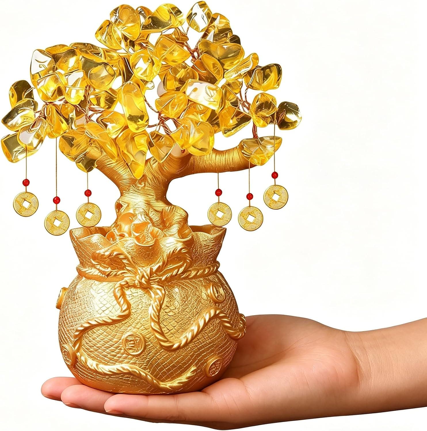
Citrine Money Tree for Wealth Qi
Why this one: Citrine supports bright yang qi and the wealth gua, while the tree form symbolizes growth and steady abundance in the wood element.

Feng Shui Gold Dragon Turtle Wealth Statue
Why this one: This golden dragon turtle activates sheng qi (auspicious energy) in your wealth bagua area, balancing yin earth energy with yang metal energy to attract and hold lasting abundance.
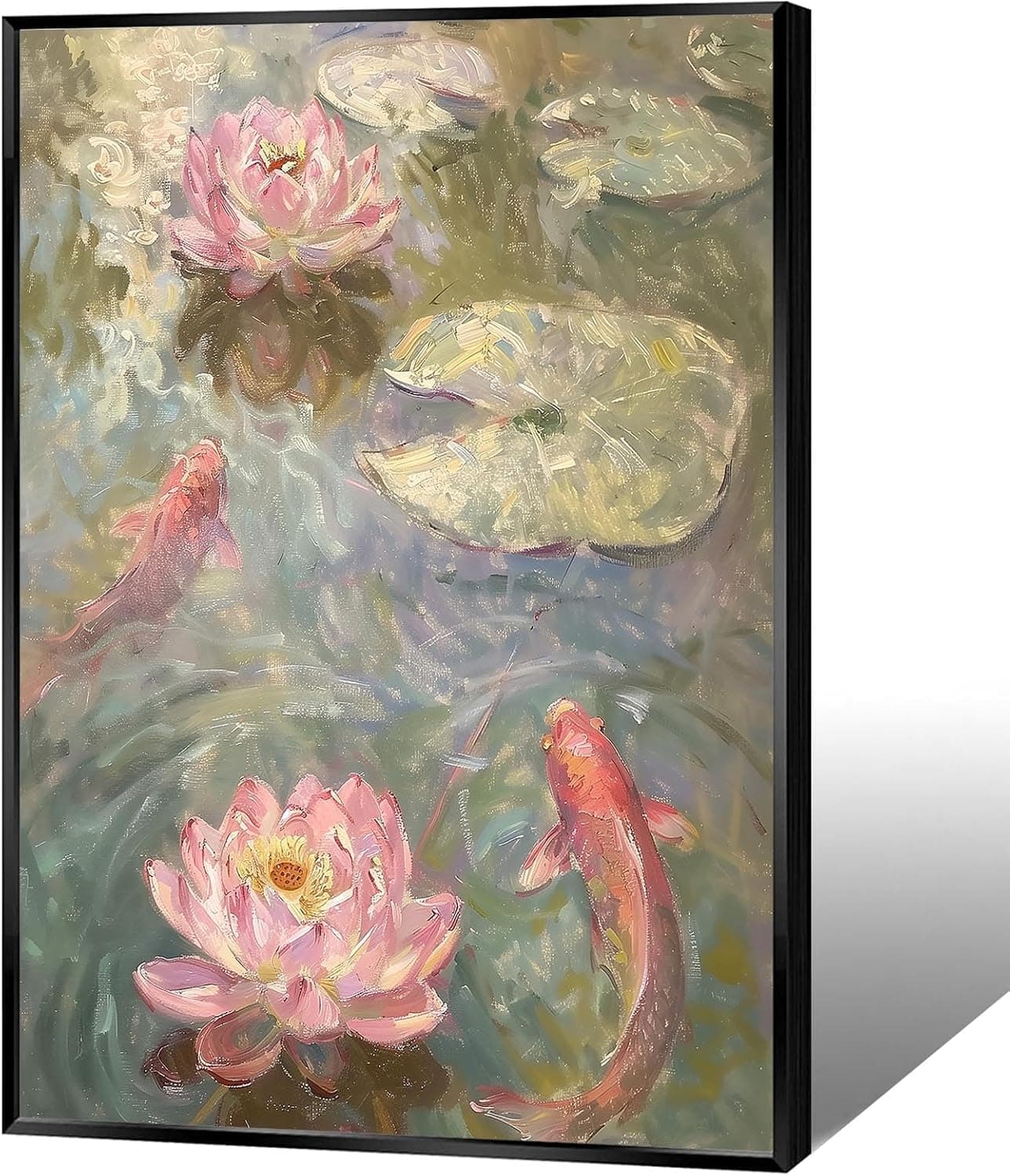
Koi & Lotus Feng Shui Canvas Art
Why this one: Koi strengthen wealth qi and lotus softens yin energy, helping balance the bagua and invite smooth-flowing prosperity.

Japandi Crane Oval Wall Art
Why this one: Cranes symbolize longevity and harmonious qi; place it to soften yang energy and invite balanced flow through the bagua.

Money Fish Wealth Carp Statue
Why this one: The carp and waves activate flowing qi and the water element, helping strengthen wealth energy in the bagua wealth area.

Handmade Golden Treasure Basin Feng Shui Wealth Decor
Why this one: The golden yuan bao activate metal energy (linked to wealth in five elements) to draw abundant qi into your home’s prosperity bagua area, balancing yin and yang for steady financial flow.
As an Amazon Associate, we earn from qualifying purchases. We only recommend items our practitioners have personally tested.
Continue Your Journey
Explore these related guides to deepen your understanding:

Ready for Deeper Guidance?
Try our free I Ching reading for personalized wisdom, or explore our curated Feng Shui essentials.