The wrong living room color choice usually fails by proportion, not by symbolism.
The Living Room That Felt Off
A north-facing living room with a beige sofa and one dark accent wall can feel colder at 8 p.m. than it did at noon. I’ve stood in rooms like that where the owners kept adding “cozy” objects—candles, textured pillows, a warm lamp—and the room still felt like it was pulling people away from each other. The problem was not a lack of decoration. It was that the largest surfaces were speaking one language while the movable pieces were trying to answer in another.
That is the first place people misread living room feng shui: they think color acts like a sticker you apply anywhere and the room changes mood on command. It does not. A room is a system. Light, wall mass, floor tone, furniture weight, and how many people use the space all interact before a single cushion enters the picture.
The myth is seductive because it sounds easy. Paint the wall green for growth, red for energy, blue for calm. Done. But a room does not live by symbolism alone. It responds to contrast, reflection, enclosure, and the social habits happening inside it. A family watching television, a couple hosting friends, and one person reading quietly all need different levels of stimulation.
In one apartment I remember, the living room had a charcoal feature wall, a beige sectional, and cold daylight from the north. At night the room felt like a waiting area. The owner blamed the sofa. The sofa was innocent. The wall was doing the heavy lifting, and it was lifting in the wrong direction.
Why the Usual Color Lists Miss the Point
Standard feng shui color lists often treat color as if it belongs to a single element and nothing else matters. That is neat, but real rooms are messy. A south-facing room can tolerate more warmth because the sun already supplies brightness; a north-facing room may need gentler reflected light and less visual weight on the walls. Same color, different result. That is why the list-only approach keeps failing people.
The missing piece is not just symbolism, but dose. Color does not act in isolation; it changes the room’s visual load. A pale green on a wall can make a room feel open because it reflects light and keeps the surface psychologically light. The same green repeated in a heavy sofa, dark rug, and dense curtains can make the space feel closed because the eye keeps registering the same note with nowhere to rest. The problem is not the hue itself. It is how much of it the room has to carry.
Color also changes how people behave in the room, which is why blanket advice is so weak. Warm hues tend to increase perceived sociability and closeness because they raise the room’s energetic signal. Cooler tones usually lower stimulation and support recovery because they soften the visual environment. Neither is “better.” The right choice depends on whether the room needs to invite conversation, reduce tension, or help people decompress after work.
Color meanings in feng shui matter, but they are only one layer of the system. If you flood a shared room with saturated red, orange, or deep yellow, you may get more movement and talk—but also agitation, dominance, and visual fatigue. That is a bad trade in a family space where several people need to coexist with different temperaments.
Philosophically, this is just yin and yang in plain clothes: not good versus bad, but active and restful in proportion. A room should support both conversation and decompression. If every surface insists on being the star, nobody gets to rest. If everything is muted to the point of disappearance, the room loses warmth and social pull. Balance is not a slogan. It is a ratio.
What Color Is Actually Doing in the Room
Color has three jobs in a living room: it sets visual temperature, it assigns weight, and it guides behavior. Visual temperature is the felt sense of warmth or coolness. Weight is how dense or airy the room appears. Behavior is the part most people ignore: color can invite conversation, quiet the nervous system, or create subtle resistance.
Think about a room with cream walls, an oat rug, and soft terracotta cushions. The walls breathe. The rug grounds. The cushions add warmth without shouting. That combination works because the strongest color is not trapped on the largest surface. It arrives in smaller doses, where the eye can catch it, register it, and move on.
By contrast, a full room painted in deep orange can become overpowering fast, especially if the ceiling is low or the furniture is already substantial. The color is not “wrong.” The dose is wrong. In systems terms, the room cannot metabolize that much intensity everywhere at once, so the whole space starts to feel busier, tighter, and harder to relax in.
This is where sociology sneaks in. Living rooms are negotiated spaces. They carry status, care work, visiting rituals, and family compromise. A palette that flatters one person’s taste but makes everyone else feel like guests in their own home is not good design. A living room should reduce friction, not declare ownership.
The good news is that you do not need a full repaint to change the whole field. The largest surface should act as the background control layer, especially in rentals. That means your walls, floor, and major upholstery set the baseline. Stronger colors belong on smaller, movable objects: cushions, throws, art prints, table decor, and lampshades.
Choosing Colors by Room Goal, Not by Guesswork
Start with the room’s job. If the living room is mainly for conversation and guests, you want warmth without pressure. If it is for after-work recovery, you want softer, cooler support. If it serves as the emotional center of the home, you want stability first and personality second.
For a north-facing room, I usually lean toward cream, oat, sand, muted wood tones, soft terracotta, and restrained green accents. The reason is simple: north light can make color feel thinner and colder. A little warmth in the textile layer prevents the room from reading sterile. In one beige-sofa room I saw, swapping black cushions for dusty green ones and adding a sand-colored throw changed the entire evening mood. The room stopped feeling defensive.
For a south-facing room, you can tolerate more color because the light already carries heat. Here, dusty blues, sage, softened clay, and pale neutrals often work better than hard, hot reds. The sunlight does part of the energetic work for you. If you add too much saturation on top, the room can become restless by late afternoon.
For east-facing rooms, I like fresh, restorative colors that suggest renewal without becoming busy: muted sage, pale wood, a little green-gray, and light cream. Morning light can make these rooms feel alive without overstimulation. West-facing rooms often get stronger evening warmth, so they can handle a slightly richer terracotta, amber, or warm beige as long as the palette is not fighting the sunset.
Center rooms are a different case. When a living room sits inside the middle of a home or apartment, stability matters more than directional drama. Earth tones, natural fibers, and grounded rugs work well because they anchor the room without enclosing it. If you need a single reference for this logic, study the logic of the bagua map and room sectors, then translate it into practical design rather than superstition.
Where to Place Color So It Works Without Repainting Everything
Do not start with the biggest wall unless that wall is the problem. Start with the room’s largest background surface and ask: does this surface need to recede, reflect, or hold? In rentals, the answer is often “recede.” Beige, soft white, sand, or oat help a room feel more breathable, especially when daylight is limited. This is not about blandness. It is about giving the eye somewhere to rest.
Then use the smaller objects to introduce intention. If the room needs more sociability, add warm hues through cushions, a folded throw, a ceramic bowl, or a table lamp with a terracotta or linen shade. If the room needs calm, let muted sage, dusty blue, or soft gray appear in artwork or textiles instead of the walls. Smaller items are easier to change, which matters because people often underestimate how quickly they become tired of a strong color used everywhere.
Rugs do one special job well: they anchor the center of the room and define stability without boxing the space in. A rug in sand, warm gray, or a subdued pattern can make a living room feel assembled instead of scattered. In open-plan apartments, this matters even more. The living room blends into the kitchen, so the rug becomes a boundary marker without building a wall.
Here is the practical sequence I use. First, identify the room’s light direction. Second, decide whether the room needs more warmth, more calm, or more grounding. Third, keep the largest surface neutral enough to support that goal. Fourth, assign stronger color to one or two movable layers. Fifth, step back at night, because many rooms look “fine” in daylight and completely different after sunset. That last step saves people from a lot of expensive mistakes.
When Balance Breaks: Shared Spaces, Mixed Preferences, and Too Much of One Tone
A family living room is often where taste becomes politics. One person wants high-energy warm colors. Another wants calm and visual quiet. If both insist on ruling the entire room, the space starts to feel tense before anyone sits down. That is not just aesthetics. It is a signal that the room is carrying competing social claims.
Try this instead: let the warm side show up in smaller accents and the calm side hold the background. A terracotta cushion can speak for liveliness. A cream wall and natural rug can protect the nervous system. This is not compromise in the weak sense. It is design ethics in action. The room exists to support mutual use, not individual conquest.
That principle is especially important in open-plan apartments. When the living room shares space with the kitchen, color can easily bleed into conflict. A saturated wall color in the lounge area may start arguing with cabinet finishes or backsplash tile. Instead of forcing one bold statement across the whole layout, use repeated notes: a green print near the sofa, a clay bowl on the table, a warm runner near the kitchen edge. Repetition creates unity without domination.
Too much of one tone can also flatten a room emotionally. A space drenched in cool gray can feel elegant but withdrawn. A room overloaded with warm yellow can feel cheerful for ten minutes and then oddly demanding. I have seen both. The fix was rarely adding more color. It was usually subtracting intensity and restoring proportion.
Surprisingly, a room often improves when you remove the thing you were most attached to. That bright accent wall, that glossy crimson lamp, that overconfident rug. Once the room relaxes, people do too.
A Living Room Palette That Supports the People in It
If you want a working palette, build it in layers. Begin with a quiet base: cream, oat, sand, warm white, or a soft mineral tone. Add one grounding earth note through the rug or larger upholstery. Then introduce one or two accent colors that match the room’s purpose. Soft terracotta for warmth. Muted sage for restoration. Dusty blue for quiet. Restraint matters more than novelty.
The I Ching teaches this kind of thinking better than a color chart does. A hexagram is never just one line. It is a relationship of lines, and the meaning comes from their arrangement, not from one symbol acting alone. A room works the same way. Color is not an isolated virtue. It is part of a pattern of support, contrast, and timing.
If you want the deeper room-level framework that sits behind these decisions, return to feng shui living room colors with the question, “What does this room need to do for the people who use it?” That question changes everything. It moves you away from decorative rules and toward actual function.
And function is where good feng shui becomes visible. A room that helps people stay a little longer, speak a little softer, or settle a little faster is not merely prettier. It is doing real work. That is the standard.
So before you buy another paint sample, check the room’s direction, its light, its biggest surfaces, and the emotional job it must perform. Then use color where it can influence the system without overpowering it.
The right palette does not announce itself. It makes the whole room easier to live in.
FAQ
Should I paint all four walls in my feng shui color?
Not usually. Four strong walls can overwhelm a living room fast, especially if the space is small or the light is limited. A better move is to keep the largest surface neutral and use stronger color in textiles, art, or one contained feature.
What if my partner and I want opposite color moods?
That is common, and it is exactly why shared rooms need proportion, not victory. Put the energizing color in accents and let the calmer tones hold the background so the room can support both conversation and recovery.
Can I use feng shui living room colors in a rental without repainting?
Absolutely, and rentals are often the best place to practice. Use rugs, cushions, throws, lampshades, and art to shift the balance while the walls stay quiet enough to support the whole system.
Mei Chen
Traditionally informed guidance • Cross-referenced with classical Chinese source texts
Content draws from both Compass (Luopan) and Form (Xingshi) school traditions. Illustrative examples are composites based on consultation experiences.
Practitioner-Selected Tools for This Topic
Items our team has tested and found effective for the principles discussed above. Individual results may vary.
 -19%
-19%Wind Chimes for Outside with 5 Bell Unique Copper Musical Chimes Feng Shui Wi...
 -5%
-5%YU FENG Evil Eye Money Tree, Blue Feng Shui Decor with Golden Buddha
 -29%
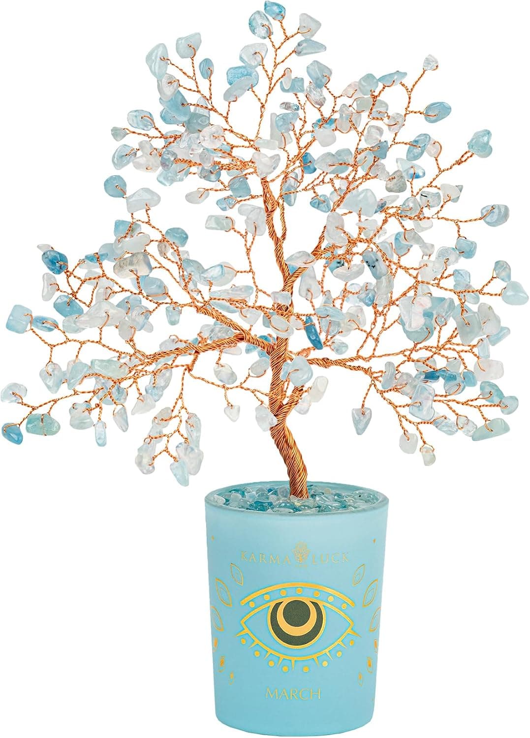
-29%Karma and Luck March Birthstone Crystal Tree of Life, Aquamarine Gemstone Fen...
 -29%
-29%Karma and Luck July Birthstone Crystal Tree of Life, Ruby Gemstone Feng Shui ...
As an Amazon Associate, we earn from qualifying purchases. We only recommend items our practitioners have personally tested.
Continue Your Journey
Explore these related guides to deepen your understanding:


Ready for Deeper Guidance?
Try our free I Ching reading for personalized wisdom, or explore our curated Feng Shui essentials.