Knocking down a wall can make a kitchen look brighter and feel worse by the week.
The Real Story Behind Feng Shui Kitchen-colors
The conventional thinking on Feng Shui Kitchen-colors has a fundamental flaw. I watched a couple in a converted warehouse in Portland paint their island a warm clay red, hang a pale bamboo pendant over the sink, and replace a tired linoleum floor with white oak. They had followed every cheerful article they could find. Two weeks later, the wife said she stopped cooking at night because the room felt "too exposed," and the husband started leaving dishes in the sink until morning. The problem wasn't the paint. It was the open plan.
Open space looks modern, but it can spread a kitchen's signals too thin. In a closed room, color holds its ground; in a large combined kitchen-dining-living space, the same shade can get swallowed by glare, sightlines, and constant movement. That is why a soft green that feels calming in a galley kitchen may turn useless in a great room where the sofa, TV, and entryway all compete for attention. mapping the room before choosing colors matters more than chasing a trendy palette.
People love to say the answer is "more brightness." Not even close. If the cooktop sits on the south wall, the breakfast counter faces west light, and the fridge is visible from the front door, you are already dealing with a room that leaks attention in three directions. Add glossy finishes and the kitchen starts acting like a stage set, not a place where food settles into the home.
The old mistake is assuming color works the same way everywhere. It doesn't. Color in a kitchen is not wallpaper; it's a boundary. And once the walls come down, that boundary has to be rebuilt with the right tones, texture, and placement, or the room gets nervous and the people in it do too.
I've seen dozens of open-plan kitchens where the owners blamed clutter, then lighting, then budget, and never the color field itself. The truth is less flattering. A room can be technically beautiful and still feel scattered enough that nobody lingers to finish tea.
Case Notes From an Open-Plan Kitchen That Went Wrong
A teacher named Elena asked me into her townhouse in Oakland on a rainy Tuesday morning. The kitchen sat at the center of the home, with no wall between the charcoal cabinets and the living area. She had chosen white walls, a blue-gray backsplash, brass pulls, and a sage green runner because every element sounded "balanced." Yet she said meals felt rushed, her teenage son ate standing up, and she kept forgetting ingredients on the grocery list. That is classic fragmentation.
What happened here was simple once you looked closely. The white walls reflected too much light from the east-facing windows, while the blue-gray backsplash cooled the cooking zone until it felt unfinished. Her sage runner looked lovely in photos, but it was too small to anchor the whole field. The room had no visual bass note.
Conventional advice told her to "keep it light." That advice works when the kitchen is boxed in and needs air. In an open plan, light colors can wash out the very edges that tell the nervous system where the work zone ends and the rest of the house begins. the center rules the room, and if the center is visually weak, every surrounding area starts acting loose.
One more detail changed everything: the refrigerator stood directly in line with the front door, about eleven feet away. Every time someone entered, the eye jumped to the silver door, then to the stove, then to the sofa. Too many active points. The family never truly settled.
Wrong room, wrong scale, wrong effect.
How Open Plans Distort Color
Color behaves differently once walls disappear. In a closed kitchen, a red cabinet can feel warm and grounded because the room contains it. In an open room, that same red may bleed into the dining area and make the whole home feel more urgent than inviting. The eye keeps traveling, and the body follows.
There is also the matter of elemental balance. Kitchens belong to Fire, but too much Fire in an open plan can push the room into irritability: louder conversation, quicker tempers, restless snacking, and a strange habit of pacing while waiting for water to boil. You may think the answer is to add more white. That usually creates a sharper, colder glare instead of calm.
A better question is where the kitchen begins and ends. A darker island base, a muted backsplash, or even a deeper tone on the back wall can create a visual pause. That pause matters. It gives the room a spine. color choices that drain a room without anyone noticing often fail because they are pretty without being anchoring.
Open plans also magnify reflection. Glossy cabinets, polished stone, stainless appliances, and glass pendants bounce light into every corner, so the color you picked in the sample chip no longer reads the same way at 7 p.m. under warm lamps. If the room already has a lot of movement, reflective surfaces make it harder for the kitchen to feel settled. Not better. Busier.
That is why the common instruction to choose "clean, bright" kitchen colors needs a correction. Clean is not the same as contained. Bright is not the same as coherent.
What Actually Works in Open-Plan Kitchens
Start with the kitchen's job, not the catalog photo. A cooking zone needs enough visual weight to hold the eye, but not so much contrast that it shouts across the room. Earth tones often do this well: clay, mushroom, sand, muted olive, tobacco, stone, softened taupe. They don't disappear, and they don't sprawl.
Use a stronger color where the room needs containment, then let the surrounding areas breathe. In one loft in Brooklyn, I recommended deep matte green on the lower cabinets, warm off-white upper cabinets, and a rust runner placed just inside the kitchen edge, not out in the living room. The owner, a nurse working night shifts, said she stopped feeling "jangled" at 10 p.m. and started sitting down for soup instead of grazing from the fridge while standing. Small shift. Real result.
Don't ignore the floor. A pale continuous floor running from kitchen to sofa can erase the boundary between tasks. A rug in the dining zone, a different cabinet finish, or a darker island base can help the eye recognize that cooking happens here and resting happens there. The home stops behaving like one long corridor.
Texture matters as much as color. Flat paint, honed stone, and wood grain calm down a space that already has enough glare. Shiny surfaces can be useful in small doses, but an entire open kitchen wrapped in polish often feels like it is waiting for someone to judge it.
And yes, direction still counts. A kitchen on the south side can take more Fire-supporting color than one in the north, where cooler tones may be less abrasive. For people who want a deeper technical layer, reading a feng shui compass wrong is more common than you’d think, so check the room's actual facing before you commit to paint.
Common Mistakes That Keep Repeating
One mistake is treating every open kitchen like a display case. That leads to all-white cabinetry, glass shelves, and chrome everywhere. It photographs well for exactly two minutes. Then the room starts feeling like a showroom after closing time, and nobody wants to linger there with a mug of tea.
Another is choosing a color because the samples looked peaceful under store lighting. Store lighting lies. A dusty blue that seemed restful in the showroom can read like cold dishwater beside a north window, while a terracotta swatch may suddenly look like a traffic cone once the evening lamps come on.
People also overdo contrast. Black stools, white counters, red accessories, blue art, silver appliances, and a yellow vase can create a room that never settles its pulse. The eye has nowhere to land. You feel it by the way people keep moving items around the counter for no reason.
Then there is the habit of making the kitchen too visually thin because the owners want it to "open up." That phrase causes trouble. Open up to what? Noise? Foot traffic? The dog crossing through with a toy? A room can be spacious and still have a defined edge. Without that edge, the cook is exposed, and the whole household seems to know it.
Knives make this worse when they are left visible in an open setup. A magnetic strip on the side wall may look efficient, but it puts sharp edges in direct view from the dining table. kitchen knives carry more energy than you'd think, and in an open plan that energy reaches farther than people expect.
Then the last mistake shows up quietly: matching the kitchen to the living room instead of making each zone distinct. Similar does not equal harmonious. Sometimes it just means the whole house forgets what each room is for.
A Better Way to Read the Room
Walk the space at two different times: morning and evening. Notice where light hits the counters, where the eye keeps snagging, and where you stop naturally. If the sink, stove, and fridge all stand out equally, the color field is probably too even. One point needs to lead.
Use one grounded tone, one lightening tone, and one connector. That might mean dark green lower cabinets, creamy uppers, and wood stools that bridge the kitchen to the dining side. Or it might mean a sandy wall color, olive seating, and a muted red bowl that gives the room a pulse without turning the entire house into a warning sign.
For people working with a renovation budget, paint is the cheapest place to start, but not the only place to adjust. A runner that defines the cooking zone, a dimmer that softens evening glare, and a matte finish on one major surface can do more than another decorative object ever will. the bedroom colors that quiet the mind teach the same lesson: containment beats pretty noise.
Some homes need less color, not more. Others need a stronger anchor at the perimeter so the room stops spilling into everything else. The right choice depends on the layout, the facing, and how much traffic cuts through the space before breakfast.
That is the part most advice skips. It treats color as if it lives on the wall. In reality, it lives in motion, in sightlines, in the way your shoulders drop when you enter the room and rise again when the blender starts.
Open plan kitchens can support a calm, steady household. They can also expose every weak decision at once. The difference usually comes down to whether the color choices create a container or just more scenery.
FAQ
Is conventional Feng Shui Kitchen-colors advice reliable?
Often not, because most advice assumes a closed kitchen with clear boundaries. Once the wall is gone, the same paint color can lose force, spread too far, or clash with the living area. The advice isn't useless; it is incomplete.
Should I use white in an open kitchen?
White can work, but it needs support. If the room already gets strong daylight or heavy reflection from stone and appliances, too much white makes the space feel exposed and thin. A warmer neutral or a grounded lower cabinet color usually holds better.
What if my kitchen is already built and I can't renovate?
Then work with the edges you can change: runner placement, cabinet finish, lighting temperature, and one anchored color on a major surface. Even a shift of texture from glossy to matte can change how the room reads at night. Small moves matter more than people want to believe.
Do open kitchens need more than one color?
Usually, yes. A single flat tone across every surface can flatten the room, while too many competing colors make it restless. The sweet spot is a controlled trio: a base, a lift, and a connector.
How do I know if my kitchen colors are the problem or if something else is off?
Look at behavior. If people avoid sitting in the kitchen, leave clutter on the counter, or rush through meals, the space may lack containment. Then check the layout, the direction, and the visibility of sharp or reflective objects before you blame the paint. Sometimes the issue is not the shade at all; it is the fact that the stove faces the sofa and the room never gets a moment to breathe.
Mei Chen
Traditionally informed guidance • Cross-referenced with classical Chinese source texts
Content draws from both Compass (Luopan) and Form (Xingshi) school traditions. Illustrative examples are composites based on consultation experiences.
Practitioner-Selected Tools for This Topic
Items our team has tested and found effective for the principles discussed above. Individual results may vary.

Citrine Money Tree for Wealth Qi
Why this one: Citrine supports bright yang qi and the wealth gua, while the tree form symbolizes growth and steady abundance in the wood element.

Feng Shui Gold Dragon Turtle Wealth Statue
Why this one: This golden dragon turtle activates sheng qi (auspicious energy) in your wealth bagua area, balancing yin earth energy with yang metal energy to attract and hold lasting abundance.
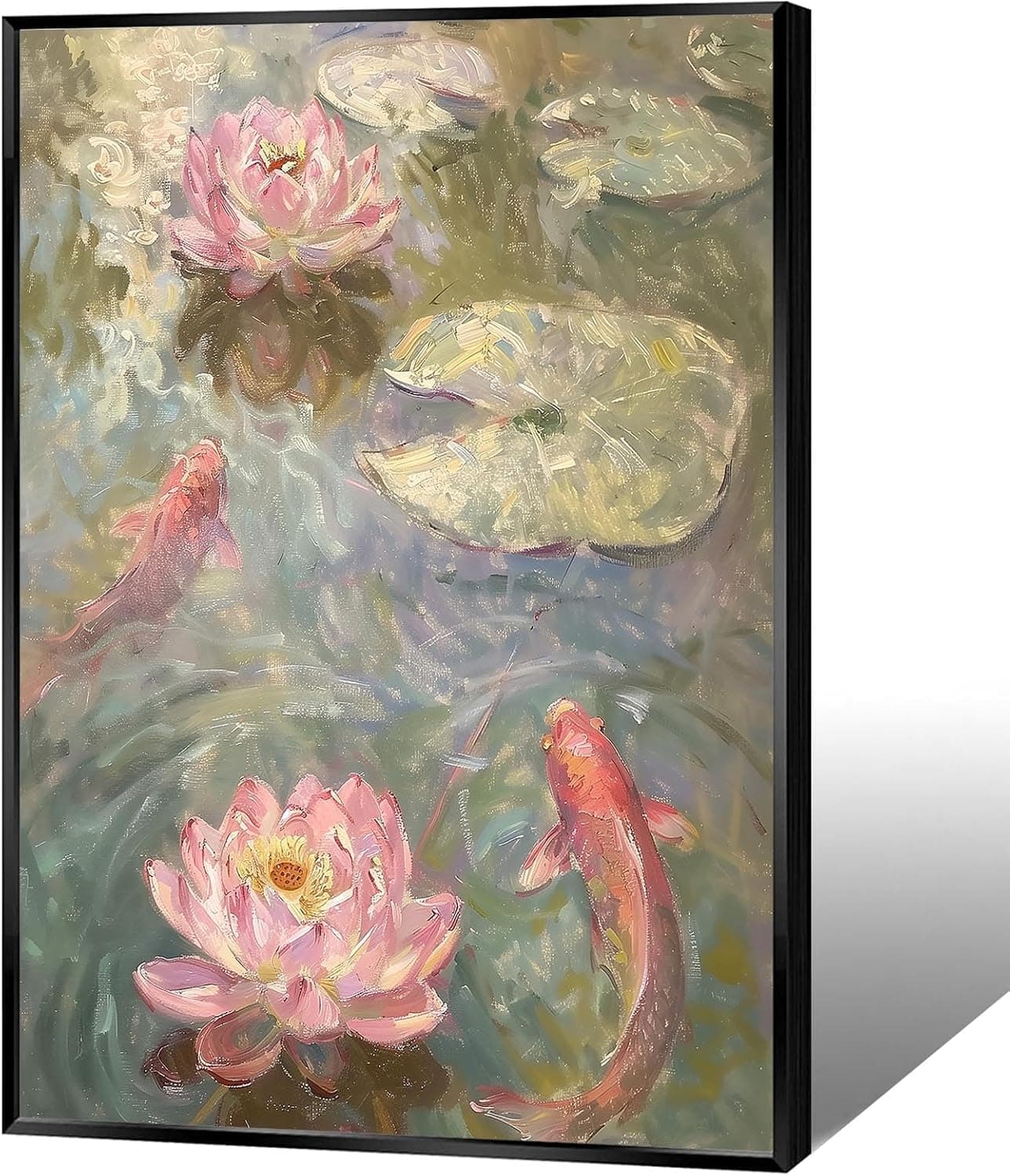
Koi & Lotus Feng Shui Canvas Art
Why this one: Koi strengthen wealth qi and lotus softens yin energy, helping balance the bagua and invite smooth-flowing prosperity.

Japandi Crane Oval Wall Art
Why this one: Cranes symbolize longevity and harmonious qi; place it to soften yang energy and invite balanced flow through the bagua.

Money Fish Wealth Carp Statue
Why this one: The carp and waves activate flowing qi and the water element, helping strengthen wealth energy in the bagua wealth area.

Handmade Golden Treasure Basin Feng Shui Wealth Decor
Why this one: The golden yuan bao activate metal energy (linked to wealth in five elements) to draw abundant qi into your home’s prosperity bagua area, balancing yin and yang for steady financial flow.
As an Amazon Associate, we earn from qualifying purchases. We only recommend items our practitioners have personally tested.
Continue Your Journey
Explore these related guides to deepen your understanding:

Ready for Deeper Guidance?
Try our free I Ching reading for personalized wisdom, or explore our curated Feng Shui essentials.