The best garden layouts are not decorated into harmony; they are shaped so the body can move, pause, and return without strain.
When a lucky-looking side yard still feels tense
I once saw a side yard with a small fountain, three healthy shrubs, and red lanterns tied neatly to the fence. It photographed well. It also felt bad the moment you stepped in. The path narrowed near the gate, the seating area faced a blank wall, and every movement had to negotiate around a planter that had been placed where the body wanted to turn. That is the failure mode many people miss in feng shui garden design: the objects look correct, but the circulation is wrong.
The body notices squeeze before the eye notices symbolism. A cramped approach creates micro-stress because you keep preparing for interruption, even if the interruption never comes. That tension can be subtle in a backyard and glaring on a balcony. On a small apartment terrace, for example, a chair that overlaps the door swing can make the entire space feel occupied before anyone sits down.
Quality starts with movement. If you cannot enter, pause, turn, and leave without brushing past something, the garden is working against you. I have seen this in a north-facing courtyard where a narrow strip of paving looked elegant on paper but forced guests to step single-file along a wall of bamboo. The result was not serenity. It was hesitation.
That is why I do not begin with symbols. I begin with the path, the threshold, and the space the body needs to understand where it is.
Where the classical logic actually came from
Traditional Chinese garden thinking did not treat outdoor space as a shelf for lucky objects. It treated space as something inhabited and read through orientation, enclosure, and sequence. A good garden was supposed to feel received, not dumped into. The gate mattered because arrival matters. The bend mattered because direct force was not always desirable. The balance between open ground and planted mass mattered because a garden that is either barren or overstuffed fails to support attention.
That older logic still makes sense if you strip away the pop-feng-shui gloss. Architecture has always cared about circulation hierarchy: what is primary, what is secondary, where the body is guided, and where it can linger without blocking others. A garden path is not just a line. It is a cue. It tells the guest whether to move, slow down, or stop. When the cue is unclear, people improvise, and improvisation is where discomfort begins.
In older courtyard settings, threshold quality was everything. A garden edge had to signal transition without becoming a wall. Too abrupt, and the space felt defended. Too open, and it felt unheld. That balance between enclosure and permeability is one reason the bagua map becomes useful only after the site is read properly; the map is not a substitute for seeing how a space actually behaves.
There is also a social layer that many modern articles ignore. Outdoor space is negotiated territory. In a family garden, the sunny bench, the hose area, the side gate, and the main path can all become claims of use. If the design does not make those claims legible, people start competing silently. The garden then carries household tension instead of easing it.
How the idea shifted into modern shortcuts
Modern feng shui advice often compresses a layered environmental practice into a shopping list. Add water. Add red. Add plants. Add a stone path. The trouble is not that these things are wrong. The trouble is that they are incomplete. A fountain can be helpful and still fail if it sits where movement should widen. A lantern can enliven an edge and still feel awkward if it highlights a route nobody can use comfortably.
The same mistake shows up on balconies and apartment patios. A renter may place symbolic cures in the corners, but if the railing line cuts through the usable zone and the chair blocks the door swing, the space remains functionally broken. I saw one narrow balcony with a little ceramic urn, a hanging crystal, and two potted herbs. It looked careful. It was not livable. Every time the door opened, the occupant had to pivot around the chair and squeeze sideways to reach the railing. That is not a minor inconvenience. It is repeated friction.
Symbolic objects work best when they reinforce a layout that already reads clearly. They do not rescue a confused plan. This is where quality indicators matter more than decoration. If the light is harsh, the planting is too dense, and the circulation pinches at the same point every day, no amount of charm will fix the underlying design failure.
And no, more stuff is not the answer. Sometimes the most auspicious move is removal.
What high quality looks like on the ground
Good garden design has three visible traits before it has any decorative ones: circulation, proportion, and threshold clarity. Circulation means there is a primary route and, if needed, a secondary one. The main route should feel obvious and unforced. The secondary route should let someone water plants, move a chair, or exit without crossing the main line of use. When these routes compete, the garden starts to feel cramped even if it is technically large enough.
Proportion is the next test. If planting overwhelms the paving, the space can feel claustrophobic and visually noisy. If paving overwhelms the planting, the space feels exposed and unfinished. The best balance creates a feeling of being held. Leaves soften the edges. Hard surfaces support movement. Light lands in layers, not in one harsh wash across a bare slab.
Filtered light across leaves changes the nervous system faster than most people expect. It gives the eye somewhere to rest. By contrast, a bright, featureless surface reflects glare and makes the body work harder to orient itself. That is why a small courtyard can feel calmer with less hardscape, not more. The quality of light matters as much as the quality of materials.
Water follows the same rule. A small fountain can be excellent when it is proportionate and placed where the sound does not fight traffic, neighbors, or the HVAC unit. Water should support the atmosphere, not compete for attention. When the sound is too loud or too close to the seating zone, it stops feeling restorative and starts feeling intrusive.
Thresholds are the final indicator. A good gate, step, or edge announces arrival without forcing a hard stop. The transition should be readable. People should know when they have entered, but not feel barred from continuing. This matters in front gardens, side yards, and apartment patios alike. Clear thresholds reduce ambiguity, and ambiguity is where people start treating a space as neither private nor shared, which weakens comfort fast.
If you want to compare that logic with another domestic threshold, look at how a front entry sets the tone before anyone reaches the interior. The same principle repeats outdoors: the approach must be legible before it can feel welcoming.
Why the garden changes mood and household relations
A garden is not just scenery. It is a social arrangement. When one person claims the only sunny seat for tea, another avoids the entrance because it feels exposed, and the path becomes a negotiated corridor, the design has failed to lower friction. In those situations, the layout itself is asking people to argue without words.
That is one reason I pay attention to sightlines. If the seating faces a blind wall, the occupant may feel cut off. If the seat faces the street too directly, it may feel exposed. If the planting screens everything, the space can become private in the wrong way: hidden, but not restful. The best arrangement lets someone feel both sheltered and aware. That is a subtle balance, and it usually comes from proportion more than ornament.
From a sociology perspective, shared space works when access and ownership are easy to read. People relax when they know where they can stand, where they should pass, and where they may pause without intruding. A family garden that makes those signals clear tends to generate less silent resentment. The environment lowers the burden on the relationships inside it.
I have seen this shift happen in a small townhome courtyard where the main bench was moved off the path and a secondary stool was added near the herb bed. Nothing exotic changed. No statue. No dramatic cure. The space simply stopped asking two people to occupy the same strip of ground at the same time.
How to apply the principles in a small space
Start by tracing movement with your feet, not your imagination. Walk from the door to the far edge, then back again. Notice where your body hesitates, turns sideways, or avoids a planter. Those are the real problems. In a balcony, the door swing and chair placement are often the first collision points. In a side yard, the pinch usually appears near a gate, hose bib, or narrow turn.
Next, identify the primary route and protect it. If a bench, pot, or decorative screen sits on that route, move it. Do not ask the body to work around your styling choice. In a tight space, the circulation line deserves priority over the display zone. That single decision often changes the feel of the whole area.
Then check the ratio of planted mass to open area. A small space usually wants fewer, better-placed plants rather than a dense cluster. Leave enough open surface for the eye to read the shape of the space. If everything is busy, the mind cannot settle. If nothing is layered, the space feels abandoned. Either extreme weakens the effect.
Use soft enclosure instead of hard blockage. A trellis, a slim shrub, or a low screen can define the edge without shutting the space down. The goal is to create a readable threshold and a sense of shelter. In rental settings, this is often the only move you can make, and it is usually enough.
If you are working from a larger property, the same principles still hold, just at a different scale. Compare the garden’s structure with the logic used in a living room layout that keeps movement clear; both spaces fail when furniture or planting interrupts the natural route.
For plant selection, use restraint. You do not need a jungle. You need healthy growth, maintained edges, and a layout that does not turn maintenance into a burden. I have watched more good intentions die from overplanting than from bad taste. Dense planting looks impressive for a week and then becomes a maintenance problem, which is another form of energetic clutter.
If the garden is shared, assign roles plainly. One person waters. One person trims. One person decides whether the seating area stays open for guests or private for daily use. This sounds practical because it is practical. Good design reduces negotiation by making the territory easy to understand.
And if your only outdoor area is a narrow balcony, keep the center line open. That may mean a single chair instead of two, a wall-mounted shelf instead of a floor stand, or one plant grouping instead of scattered corners. Small spaces reward discipline. They punish decorative excess immediately.
When the right cure cannot compensate for the wrong layout
People often want a remedy that works even when the geometry is poor. That is understandable. It is also a fantasy. A fountain cannot make a pinched passage spacious. Red accents cannot make an exposed seat feel protected. A row of healthy plants cannot make a blind wall interesting enough to support lingering.
Quality in feng shui garden design is not measured by how many auspicious objects appear in the frame. It is measured by whether the space supports movement, offers legible thresholds, balances light and enclosure, and lets people share it without friction. That is the standard I use every time.
So if a garden feels off, ask a harder question than “What cure is missing?” Ask which line is blocked, which edge is unclear, and which part of the space is asking people to behave awkwardly. That question usually gets you to the real answer faster than any charm ever will.
When you want the broader spatial logic behind this approach, return to the bagua map and how it organizes a home’s zones. The garden works best when it is read as part of the whole dwelling, not as a decorative afterthought.
FAQ
Should a small garden have a water feature? A water feature can be useful, but only if it fits the scale of the space and does not compete with movement or noise from neighbors. In a small courtyard or balcony, proportion matters more than symbolism. A tiny fountain in the wrong place is just clutter with sound.
Can I use feng shui ideas on a rental balcony? Yes, and the best changes are usually reversible: clear the circulation line, soften the edge with one or two well-placed plants, and avoid blocking the door swing. A rental space becomes more useful when it reads clearly, not when it is overloaded with symbolic items. Think usability first, decoration second.
What is the fastest sign that a garden layout is poor? Watch how your body moves. If you keep turning sideways, pausing to avoid contact, or feeling exposed in the seating area, the layout is telling you something is wrong. That discomfort is not imagination; it is feedback.
Mei Chen
Traditionally informed guidance • Cross-referenced with classical Chinese source texts
Content draws from both Compass (Luopan) and Form (Xingshi) school traditions. Illustrative examples are composites based on consultation experiences.
Practitioner-Selected Tools for This Topic
Items our team has tested and found effective for the principles discussed above. Individual results may vary.
 -19%
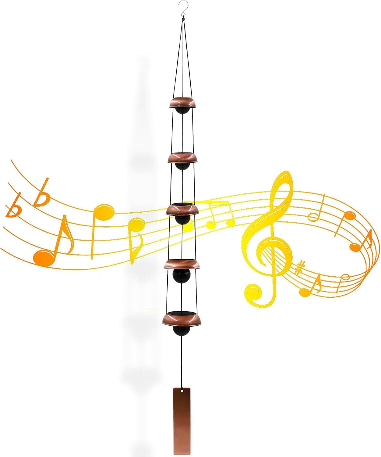
-19%Wind Chimes for Outside with 5 Bell Unique Copper Musical Chimes Feng Shui Wi...
 -5%
-5%YU FENG Evil Eye Money Tree, Blue Feng Shui Decor with Golden Buddha
 -29%
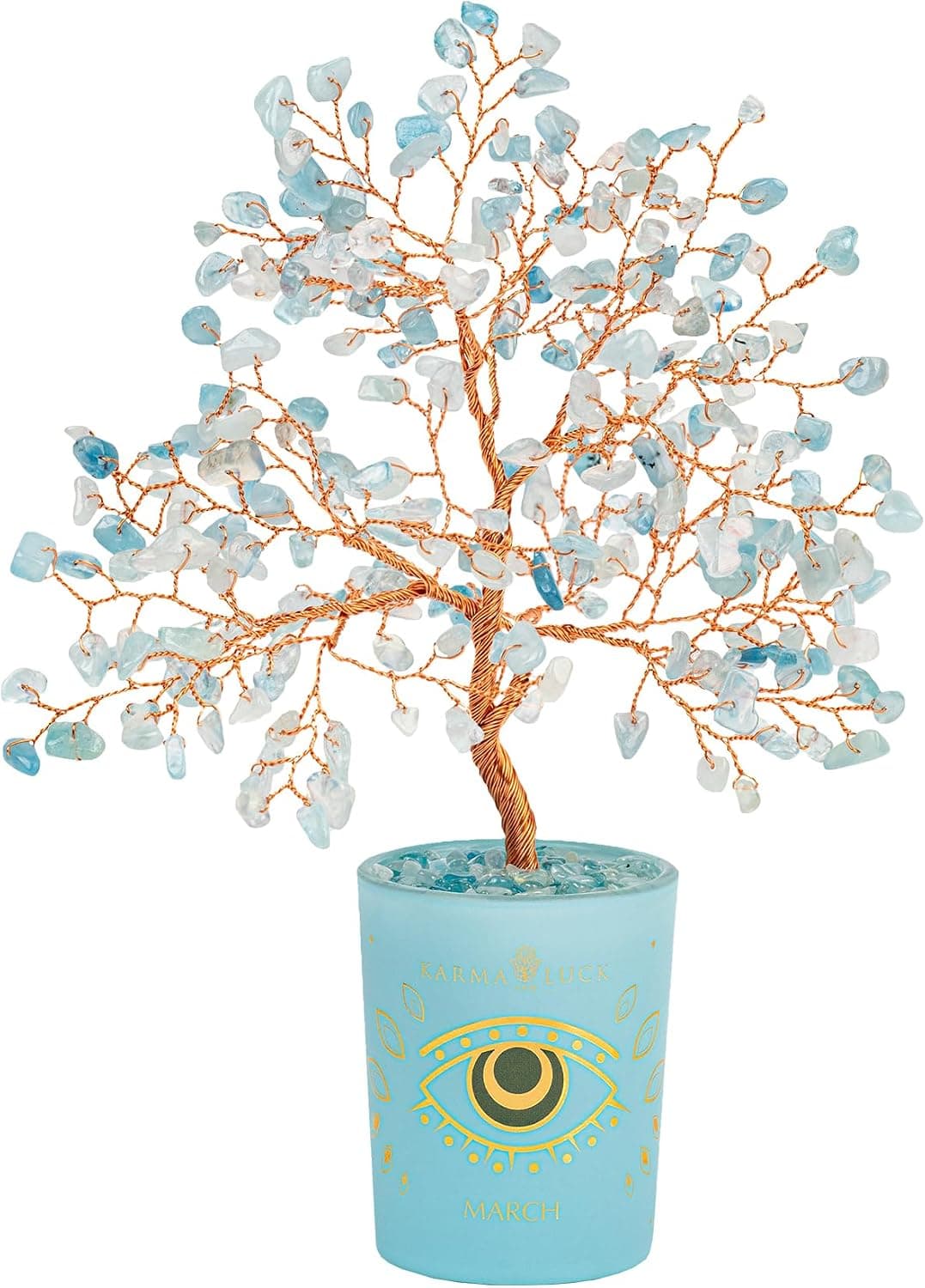
-29%Karma and Luck March Birthstone Crystal Tree of Life, Aquamarine Gemstone Fen...
 -29%
-29%Karma and Luck July Birthstone Crystal Tree of Life, Ruby Gemstone Feng Shui ...
As an Amazon Associate, we earn from qualifying purchases. We only recommend items our practitioners have personally tested.
Continue Your Journey
Explore these related guides to deepen your understanding:


Ready for Deeper Guidance?
Try our free I Ching reading for personalized wisdom, or explore our curated Feng Shui essentials.