A bad dining-room flow can drain appetite, attention, and profit faster than a slow kitchen.
When the dining room feels busy but sales stay flat
I walked into a small noodle restaurant in the Pearl District one rainy Thursday and saw the problem before I saw the menu. The hostess stand blocked the entrance, a bright red gum-ball machine fought with the cash register, and half the tables faced the restroom door. The owner kept asking why guests rushed their meals and never lingered for dessert. The room was answering for him.
That is the part people miss about reading the energetic map of a room: it is not a decoration exercise. In a restaurant, layout shapes pace, appetite, privacy, and the feeling of welcome. If the flow is wrong, diners may not know why they feel slightly tense, but they will eat faster, spend less, and leave sooner.
The phrase feng shui for restaurant layout tips gets thrown around like a style note, but the real work is more practical than mystical. You are managing how qi enters, slows down, settles, and circulates without becoming chaotic. That means entrance, seating, circulation, service points, and visual focus all need to cooperate instead of compete.
And no, more mirrors do not fix everything. I know that surprises people. A mirror can expand a tight room or pull light into a dark corner, but if it reflects a busy corridor, a restroom sign, or a cluttered service station, it multiplies the wrong thing.
The framework: welcome, gather, serve, release
Think in four moves. First, the restaurant should welcome energy at the door. Second, it should gather that energy into the dining area without scattering it. Third, it should serve efficiently without jarring the room. Fourth, it should release guests gently when they are finished, rather than pushing them out with noise or visual friction. This is the spine of strong dining-room feng shui.
The entrance sets the tone immediately. If guests walk straight into a jam of waiting bodies, coat racks, specials boards, and people checking their phones, the first impression is compression. Compression is not always bad, but in hospitality it must be softened. You want a clear sightline, a place to pause, and a visual cue that says, “You belong here.” A well-positioned host desk, a clean mat, warm lighting, and an uncluttered threshold do more for revenue than many owners realize.
From there, the seating plan matters more than most owners expect. Tables should not feel like they are in a hallway. Booths and banquettes create containment and ease, while isolated chairs in the middle of traffic create exposure and restlessness. If guests can feel every server passing behind them, their nervous systems stay alert. Alert diners order less slowly, talk less openly, and finish sooner.
Service stations need special care. A stack of napkins, a sanitizer bottle, a mop bucket, a loud POS terminal, and a glaring prep shelf all at the edge of the dining room create a constant message of utility over experience. I’ve seen a restaurant improve simply by moving the water station behind a screen and replacing a chrome utility cart with a narrow wood console. The room felt calmer in one evening because the eye had somewhere better to rest.
Kitchen energy must also be managed. When the kitchen door opens directly into the dining room, every burst of heat, noise, and motion spills outward. That does not mean you need to rebuild the back of house. Often you need a visual buffer: a plant grouping, a partial divider, a shelving unit with attractive objects, or a change in lighting that makes the transition feel intentional. A few well-chosen plants can soften that edge if they are healthy and placed where they do not block movement.
One more thing: people love to talk about lucky colors as if they can rescue a bad floor plan. They cannot. Color supports the room, but layout leads. A restaurant painted in beautiful jade green will still feel strained if diners are squeezed shoulder to shoulder near the bathroom and every server cut across the front door path.
How to arrange the room so energy moves with ease
Start at the doorway and stand still for a moment. Ask what the first thing is that a guest sees. If it is a trash can, a payment counter, a storage bin, or a line of backs from waiting customers, you have work to do. The first sight should be either the host, a welcoming focal point, or a clear route inward. That single choice changes the emotional temperature of the whole room.
Next, look at traffic lines as if you were carrying a tray yourself. There should be a natural path from entry to host stand, from host stand to table, and from table to restroom or exit without forcing people through the middle of seated diners. The most common mistake I see is a beautiful room with a beautiful table plan that still makes servers zigzag like they are crossing a crowded street. A room can be spacious and still feel cramped if the movement is clumsy.
Pay attention to where the tallest, heaviest, or most active furniture sits. In dining-room feng shui, the strongest pieces should support the room, not dominate it. Big storage units belong along stable walls, not in the center where they create pressure. A long communal table can work well if it anchors the room, but it should not become a barrier that forces people to brush past one another in a tight pinch.
Window seats, corner tables, and banquettes usually support comfort better than exposed center tables. People like to feel held from behind and open toward the front. That is not superstition; it is basic human behavior. We all relax faster when the space behind us feels protected.
Lighting does a tremendous amount of work. If the entry is harsh and the dining room is dim, the transition feels broken. If the room is evenly lit but flat, it loses appetite. The best restaurants use light to guide attention: brighter at the entrance and service points, softer over tables, and focused on architectural or decorative features that reward the eye without overstimulating it.
Sound matters too, even though many owners treat it as an afterthought. A clattering echo turns a room into work. Upholstered seating, curtains, art, and wood surfaces can absorb some of that restless rebound. When a room sounds better, it also feels better. Guests stay longer. They order another drink. They are less eager to escape.
Practical guidelines that hold up in real rooms
In a sushi restaurant on a side street in Seattle, I once saw a narrow entry open directly onto a glass pastry case, a loud refrigerator, and the bathroom corridor. The owner had spent a fortune on tile and lighting, yet the room felt agitated the moment you stepped inside. We moved the waiting area to the left, put a low bench along the wall, replaced the reflective menu board with framed art, and added a slim screen near the restroom path. Within two weeks, guests were staying for dessert instead of rushing out after the main course. The food had not changed. The room had.
That kind of shift is why I push owners to think in layers rather than in isolated cures. The best feng shui for restaurant layout tips are not about buying objects; they are about editing pressure. Remove what interrupts. Support what calms. Highlight what invites. If you do only one thing, make the entrance legible and the seating comfortable.
Use furniture to create pockets of privacy without sealing the room shut. A row of booths along one wall can make a large space feel intimate. Two-top tables near the windows can create a sense of openness. High-back seating can help in lively rooms, but do not overuse it, or the dining room begins to feel boxed in. Balance matters more than symmetry.
Keep the cash register and point-of-sale station visually quiet. Bright screens, receipts, and stacks of supplies add mental friction. If the till must be near the entrance, give it a cleaner backdrop. Even a simple shelf, a warmer finish, or a more discreet fixture can reduce the sense that the whole restaurant is doing paperwork in public.
Be cautious with glossy surfaces near active pathways. They reflect motion, and motion is already abundant in a restaurant. A little sheen is fine; a room full of reflective glare is exhausting. The same goes for overly aggressive patterns on floors or walls. Guests should not feel as though they are being watched by the wallpaper.
And do not overlook the bathroom route. If the restroom door opens straight into prime dining sightlines, you are leaking energy in the most obvious way possible. A curtain, screen, change in wall color, or angled partition can make a huge difference. You are not hiding reality. You are giving it dignity.
Common mistakes that cause the room to leak energy
The first mistake is crowding the entrance with too many signals at once. Host stand, menu board, merch shelf, standing guests, umbrella bin, delivery bags: all of that creates confusion before the meal begins. One or two of those elements can be handled well. All of them together make the room feel stressed.
The second mistake is ignoring the dining room’s relationship to the back-of-house. A noisy service path slicing through the guest area will wear people down. So will a restroom corridor that dominates the view. If you want to study how small adjustments change the emotional feel of a room, look at threshold flow and first impressions and then apply the same logic inside the restaurant.
Another trap is overdecorating the walls while leaving the circulation awkward. Art can help, but art cannot rescue bad movement. I have seen restaurants hang expensive pieces above tables that were already too close together. The result was not refinement. It was visual pressure.
Some owners also mistake constant activity for healthy energy. Busy is not the same as balanced. A packed room with poor layout can still underperform because guests do not relax long enough to order more, and staff spend their time dodging one another. The room may look alive. It may not feel prosperous.
FAQ
How do I know if my dining room layout is hurting sales?
Watch the guests, not just the register. If people rush in, eat quickly, avoid certain tables, or seem relieved when they leave, the room is probably creating tension. A layout that supports comfort usually shows up in longer visits, easier table turns, and smoother service.
Should every restaurant follow the same feng shui approach?
No, because the room’s shape, entrance position, kitchen location, and seating style all change the strategy. A cafe, a fine-dining room, and a casual noodle shop do not need the same arrangement. The principles stay the same; the execution changes with the space.
Do I need to use the bagua on a restaurant floor plan?
Surprisingly, the map is most useful when you use it as a diagnostic tool rather than a rigid rulebook. It helps you see where certain functions are overloading the space or where support is missing. I often pair it with practical observation of traffic and sightlines, which keeps the advice grounded.
Can a few decorative fixes improve a bad layout?
They can help, but only after the major pressure points are addressed. A plant, a screen, or a softer light source is useful when it supports the flow. If the tables are still blocking the entrance or the restroom door is still stealing attention, the room will keep fighting itself.
Mei Chen
Traditionally informed guidance • Cross-referenced with classical Chinese source texts
Content draws from both Compass (Luopan) and Form (Xingshi) school traditions. Illustrative examples are composites based on consultation experiences.
Practitioner-Selected Tools for This Topic
Items our team has tested and found effective for the principles discussed above. Individual results may vary.
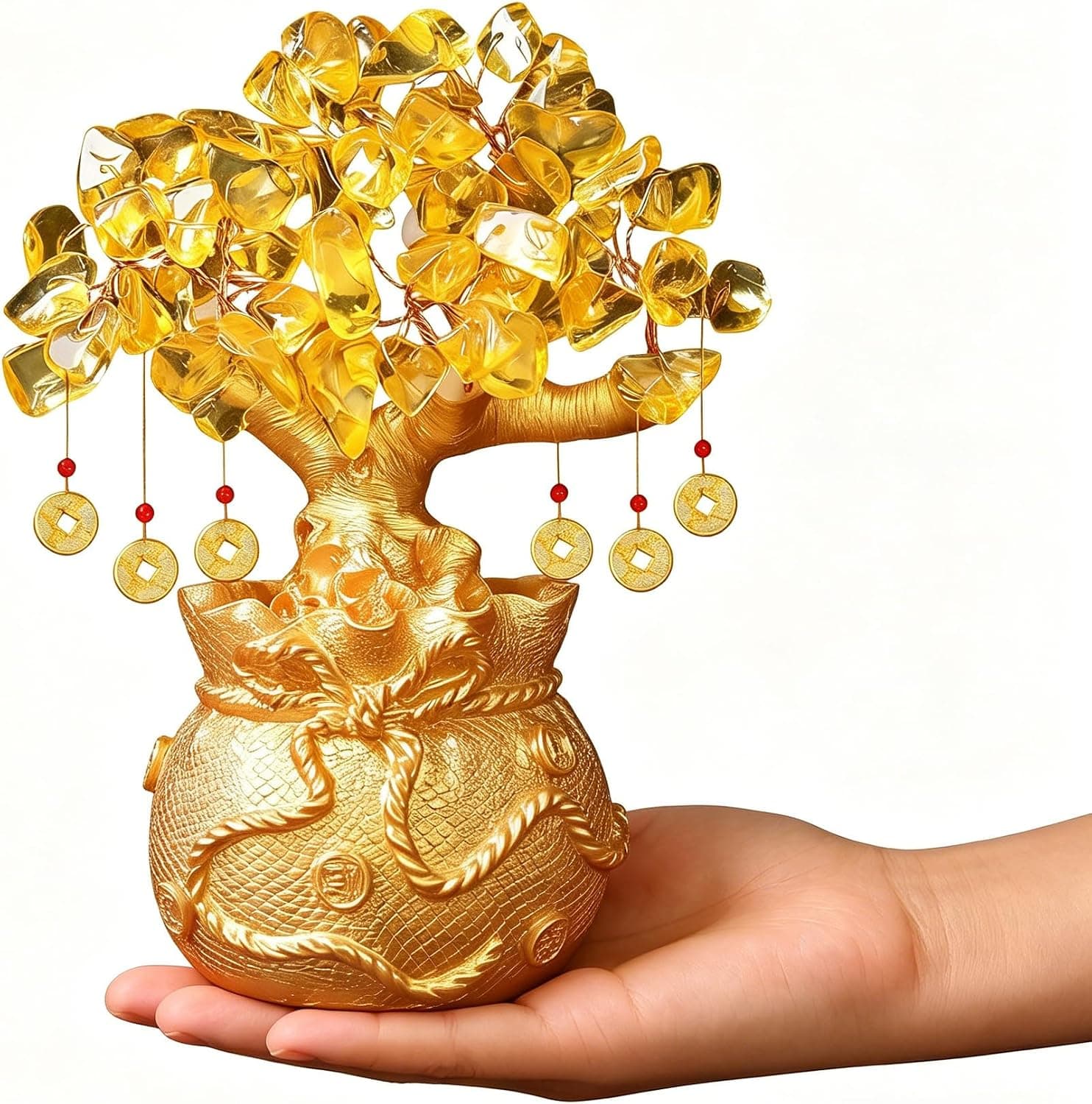
Citrine Money Tree for Wealth Qi
Why this one: Citrine supports bright yang qi and the wealth gua, while the tree form symbolizes growth and steady abundance in the wood element.
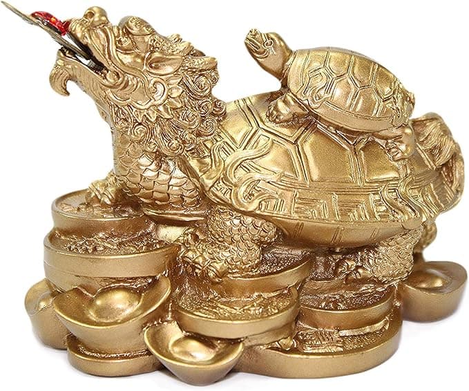
Feng Shui Gold Dragon Turtle Wealth Statue
Why this one: This golden dragon turtle activates sheng qi (auspicious energy) in your wealth bagua area, balancing yin earth energy with yang metal energy to attract and hold lasting abundance.
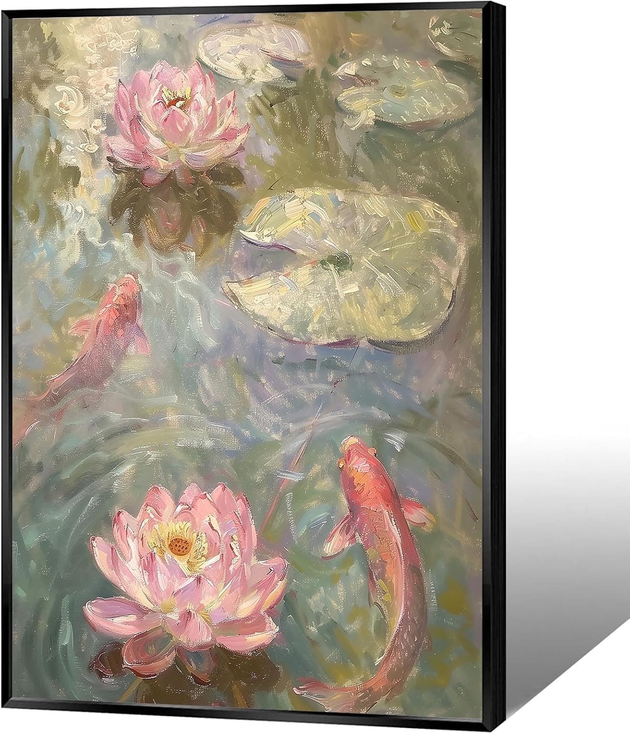
Koi & Lotus Feng Shui Canvas Art
Why this one: Koi strengthen wealth qi and lotus softens yin energy, helping balance the bagua and invite smooth-flowing prosperity.

Japandi Crane Oval Wall Art
Why this one: Cranes symbolize longevity and harmonious qi; place it to soften yang energy and invite balanced flow through the bagua.
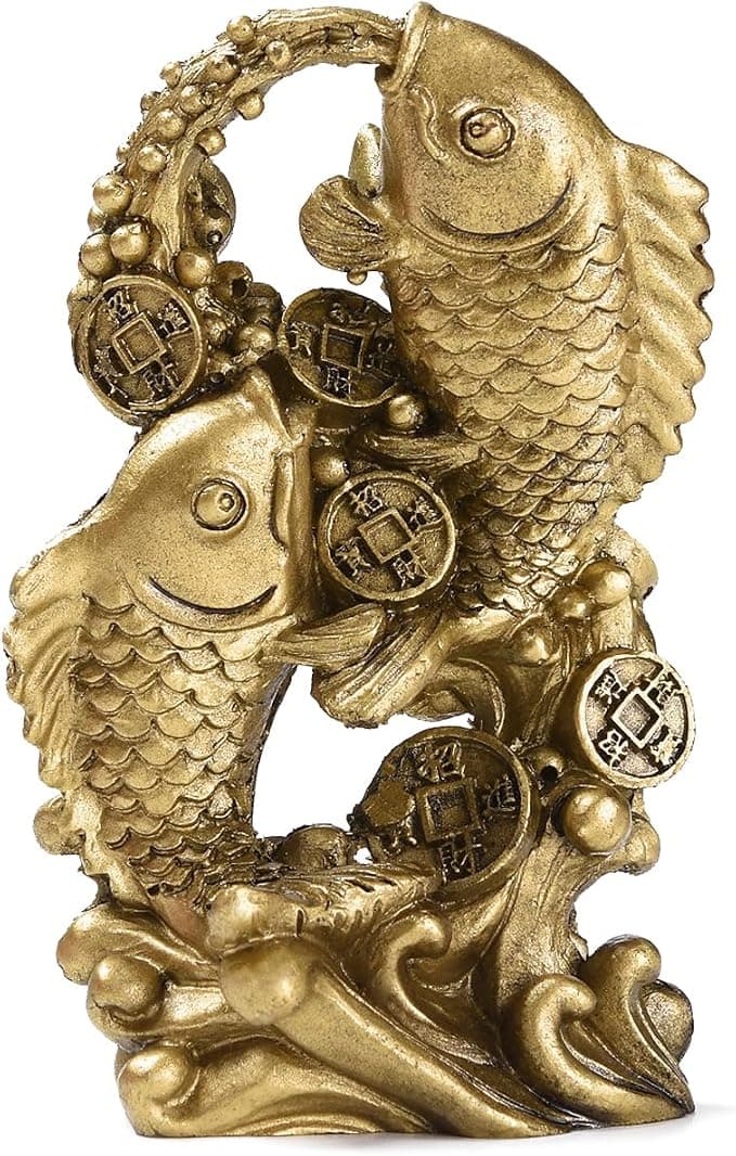
Money Fish Wealth Carp Statue
Why this one: The carp and waves activate flowing qi and the water element, helping strengthen wealth energy in the bagua wealth area.
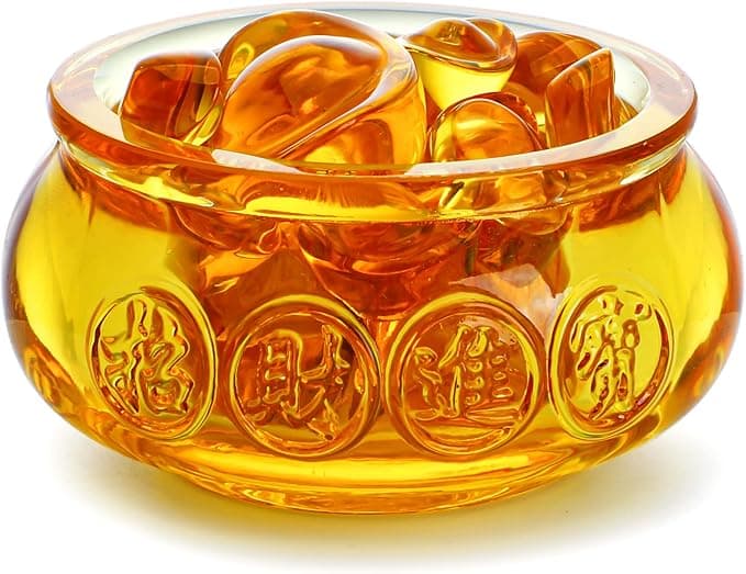
Handmade Golden Treasure Basin Feng Shui Wealth Decor
Why this one: The golden yuan bao activate metal energy (linked to wealth in five elements) to draw abundant qi into your home’s prosperity bagua area, balancing yin and yang for steady financial flow.
As an Amazon Associate, we earn from qualifying purchases. We only recommend items our practitioners have personally tested.
Continue Your Journey
Explore these related guides to deepen your understanding:

Ready for Deeper Guidance?
Try our free I Ching reading for personalized wisdom, or explore our curated Feng Shui essentials.