Put the right color on a front door and the wrong distance can still ruin the effect.
The Real Story Behind Feng Shui Door Colors
A gap exists between theory and practice when it comes to Feng Shui Door Colors is typically understood.
I walked into a narrow row house in Kensington last spring and saw a glossy red front door facing a brick stoop barely three feet deep. The owner had followed every rule she found online, even buying a lacquer sample that looked handsome under the afternoon light. Yet she was exhausted, the hallway felt cramped, and the mail stacked up on the console table beside a dead bowl of tulips. The color was not the problem by itself. The problem was that the door sat too close to the street, so the first thing the house absorbed was pressure, not welcome.
That is the part most advice skips. A door color does not act alone; it works through distance, sightline, and how quickly a person crosses the threshold. In other words, proximity changes the mechanism. A saturated color right beside the main entrance behaves like a signal flare. Farther back, in a generous entry hall, the same tone can soften and organize the space. Close to the threshold, it can feel pushy before anyone even takes off a coat.
Most people choose a color and stop there. Wrong.
Think of the entrance as a device with three parts: the exterior approach, the door plane, and the first interior landing. When those three zones compress into a short run of about three feet, the color hits the eye before the body has time to settle. That is why a deep emerald door can feel elegant on a townhouse with a recessed vestibule, then feel tense on a flat apartment door opening straight off a sidewalk. The same pigment, different physics. A different room entirely.
How Distance Changes the Signal
Color is the visible part; qi movement is the timing. If the threshold is tight, the eye lands on the door and then immediately on whatever waits inside: shoes, a runner rug, a mirror, a staircase. That quick visual sequence matters because the door becomes a launcher instead of a filter. The house takes in the color before it can receive the person. You can see this in buildings where the front door opens directly into the living room. Red near the entrance may stir activity, but too much of it can make the space feel as if it never gets to exhale.
Here is the mechanism in plain terms. A color with strong yang qualities, such as red, bright orange, or saturated purple, activates attention. In a deep setback, attention disperses across the approach, so the activation is balanced by breathing room. In a shallow setback, the same activation concentrates at the threshold and can lead to restlessness, sudden spending, or a home that feels louder than it should. I have seen this in a condo where a scarlet door sat two steps from the elevator lobby; the resident kept losing keys and snapping at her partner before dinner. Once she shifted the palette to a softened oxblood and cleared the area around the jamb, the place felt less jumpy within a week.
mapping the entrance with a Bagua overlay helps, but only if you do it after you measure the approach, not before. A color can support the sector and still overwhelm the threshold if the entry is too compressed. That is why people get confused. They follow the chart, pick the tone, and then wonder why the home still feels strained.
the living room at the front of the house deserves the same kind of attention, because the entrance often pours directly into it. If the first thing you see is a vivid door, a black console, and a mirror catching the opposite wall, the whole chain becomes overactive. Better to let one element lead and the others support. Not both. Not all at once.
The Three-Foot Rule in Practice
The three-foot rule is simple: if the front door is within roughly three feet of the main street-facing edge, hallway bend, or immediate landing, treat the color as a high-intensity cue and lower the saturation. That does not mean choosing a dull door. It means choosing a tone that can sit near the threshold without yelling. Slate blue, muted green, charcoal with warmth, or a deep clay can do the job because they hold presence without flashing at every arrival.
When the approach extends beyond three feet, the door can carry more visual weight. A recessed entry with a small porch, a covered stoop, or a windbreak gives the color time to unfold. That extra distance acts like a buffer. The eye makes a small journey before reaching the handle, and that journey gives the home room to gather itself. In those cases, richer reds, stronger blues, and cleaner whites often feel coherent instead of abrasive.
One detail matters more than people expect: what the door looks like from inside. If the inner face of the entry is already busy, a vivid exterior can become too much because the body receives the same message twice. That is why I often ask clients to stand just inside the threshold and look back out. If the door dominates both directions, the home has no pause point. Then the color needs to soften, or the surrounding hardware, mat, and wall tone need to absorb some of its force. A brass knocker, a darker sweep plate, or an earth-toned runner can reduce that pressure.
bedroom rules about calm and containment actually help here too, because the entrance should not feel like a stage. A home needs a gradual handoff from public to private. Skip that, and the body never fully unwinds.
Do not confuse restraint with fear. A quiet door can still be memorable. The goal is not to make the entrance invisible; the goal is to keep the first contact from feeling like an argument.
Why Common Color Advice Backfires
People love fixed meanings. Red means luck, black means depth, green means growth, white means clarity. Fine. But meanings in isolation are lazy. They ignore the sequence of arrival. A bold color near the door often gets recommended as if the entrance were a billboard. It isn't. It is the first pressure point in the house.
The backfire usually happens in one of three ways. First, a bright color at a shallow threshold creates visual speed, so people rush in and out without settling. Second, a dark color in a dim entry swallows the handoff from outside to inside, which can make the home feel closed even when the owner wants protection. Third, a pale color on a door that sits far from the street can look washed out, so the house loses definition and the entrance feels unfinished. Different mechanism, different result.
That is why the same advice can work for one home and fail in the next. A Victorian with a long walk-up can handle a stronger door color because the approach buffers the transition. A flat with the door nearly touching the sidewalk cannot. The door is not just a color field; it is a control valve. Treat it like one.
door color choices are also shaped by what the rest of the facade is already doing. If the wall is brick, a saturated paint can be too much. If the facade is pale stucco, a muted door may disappear. There is no universal answer hidden in a chart. There is only a measured relationship between distance, material, and tone.
What to Adjust Before You Repaint
Start with the approach, because that is the part everyone overlooks. Measure from the door to the first place your eye has to change direction. If it is under three feet, reduce the intensity of the color before you do anything else. If repainting is not possible, change the adjacent elements first: the mat, the porch light, the hardware finish, the wall beside the frame. Those pieces either sharpen the signal or soften it.
Then look at sightline control. Can someone standing outside see straight into the heart of the home? If yes, the door color has to work harder because there is no visual stopping point. A runner rug, a plant with rounded leaves, or a wood bench can slow that line without making the entrance feel crowded. I once worked with a nurse in Seattle whose teal front door sat just outside a tiny vestibule. She added a warm oak bench, a charcoal mat, and a frosted sidelight film. The result was immediate: the hallway stopped feeling like a tunnel, and she said coming home no longer felt like stepping into an argument with her own walls.
Next, check the direction of movement. If the door opens directly toward stairs, a kitchen, or a mirror, even a good color can become too active because it keeps feeding motion into motion. That is where the compass reading for the entrance becomes useful. Not for superstition. For orientation. Once you know what the door faces, you can decide whether the color should warm, cool, or anchor the approach.
room color psychology matters, but the door is not a room wall. It has to mediate between weather, street, and interior life. That makes it stricter. It also makes it easier to overdo.
One more thing. The most common mistake is choosing a color because it photographs well. Cameras love contrast. Houses live with repetition. A crimson door might look fantastic on a screen and still keep the entry in a constant state of alert. A softened navy may look less dramatic and feel far more livable. That tradeoff surprises people, because they expect the door to impress guests first. The house does not care about impressing guests. It cares about how often the owner exhales near the coat rack.
How the Mechanism Plays Out in Real Homes
Let me give you a cleaner example. In a brick semi-detached house in Richmond, the front door was painted bright vermilion and sat almost flush with the sidewalk. No porch. No recess. Just a single step and a narrow strip of tile inside. The owner loved the color because it looked lively from the curb, yet she kept reporting that evenings felt jagged. Her teenage son dropped his backpack in the hall and disappeared. Her partner ate standing up. The dog paced. Same house, same people, same week. Different signal.
We changed the door to a smoky terracotta, added an ochre mat, and replaced the silver handle with brushed bronze. The tone was still warm, still inviting, but it stopped shouting before anyone crossed the threshold. That small adjustment did not magically fix family life, because homes are not vending machines. Still, the entry stopped acting like a drumbeat. The hallway felt longer. People paused. Jackets got hung up instead of tossed over chairs.
The mechanism was straightforward: the shallower the approach, the less forgiveness the color gets. Saturated tones need room to disperse. Muted tones tolerate compression better. If you want a bright door and your entrance is tight, create distance with a small overhang, a deeper mat field, or a painted frame that separates the door from the wall. That boundary matters because it gives the eye a place to rest before it reaches the handle.
placement issues in the kitchen teach the same lesson from another angle: the sharper the object and the tighter the space, the more important containment becomes. The front door is less obvious, but it works by a similar logic. Control the edges, and the center behaves better.
Where People Go Wrong When They Follow the Chart Too Literally
They ignore the threshold. That is the core mistake. A chart tells you which element supports a sector, but it cannot tell you how aggressively the door is being forced to act by its surroundings. A south-facing door in a recessed entry can hold more fire. The same door jammed against a sidewalk may already be overworked before the first visitor arrives.
They also forget the interior reaction. A color can be technically correct and still trigger the wrong atmosphere if the first view inside is cluttered, reflective, or angular. That is why a beautiful blue door sometimes leaves a house feeling icy. The issue is not the blue alone. It is blue plus a glass table, blue plus a mirror, blue plus a narrow corridor with no soft texture to catch the eye.
And yes, people overvalue trend. A certain shade goes viral, so everyone wants it. Then the entrance looks like a showroom display with no relationship to the actual footprint of the house. That kind of copy-and-paste decision produces the same complaint over and over: the door looks great, but the home feels oddly tense.
a calmer bedroom starts with the same principle: the environment has to match the scale of the body moving through it. If the entry overstates itself, the rest of the house spends the day correcting the mistake.
Surprising, maybe, but not mystical. The body notices what the eye has to process before it can settle. That is enough to explain most of the results people call luck.
FAQ
Is conventional Feng Shui Door Colors advice reliable?
Often no, because it usually treats color like a standalone cure. A door near the street, a door behind a porch, and a door opening straight into a hallway all create different conditions. The advice only works when the distance and sightline match the color.
What color should I choose if my door is very close to the main entrance?
Start with a lower-saturation tone that still has character, such as muted blue, softened green, warm gray, or clay. Those shades hold presence without overloading a compressed threshold. A bright finish can work, but only if the surrounding space gives it room.
Does a small foyer change the rules?
Absolutely. A foyer acts like a buffer, so it gives the door color time to settle before the rest of the home takes over. Even a modest bench, a darker mat, or a framed wall can change how the color lands in the body.
Can I keep a red door if the entry is shallow?
Sometimes, but it needs support. Reduce the glare with matte hardware, a grounded mat, and a little more visual breathing room around the frame. Without that, the red tends to push too hard and the entrance can feel restless.
Should I trust photos when choosing a front-door color?
Photos lie by flattening scale and exaggerating contrast. A color that looks elegant on a screen may dominate a real doorway because the camera cannot show how close the threshold sits to the street. Stand in the doorway at dusk and look from both directions; that view tells the truth better than any paint chip.
What if my door color already feels wrong?
Do not rush to repaint. First, change the pieces around it: mat, lighting, hardware, and whatever sits directly inside the entry. If the pressure drops after those adjustments, the color may stay. If not, the door is telling you something your mood already knew.
Mei Chen
Traditionally informed guidance • Cross-referenced with classical Chinese source texts
Content draws from both Compass (Luopan) and Form (Xingshi) school traditions. Illustrative examples are composites based on consultation experiences.
Practitioner-Selected Tools for This Topic
Items our team has tested and found effective for the principles discussed above. Individual results may vary.

Citrine Money Tree for Wealth Qi
Why this one: Citrine supports bright yang qi and the wealth gua, while the tree form symbolizes growth and steady abundance in the wood element.

Feng Shui Gold Dragon Turtle Wealth Statue
Why this one: This golden dragon turtle activates sheng qi (auspicious energy) in your wealth bagua area, balancing yin earth energy with yang metal energy to attract and hold lasting abundance.
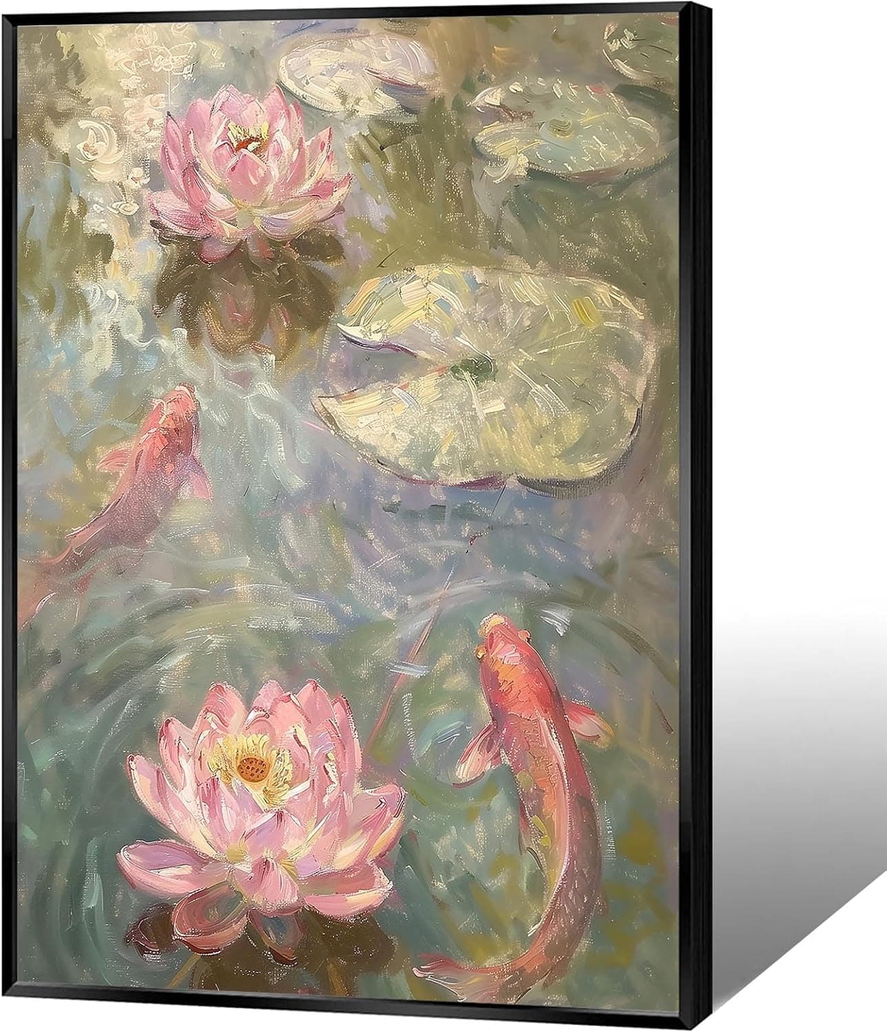
Koi & Lotus Feng Shui Canvas Art
Why this one: Koi strengthen wealth qi and lotus softens yin energy, helping balance the bagua and invite smooth-flowing prosperity.

Japandi Crane Oval Wall Art
Why this one: Cranes symbolize longevity and harmonious qi; place it to soften yang energy and invite balanced flow through the bagua.

Money Fish Wealth Carp Statue
Why this one: The carp and waves activate flowing qi and the water element, helping strengthen wealth energy in the bagua wealth area.

Handmade Golden Treasure Basin Feng Shui Wealth Decor
Why this one: The golden yuan bao activate metal energy (linked to wealth in five elements) to draw abundant qi into your home’s prosperity bagua area, balancing yin and yang for steady financial flow.
As an Amazon Associate, we earn from qualifying purchases. We only recommend items our practitioners have personally tested.
Continue Your Journey
Explore these related guides to deepen your understanding:

Ready for Deeper Guidance?
Try our free I Ching reading for personalized wisdom, or explore our curated Feng Shui essentials.