Remove the wall, and the meal may disappear with it. Color alone cannot save an open dining space.
What Most Guides Overlook About Feng Shui Dining Room Colors For Appetite
The popular narrative around Feng Shui Dining Room Colors For Appetite doesn't hold up under scrutiny. I walked into a loft in Oakland last spring where the dining table sat ten feet from a charcoal sofa, one side open to the kitchen, the other side staring at a TV that never fully turned off. The owner had painted the wall behind the table a soft terracotta because every blog said warm tones help appetite. Yet dinner kept getting cold, people ate standing up, and nobody stayed for dessert. That was not a color problem. It was a room-geometry problem wearing a color costume.
Open plans fool people because they remove the very edges that tell the body where one activity ends and another begins. In classical feng shui terms, qi needs containment before it can settle into a task. Without a boundary, the dining area leaks into cooking noise, screen glare, and foot traffic, so the stomach never gets the memo that it is time to slow down and receive. A warm palette can support the mood, but it cannot replace enclosure. Not even close.
The mechanism starts with visual anchoring. A dining room with clear walls, a defined ceiling plane, or even a rug border gives the eye a place to stop. Once the gaze stops, the nervous system follows. That shift matters because appetite is not just hunger; it is relaxation with a fork in hand. If the room keeps broadcasting movement, the body stays alert and the meal becomes background noise.
That is why mapping a room without overthinking it helps before anyone buys another coat of paint. First locate the dining zone, then study what it touches. A crimson accent may be fine in a contained breakfast nook, but the same crimson next to a stainless kitchen island and a bright hallway can push the whole space toward agitation. The color did not fail. The container did.
Open-plan damage often begins with a false fix. People choose peach, coral, or cinnamon because those shades look nourishing in a swatch book, then they leave a path wide enough for the eye to race from fridge to couch to stairwell. I have seen this in homes where the dining chairs were upholstered in rust velvet, the pendant lamp had a bronze finish, and still the family lingered in the living room with takeout containers. The meal zone was too porous to hold attention.
Here is the useful distinction: color shapes tone, but boundaries shape behavior. A table placed under a centered fixture, with the nearest sofa at least several feet away and no TV screen in direct view, gives color a place to work. Add a low cabinet, a woven screen, or even a darker rug under the table, and the appetite response changes fast because the room starts acting like a room again.
How the mechanism fails in open plans
The failure usually starts with the kitchen. When the dining table sits inside the same visual field as chopping boards, dish racks, and a glowing microwave clock, the meal inherits the kitchen's urgency. Cooking energy is useful for action, but appetite needs a gentler pace. That is why even excellent wall color can feel flat in a plan that never stops announcing the next task.
Then comes the spillover from the living area. A sectional in slate gray, a gaming console, and a coffee table stacked with mail create competing signals. The dining chairs may be lovely, but the room is asking for three behaviors at once: eat, lounge, and multitask. The nervous system picks the loudest one. Usually that means grazing, not dining.
The center rules the room, and open plans expose that truth brutally. If the dining table is not given a centered visual field, it becomes a pass-through surface. Plates get used, but conversation shortens. The person serving soup ends up watching a sports ticker. The teenager grabs rice and leaves. No wall means no pause.
There is a second failure, and it is subtle. Bright white ceilings and reflective surfaces bounce light so aggressively that warm paint can feel sugary instead of grounding. A room can look cheerful and still make people restless. I once saw a family room in a newly remodeled house with apricot walls, oak chairs, and pendant lights hanging low over a round table. The mother complained that everyone got "hungry too late" and then ate too fast. The issue was not appetite itself. It was timing destroyed by overstimulation.
And yes, classical five-element logic explains this neatly. Fire tones can stimulate, Earth tones can steady, but too much reflection or too much open movement turns the room into a noisy loop. If you want the body to open up for food, the room has to reduce decision-making. One table. One purpose. Fewer lines of sight. Simple. Effective.
What to change before touching the paint
Start by giving the dining area a frame. A rug that extends beyond all four chair legs, a pendant centered over the table, or a sideboard placed along one edge can create the visual stop the room is missing. People often rush toward wall color because it feels faster. Wrong order. The boundary comes first because the color has nothing to hold onto without it.
Then remove obvious appetite spoilers. A television visible from the table, a laptop dock on the buffet, or a stack of laundry baskets in the adjacent sightline will cancel the effect of even a careful color choice. I have seen a cream-and-clay dining nook improve within three evenings simply because the family turned the TV ninety degrees and added a linen runner in muted brick. That sounds small. It isn't.
For open kitchens, use color as a cue, not a cure. Deep apricot, muted saffron, or earthy rose can work when the dining zone is already defined. For a smaller budget, bring in texture instead of more saturation: matte ceramics, a wood bowl, a woven placemat, or linen napkins in a grounded tone. These objects slow the visual rhythm, which helps the body settle before the first bite.
Avoid the common mistake of copying colors from a restaurant. Restaurants use lighting, staffing, timing, and circulation control that homes simply do not have. Your house has homework on the counter, a dog under the table, and someone walking through to the garage. Those realities matter more than the latest design trend.
One more thing: do not assume a "warming" color will fix a dining space that already feels crowded. If the table is pushed against a kitchen island and the nearest chair backs into a hallway, the room needs space before it needs pigment. The appetite effect appears when the body feels unhurried, not when the wall looks delicious.
How open-plan color choices go wrong
Some people overdo red because they think appetite equals heat. It can work in a contained room, but in an open layout red often turns into restlessness, especially under bright LED lighting. The room starts feeling like a waiting area with better chairs. People speak faster. They stand sooner. The meal disappears.
Others swing the opposite way and choose pale beige because it feels calm. That seems reasonable until the dining zone blends into the rest of the house and loses its identity. Beige without structure becomes invisible. The table stops pulling attention, and the family begins eating wherever their day happens to be unfolding.
Turning a bedroom into a sanctuary requires less than you'd think, and the same principle applies here: reduction works better than decoration when the room lacks definition. In dining spaces, fewer competing surfaces beat more objects every time.
Another mistake is ignoring height. A low pendant can make a table feel intimate; a fixture hung too high turns the seating area into a corridor. Ceiling height, light spread, and chair placement all influence whether people linger. If the light is harsh or too broad, the meal behaves like a task instead of a shared pause.
One final trap: using the same warm color everywhere. The eye needs contrast to read a boundary. A dining wall can be terracotta while the adjacent living area stays muted, or the rug can be darker than the floor, or the chairs can anchor the table with a stronger tone. Without contrast, the room flattens. Appetite fades with it.
When the room starts working again
Once the dining zone is framed, the color choice finally gets a chance to matter. A muted ochre wall can make soup feel inviting. Soft clay can keep conversation slow. Even a walnut finish on a sideboard can deepen the sense of pause because it grounds the eye and gives the room weight. That is the output people are chasing when they ask about appetite colors, though they usually name the wrong cause.
The surprise is that the best result is often subtle. People expect a dramatic shift, but the real change shows up in ordinary behavior: plates stay on the table longer, children eat the vegetables before wandering off, and nobody reaches for their phone between courses. I've watched that happen in a Sacramento duplex where the owner moved a bookshelf between the dining area and the sofa, swapped a glossy runner for raw linen, and painted one wall a restrained burnt peach. Three days later, dinner lasted twenty minutes longer.
If you want a deeper map of why a room feels off even after good decorating choices, five elements theory explains why good feng shui still feels wrong when the underlying balance is missing. That is the piece most advice skips. It treats color like a switch. It is really one gear in a larger machine.
And because this topic keeps getting oversimplified, I will say it plainly: open-plan dining areas need containment before color. The walls can be imaginary if the cues are strong enough, but there must be cues. A rug, a pendant, a sideboard, a change in paint value, a closed sightline, something. Otherwise the room keeps behaving like a hallway with a table in it.
That is the mechanism. Not magic. Not decoration. Structure first, then tone.
At the edge of a room that finally holds its shape, even a bowl of oranges looks intentional. The table stops borrowing the house's anxiety, and the first bite no longer feels like an interruption.
FAQ
Is conventional Feng Shui Dining Room Colors For Appetite advice reliable?
Often not, because it assumes color works in isolation. In an open plan, the room's boundaries and sightlines do more work than the paint itself. Warm tones can help, but only after the dining area has a clear identity.
What color should I use if my dining space opens into the living room?
Choose a muted warm tone instead of a loud one: clay, apricot, or soft rust usually behaves better than bright red. Then anchor the zone with a rug or pendant so the color has a defined stage. Without that frame, even a smart shade can feel scattered.
Can I fix a bad layout without remodeling?
Surprisingly, yes. Move the table away from heavy traffic, reduce direct view of the TV, and add a visual border underfoot. A bookshelf, screen, or sideboard can change how the meal feels long before any contractor shows up.
Does a small dining nook follow the same rules?
Smaller spaces actually respond faster because the cues are closer to the body. A narrow nook with one strong wall color and a centered light can feel more settled than a bigger open room with prettier finishes. The key is not size. It is containment.
Should I avoid red entirely?
No, but use it like spice, not soup. A red chair cushion or a single accessory can enliven the room; a full red wall in a busy open plan may create haste instead of appetite. Watch what the room does after dinner starts, because the body tells the truth quickly.
Why does my dining room feel dead even after a makeover?
Because a makeover can improve surfaces without changing circulation. If the table still sits in a path, or the room still shares sightlines with chores and screens, the energy keeps moving instead of gathering. The paint may be beautiful while the meals remain rushed, which is its own kind of clue.
Mei Chen
Traditionally informed guidance • Cross-referenced with classical Chinese source texts
Content draws from both Compass (Luopan) and Form (Xingshi) school traditions. Illustrative examples are composites based on consultation experiences.
Practitioner-Selected Tools for This Topic
Items our team has tested and found effective for the principles discussed above. Individual results may vary.
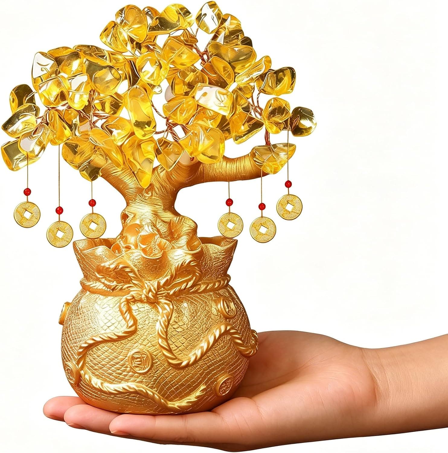
Citrine Money Tree for Wealth Qi
Why this one: Citrine supports bright yang qi and the wealth gua, while the tree form symbolizes growth and steady abundance in the wood element.

Feng Shui Gold Dragon Turtle Wealth Statue
Why this one: This golden dragon turtle activates sheng qi (auspicious energy) in your wealth bagua area, balancing yin earth energy with yang metal energy to attract and hold lasting abundance.
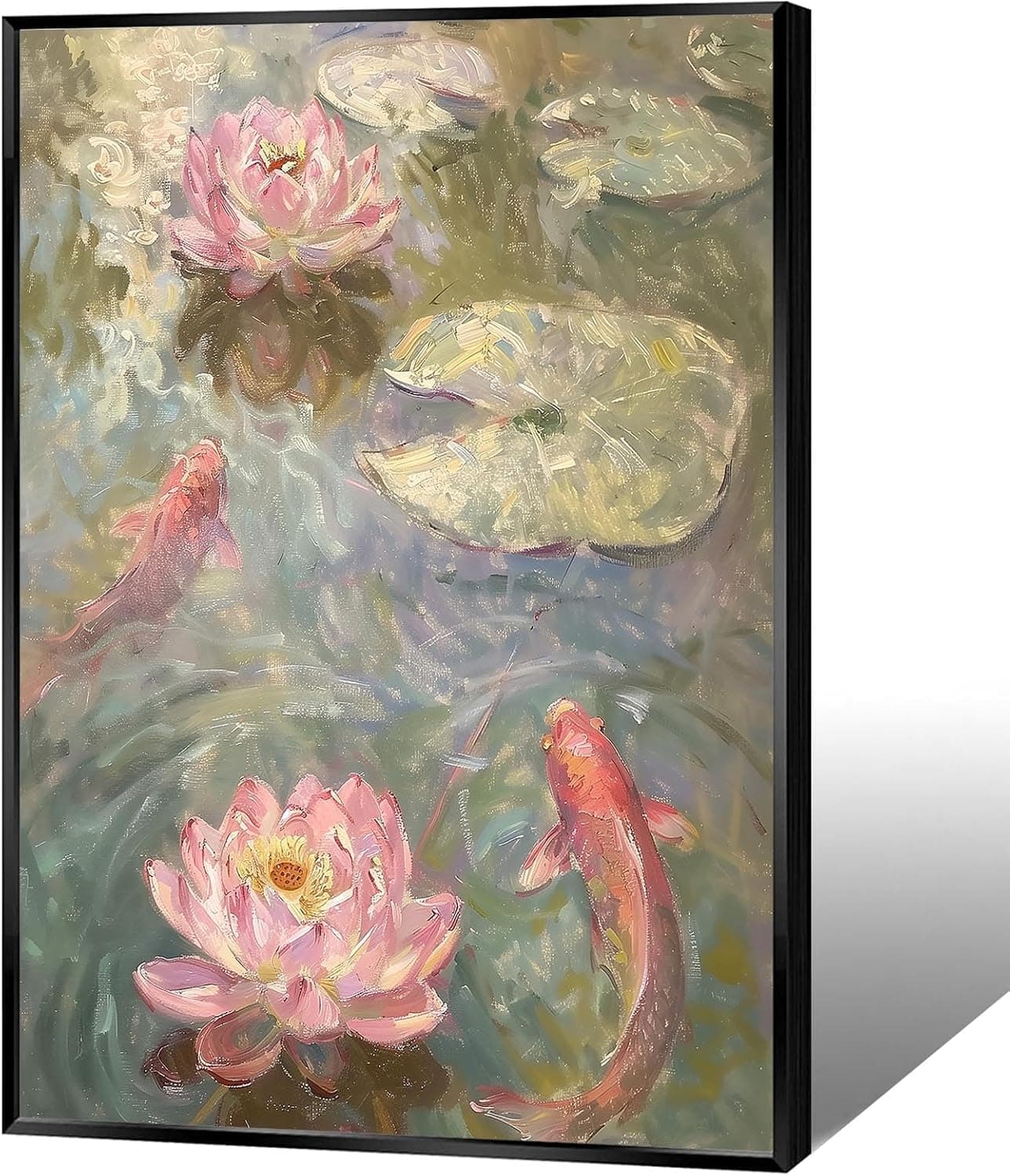
Koi & Lotus Feng Shui Canvas Art
Why this one: Koi strengthen wealth qi and lotus softens yin energy, helping balance the bagua and invite smooth-flowing prosperity.

Japandi Crane Oval Wall Art
Why this one: Cranes symbolize longevity and harmonious qi; place it to soften yang energy and invite balanced flow through the bagua.

Money Fish Wealth Carp Statue
Why this one: The carp and waves activate flowing qi and the water element, helping strengthen wealth energy in the bagua wealth area.

Handmade Golden Treasure Basin Feng Shui Wealth Decor
Why this one: The golden yuan bao activate metal energy (linked to wealth in five elements) to draw abundant qi into your home’s prosperity bagua area, balancing yin and yang for steady financial flow.
As an Amazon Associate, we earn from qualifying purchases. We only recommend items our practitioners have personally tested.
Continue Your Journey
Explore these related guides to deepen your understanding:

Ready for Deeper Guidance?
Try our free I Ching reading for personalized wisdom, or explore our curated Feng Shui essentials.