Color only works in feng shui when you match it to light, proportion, and use—not a memorized chart.
Why the ‘right’ color fails in the wrong room
I’ve seen a deep blue bedroom look calm for ten minutes and then turn heavy by midnight. The paint was not the problem. The room was north-facing, the window was small, the air barely moved, and the walls held onto shadow like wet wool.
That is the part most people miss when they search for feng shui colors meaning. They want a fixed list: red for fire, green for wood, white for metal, black for water, yellow for earth. Those associations are real, but they are not the whole mechanism. A color in feng shui is not just a symbol. It changes how a room feels and functions under light, air, and movement.
So a color can be “good” and still fail. In a dark room, a cool color may sink the mood. In a bright room, the same color may sharpen the space beautifully. In a quiet room, a deeper tone can feel grounded. In a noisy corridor, it can feel like a wall pressing back. That is why the room comes first.
The question is never only what a color means. The real question is where it lands, how much of it you use, and what the room already does on its own.
For readers who want the wider spatial logic, I would start with how the bagua divides a home into functional zones, because color choices make more sense once you know what the room is trying to do.
Symbolic meaning versus spatial behavior
Classical feng shui uses color through the five elements, but many readers stop at the symbol and miss the setting. Red means fire, so they add red. Blue means water, so they add blue. It sounds tidy. It also causes bad rooms.
Here is the difference: symbolic meaning tells you what a color represents, while spatial behavior tells you what it does in a particular room. Those two things overlap, but they are not the same. A red cushion in a large, social kitchen can support appetite and conversation. A red wall in a tiny kitchen with strong afternoon sun can feel hot, impatient, and visually aggressive. Same color. Different result.
Architecture matters here more than most guides admit. Orientation, window size, ceiling height, and room proportion all affect whether a color opens a space, compresses it, or makes it feel more balanced. In practice, color becomes part of the room’s structure, even if it is only paint or fabric.
Light matters too. Morning light, afternoon sun, and LED lighting each push a color in a different direction. The same cream can look soft at 8 a.m. and chalky at 10 p.m. The same blue can read clean in daylight and gray under a cold bulb. People think they are choosing a color. Often they are choosing how light will behave on that surface.
That is why a color chart is not a strategy. It is a vocabulary list.
How feng shui colors actually work in space
Color works through three levers: coverage, placement, and intensity. Coverage is how much of the room you change. Placement is where the color sits. Intensity is saturation, which decides whether the room feels energized or drained.
If you use a strong color on all four walls, you are not making a small statement. You are changing the room’s overall feel. If you use that same color in a lampshade, a rug, or a chair, the effect is narrower and easier to control. This is where many people overdo a supposedly lucky shade and then wonder why the room feels louder than before.
Thresholds matter as much as walls. At an entry, color should signal transition. It should help the body arrive. A white entryway with a pale wood console can feel open, clean, and ready to receive guests. But the same white in a narrow corridor with poor acoustics can become sterile and overexposed, especially if the lighting is flat and the air feels still. Then the threshold stops feeling like a welcome and starts feeling like glare.
Circulation paths matter next. Strong colors can guide movement when they are used as cues: a rug that leads the eye, a painted alcove that marks a transition, a door color that announces arrival. But if the color blocks the path instead of guiding it, it creates visual friction. The body hesitates. That hesitation is real. People feel it before they can explain it.
For a deeper look at entry behavior and how thresholds shape energy, see what actually happens at the front door.
Room-by-room color meaning in real homes
Bedrooms ask for downshifting. That means softer saturation, fewer high-contrast jumps, and colors that support rest rather than alertness. Cool colors can be restorative and clear-minded, but if you push them too far they reduce warmth and intimacy. I’ve watched a dark north-facing bedroom painted deep blue feel calm at first, then become oddly enclosed because the room already lacked daylight and the air stayed too still. The color was not wrong. The room had no counterweight.
Kitchens are different. They are active rooms, often full of movement, heat, and quick decisions. Warm colors can raise alertness and social energy, which is useful there. A red accent wall in a large open-plan kitchen can create appetite and a sense of gathering. The same choice in a small kitchen with intense afternoon sun can become agitating and visually hot, especially if the appliances reflect glare and the space has poor ventilation. Then the room feels overcooked before dinner even starts.
Living rooms need a little more flexibility because they hold multiple behaviors. Socializing, reading, resting, and screen time all happen there, sometimes in the same hour. This is why a living room often benefits from layered color rather than one dominant statement. A muted earth tone on larger surfaces, a controlled warm accent near seating, and a cooler textile or artwork can keep the room emotionally versatile without making it restless. If you want to match color to how people actually gather, the living room rules are worth studying closely.
Workspaces need clarity more than drama. Whites, pale greens, soft grays, and restrained blues can support focus if the room already has enough natural light. But too much white may feel unfinished, abrupt, or emotionally sparse. That is the part design magazines miss. White can symbolize purity and completion, yes, but in a work nook with echo, glare, and thin walls, it can feel like a draft.
Bathrooms are a special case. They already involve water, reflection, and rapid transitions. Strong saturated color can work there in small doses, but heavy wall-to-wall color often makes the room feel smaller and more humid than it is. In a bathroom, texture, finish, and reflectivity matter just as much as hue.
Mixed-use rooms need the most restraint. A studio with one window and a kitchen line along the wall cannot hold every color equally. The room will tell you where the strongest note belongs. Usually it is not on the largest surface.
When a beneficial color becomes too much
The mistake is rarely using the wrong element. It is using too much of the right one. That is a subtle but important difference.
Green can support growth and ease, but a fully green room can become too active if the shade is sharp and the daylight is already bright. Black can stabilize and deepen a space, but in a low-light room it can swallow edges and make the air feel heavier. Yellow can nourish and lift, but overuse can create a nervous buzz rather than warmth.
White gets overused because people believe it is always safe. It is not. White is beautiful when it gives the eye rest and lets light move. It becomes harsh when the room is narrow, noisy, or underlit. In a corridor with poor acoustics, white can amplify the feeling that the space has no body. That is not cleanliness. That is depletion.
So ask a more serious question: does the color support the room’s job, or does it compete with it? A color can be feng shui-friendly and still be wrong for the function at hand. That is not a contradiction. It is the actual rule.
If you are considering color alongside other cures, the same restraint applies to symbols and objects too. For example, crystals only help when their placement matches the room’s purpose. The object does not rescue a bad spatial decision.
Choosing colors by light, season, and direction
North-facing rooms tend to receive cooler, flatter light. That does not automatically mean they need more blue. Sometimes they need warmth, softness, or a lighter earth tone to counter the dimness. A room with weak daylight often benefits from colors that hold warmth under shadow depth, especially when winter light makes everything feel farther away than it is.
South-facing rooms usually get stronger light and can tolerate more saturation. A pale color that looks elegant in a north room may wash out here. A richer tone can become more honest in intense sun because the light prevents it from collapsing into gloom. East-facing rooms often feel clean and fresh in the morning, so they can handle colors that support movement and clarity. West-facing rooms can turn golden and hot late in the day, which means warm colors may need more discipline there.
Season matters too. In winter, dense colors can feel heavier if the room already has less daylight and less air movement. In summer, the same colors may feel grounded and protective. Ventilation changes the story again. Still air makes deep colors feel heavier. Moving air gives them relief. That is one reason a dark-toned room with good airflow can feel composed, while the same shade in a closed room feels oppressive.
Use this sequence when you choose. First, notice the room’s light. Second, notice its purpose. Third, decide how much color the room can carry without losing ease. Then test the color where it will live: wall, trim, textile, art, door, or small object. Color at the threshold does one job. Color on the main wall does another. Color in a textile does another still.
That approach gives you decisions instead of superstition. It also explains why a color that looked perfect in a showroom can fail at home. Showrooms are not homes. They have different scale, different light, different acoustics, and usually more air movement.
What the right color changes in daily life
When color is matched well, the change is practical. People settle faster. They move more naturally through the room. They stop fighting the space.
A bedroom becomes easier to leave at night and easier to enter at the end of the day. A kitchen feels sociable without becoming noisy. A work area supports concentration without becoming cold. A threshold gives the body a reset instead of a jolt. These are not mystical effects. They are behavioral effects shaped by environment, and feng shui has always cared about behavior.
The best result is not a dramatic “before and after.” It is a room that stops asking for attention. You notice that you sleep more easily, that the entry feels less abrupt, or that the dining area finally invites people to stay. That is the quiet success most color advice never reaches.
And if a room still feels wrong after the color choice, do not assume the color failed. Check the light. Check the circulation. Check the proportion. Check whether the room is underlit, over-saturated, or asking one color to do too many jobs at once.
That is the real method behind feng shui colors meaning. Not memorization. Reading the room.
Common mistakes that keep color from working
The first mistake is treating color as decoration only. In feng shui, color also changes mood, movement, and the sense of threshold. A pretty wall can still block a room’s function.
The second mistake is using a supportive color everywhere. If a color helps the room, that does not mean more of it will help more. Often the opposite happens. This is where readers should cross-check their choices with the bedroom’s need for rest and containment, because the most common overuse problem happens in sleep spaces.
One more thing: do not let a paint swatch overrule the room. The sample card does not know your ceiling height, your lamp warmth, your corridor noise, or the way afternoon sun lands across the floor. Your home knows. Listen to that instead.
FAQ
How do I know if a color is helping or hurting a room?
Watch the room, not the swatch. If people settle more easily, move through the space without hesitation, and stay comfortable under different lighting conditions, the color is probably supporting the room. If the room feels louder, colder, more enclosed, or oddly flat, the color may be fighting the architecture.
Can I use one color throughout the whole house for harmony?
You can, but it usually makes the home feel flattened. Different rooms have different jobs, and a single color rarely serves sleep, cooking, work, and arrival with equal skill. Harmony comes from continuity of tone, not sameness of hue.
Do accent colors matter as much as wall colors?
Surprisingly, sometimes they matter more. A strong cushion, rug, or entry object can steer attention without overwhelming the room. That makes accents useful when you want a color’s effect without letting it dominate the entire environment.
What if my favorite color clashes with feng shui logic?
Use it in the right dose, not necessarily on the biggest surface. A favorite color can belong in art, textiles, a lamp, or a door detail even if it is too strong for all four walls. Taste and function do not have to fight, but one of them has to lead.
Mei Chen
Traditionally informed guidance • Cross-referenced with classical Chinese source texts
Content draws from both Compass (Luopan) and Form (Xingshi) school traditions. Illustrative examples are composites based on consultation experiences.
Practitioner-Selected Tools for This Topic
Items our team has tested and found effective for the principles discussed above. Individual results may vary.
 -19%
-19%Wind Chimes for Outside with 5 Bell Unique Copper Musical Chimes Feng Shui Wi...
 -5%
-5%YU FENG Evil Eye Money Tree, Blue Feng Shui Decor with Golden Buddha
 -29%
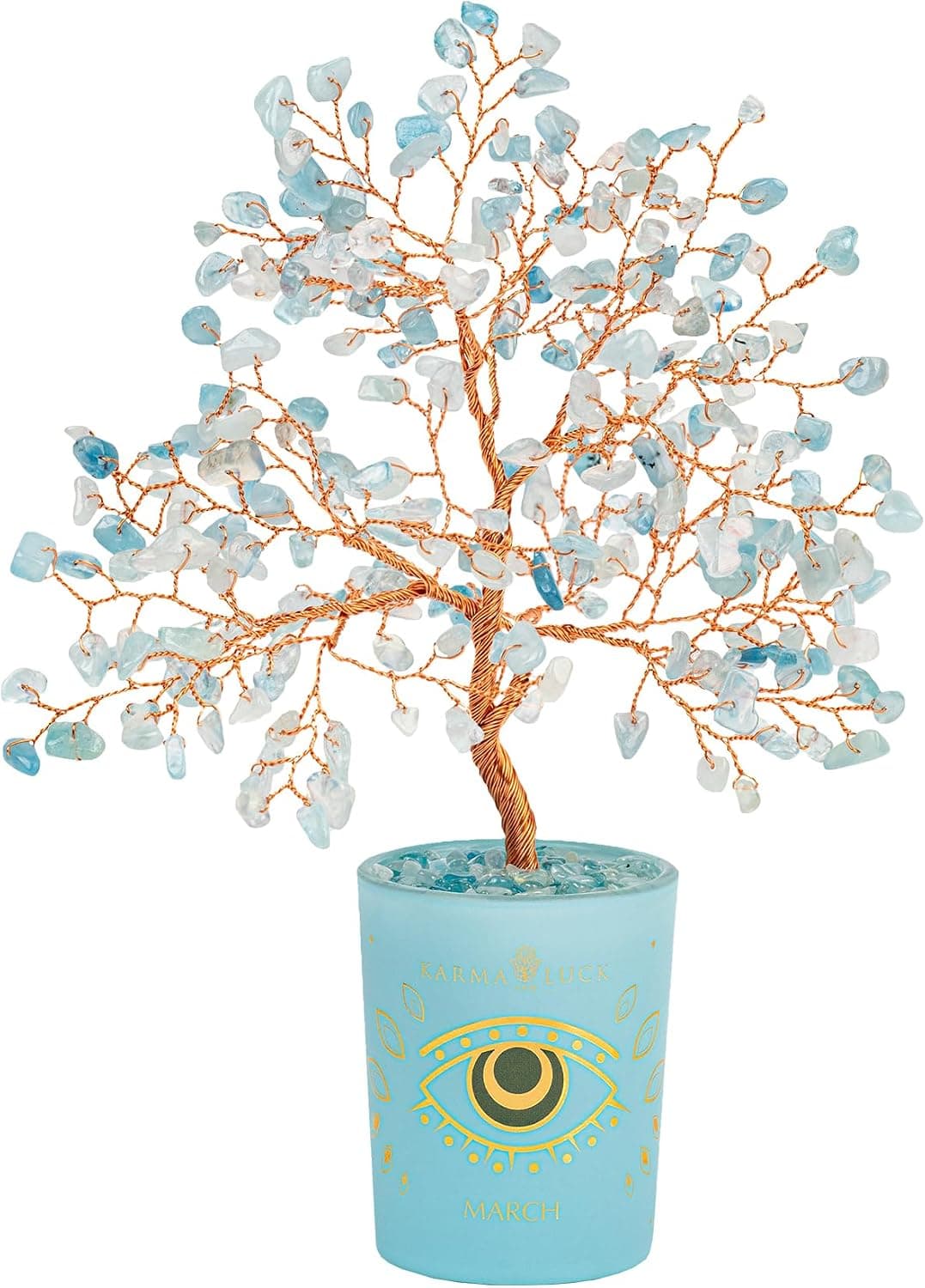
-29%Karma and Luck March Birthstone Crystal Tree of Life, Aquamarine Gemstone Fen...
 -29%
-29%Karma and Luck July Birthstone Crystal Tree of Life, Ruby Gemstone Feng Shui ...
As an Amazon Associate, we earn from qualifying purchases. We only recommend items our practitioners have personally tested.
Continue Your Journey
Explore these related guides to deepen your understanding:


Ready for Deeper Guidance?
Try our free I Ching reading for personalized wisdom, or explore our curated Feng Shui essentials.