Wrong colors can make a desk feel heavier by noon. The right ones change the pace of the whole room.
When the room feels busy before the work even starts
You sit down to answer one email, and somehow forty minutes vanish into tabs, notifications, and that strange fog that makes a simple task feel oddly heavy. I’ve seen it happen in home offices with beautiful desks, expensive chairs, even perfect monitors. The problem is often not the furniture. It’s the color story surrounding it.
People love to blame discipline. I rarely do. A cramped visual field, a harsh wall color, or too much competing contrast can push a workspace into agitation fast. The result is familiar: restless shoulders, scattered attention, and the nagging sense that you are working harder than you should.
Color is one of the fastest ways to shape the emotional temperature of a room, which is why the bagua map matters here. You do not need to repaint an office from top to bottom to get traction. You need to choose colors that support focus, steady energy, and the kind of mental endurance that gets you through the afternoon slump.
I walked into a small consulting office in Portland last year where the walls were painted a glossy lime green. The owner, a tax preparer named Mara, had put in a white desk, a red task lamp, cobalt filing bins, and a bright orange chair because she liked each piece separately. The room looked lively for about ten seconds. Then it felt like a shouting match. She told me she was making more mistakes in the last hour of every workday than she had all morning. We changed the chair to charcoal, swapped the orange bins for warm beige, and added a muted blue-gray file tray. Within two weeks, she said her late-day anxiety had dropped enough that she stopped rereading every email three times.
The color logic behind productive office energy
In feng shui, the best office palette is never about decoration alone. It is about directing qi so it supports the work you actually do. If your job requires analysis, writing, accounting, coding, or long stretches of concentration, you want colors that steady the mind instead of stimulating it. If your work depends on sales calls, presentations, or fast responses, you may need a little more warmth, but still not a room that feels like a carnival.
Think of the five elements as a practical framework, not a superstition quiz. Wood supports growth and learning, which is why greens can help a workspace feel alive without becoming loud. Water brings depth, flow, and adaptability, and deeper blues often work well for mental clarity. Earth stabilizes, so beige, sand, taupe, and soft ochre can reduce visual noise. Metal sharpens and organizes, which is why white, soft gray, and silver details can make an office feel cleaner and more precise. Fire is energy, passion, and speed, but too much of it turns into agitation.
That last part surprises people. They assume bright red means ambition and therefore productivity. Sometimes it does, but in a study or desk area it can also produce impatience, eye strain, and a restless urge to switch tasks. I have watched good workers sabotage themselves with a red accent wall behind the monitor. Their attention becomes jumpy. Their body notices before they do.
The most reliable approach is to build a palette around the type of work you do for most of the day, then add accents sparingly. If you are thinking about broader room balance, it helps to compare office choices with the calmer logic used in a restful bedroom layout. The difference is not subtle. A bedroom can be softer and more yin. An office still needs movement, but the movement must be disciplined.
How to choose office colors that actually help you work
Start with the walls, because they control the largest visual field. For most offices, muted tones beat saturated ones. A soft warm white, a light stone, a pale gray-green, or a dusty blue can hold attention without creating fatigue. If your room has low natural light, avoid colors that turn muddy in shadow. If it has strong western or southern light, avoid glossy finishes that bounce glare into your eyes all afternoon.
Then look at the color nearest your body. This is where the chair, desk accessories, and storage bins matter more than people expect. Your chair is not just furniture; it sits in your personal field for hours. A deep navy or charcoal chair can help anchor you. A beige seat can keep the room open. A bright red or neon accent chair may look daring, but if you already feel rushed, it can worsen that pressure.
Next, decide what kind of mental state you need most. For analytical work, lean on metal and water tones: white, gray, silver, soft blue, slate, and ink. For creative work, add wood tones and gentle greens so ideas can grow without becoming chaotic. For client-facing work, a balanced combination works best: calm walls, one or two clear accent colors, and a warm natural material like oak or walnut to keep the room human.
Be careful with black. It can be powerful and grounding when used in small doses, especially in modern offices where clean contrast supports focus. But black walls or heavy black furniture can feel oppressive if the room is already small or poorly lit. The same rule applies to pure white. Too much white can become sterile and draining unless you soften it with texture, plants, or warmer neutrals.
One more thing most people miss: the ceiling and flooring participate too. A bright floor with a dark ceiling can make the room feel upside down. A neutral rug can absorb visual chatter. If you need freshness and vitality, add it with a healthy plant, not with six competing bright colors. For that, good office plants for balance often do more than another decorative object ever will.
Practical color pairings for different office goals
If your work depends on writing, research, or spreadsheets, start with quiet colors and sharpen them with contrast. A pale gray wall, a walnut desk, and a navy desk lamp can create a disciplined field that tells the brain to stay with the task. Add one green accent, not five. Green supports renewal, but too much of it can start to feel casual rather than focused.
For sales or leadership roles, use warmer neutrals with restrained fire energy. Cream, camel, soft terracotta, and muted coral can help the room feel approachable and confident. A small amount of red may be useful in a meeting corner or on a notebook cover, but keep it away from the full visual field if you want steadiness instead of adrenaline.
If you work in design, media, or strategy, color should support ideation without creating clutter. I often recommend a base of off-white or stone, then one deeper color for concentration and one fresh color for mental lift. A slate-blue wall with olive accessories and a light oak desk can be more productive than a room packed with every shade from the paint store.
There is also the issue of time of day. A room that feels fine at 9 a.m. may feel unbearable at 3 p.m. because afternoon light changes the same color completely. Test paint samples on different walls and observe them at different hours. Some colors look sophisticated in the can and exhausting by lunchtime. That is not a small detail. It is the difference between a room that serves you and one that quietly drains you.
If you want to connect your office palette to the wider energy of the home, the front entry matters too. A chaotic entrance often spills into the work area, especially in apartments and shared spaces. I’ve seen offices improve just because the flow from the doorway stopped feeling cramped. That is why the front door sets the tone for the whole home.
Two mistakes that quietly wreck the effect
The first mistake is treating productivity like a stimulant. People pile in red, orange, neon yellow, and metallic shine because they want momentum. What they usually get is mental static. A workspace should support consistent output, not force the nervous system to stay revved up all day.
The second mistake is copying a trend without checking the room itself. A dark moody office can look excellent online and fail in a low-light spare room. Likewise, a bright Scandinavian setup can feel crisp in a spacious loft and flimsy in a narrow corner office. The room’s size, light, and purpose always outrank style photos.
For a deeper look at common setup errors, I’d also compare your color choices with the way living rooms handle shared energy, because offices often fail for the same reason: too many visual demands, not enough structure. Different rooms need different temperaments. That is not a contradiction. That is good feng shui.
FAQ
What are the best colors for a home office?
Soft neutrals, pale blues, muted greens, and grounded earth tones are usually the safest starting point. They support concentration without overexciting the mind. If you already feel overstimulated, avoid heavy red and high-gloss finishes.
Can I use bright colors in a workspace at all?
Absolutely, but use them as accents rather than the main event. A mustard notebook, a coral pen cup, or a single energetic artwork can add lift without turning the room into visual noise. The key is restraint.
Does office color affect remote workers more than people in a corporate building?
In some ways, yes, because your home office often surrounds you for many more hours than a company workspace. You are not just passing through it. You are living inside its mood, and that mood compounds over time.
Should I match office colors to my personal element?
That can help, but it should never override the room’s real conditions. A person who loves fire energy may still do better with cooler colors if their work is detail-heavy or their office gets strong afternoon sun. The room has to function first.
One last point many people resist: productivity is not always boosted by more energy. Sometimes it comes from less friction. That is why thoughtful color choices can outperform expensive gadgets, motivational posters, and yet another desk accessory you do not need.
Mei Chen
Traditionally informed guidance • Cross-referenced with classical Chinese source texts
Content draws from both Compass (Luopan) and Form (Xingshi) school traditions. Illustrative examples are composites based on consultation experiences.
Practitioner-Selected Tools for This Topic
Items our team has tested and found effective for the principles discussed above. Individual results may vary.
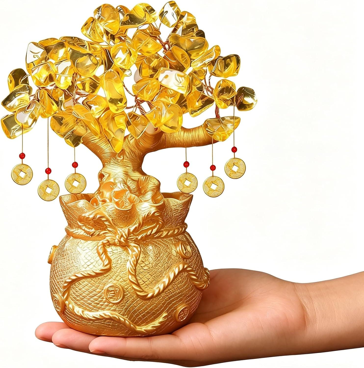
Citrine Money Tree for Wealth Qi
Why this one: Citrine supports bright yang qi and the wealth gua, while the tree form symbolizes growth and steady abundance in the wood element.
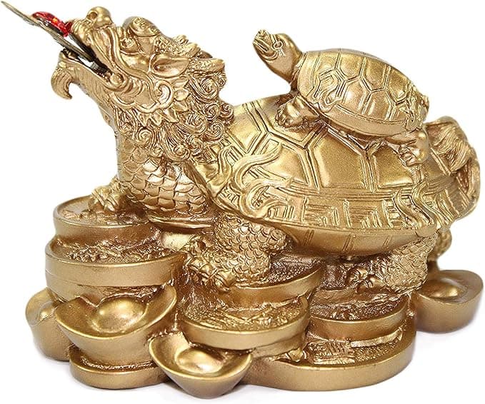
Feng Shui Gold Dragon Turtle Wealth Statue
Why this one: This golden dragon turtle activates sheng qi (auspicious energy) in your wealth bagua area, balancing yin earth energy with yang metal energy to attract and hold lasting abundance.
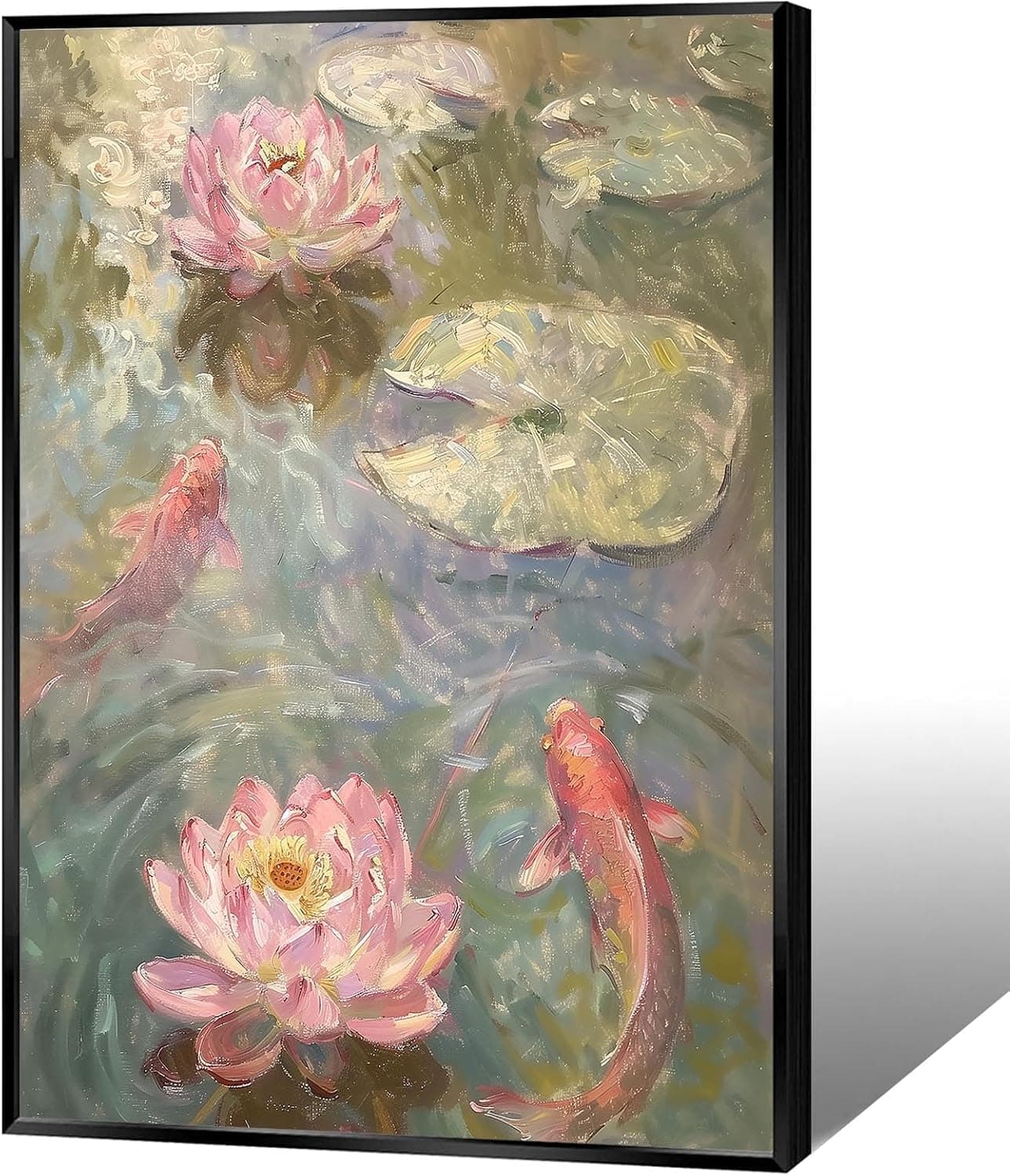
Koi & Lotus Feng Shui Canvas Art
Why this one: Koi strengthen wealth qi and lotus softens yin energy, helping balance the bagua and invite smooth-flowing prosperity.

Japandi Crane Oval Wall Art
Why this one: Cranes symbolize longevity and harmonious qi; place it to soften yang energy and invite balanced flow through the bagua.
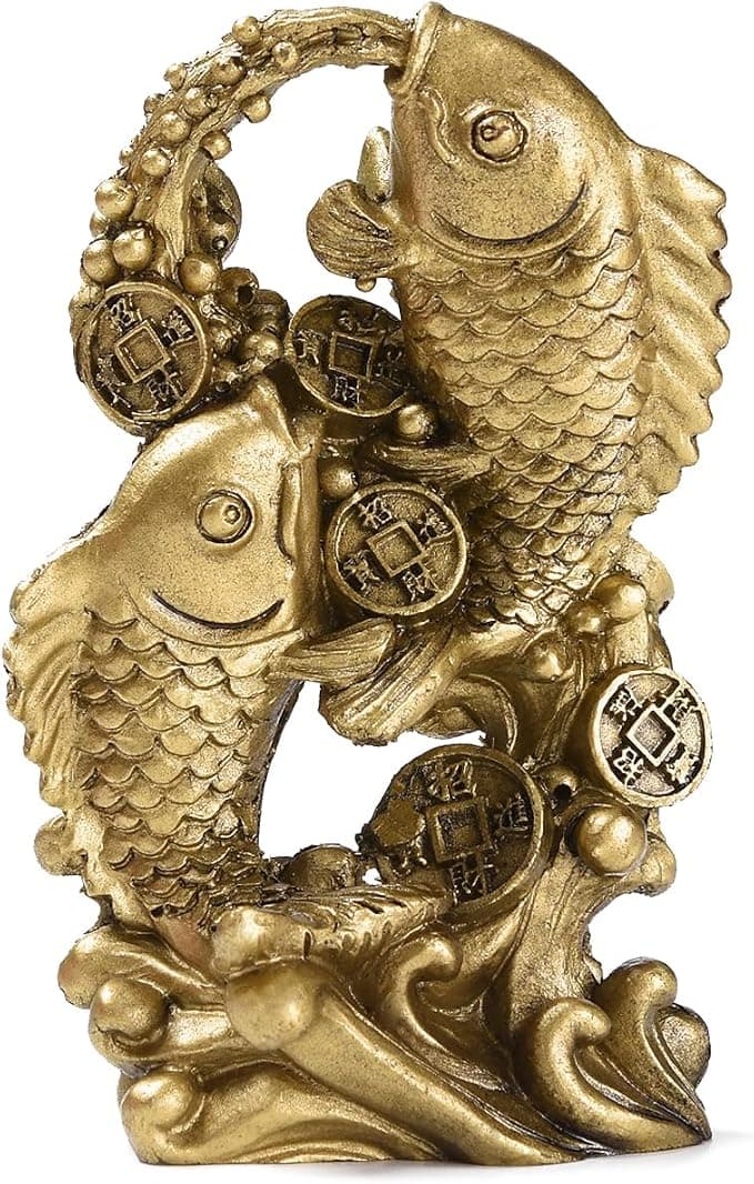
Money Fish Wealth Carp Statue
Why this one: The carp and waves activate flowing qi and the water element, helping strengthen wealth energy in the bagua wealth area.
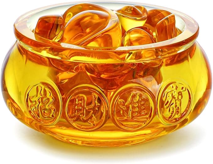
Handmade Golden Treasure Basin Feng Shui Wealth Decor
Why this one: The golden yuan bao activate metal energy (linked to wealth in five elements) to draw abundant qi into your home’s prosperity bagua area, balancing yin and yang for steady financial flow.
As an Amazon Associate, we earn from qualifying purchases. We only recommend items our practitioners have personally tested.
Continue Your Journey
Explore these related guides to deepen your understanding:

Ready for Deeper Guidance?
Try our free I Ching reading for personalized wisdom, or explore our curated Feng Shui essentials.