The wrong bedroom colors can leave a room restless, cold, or oddly agitated—even when everything else looks beautiful.
When the room feels “fine,” but sleep still slips away
I walked into a north-facing bedroom in Portland last winter and knew the problem before the homeowner said a word. The walls were a clean white, the bedding was charcoal gray, and a glossy red lamp sat on the nightstand like a warning light. She told me she woke at 3:10 a.m. almost every night. That kind of pattern is not random.
Color changes the emotional temperature of a room. In feng shui, the bedroom should support rest, softness, and the release of daytime tension. That is why a calm bedroom layout is only half the story; the palette has to agree with the room’s job. You can have a perfectly placed bed and still feel wired if the color choices keep the space too active, too cold, or too stark.
People often choose colors by style first. I understand the temptation. A dramatic black wall looks elegant online. A crisp white room feels fresh in daylight. But sleep happens at night, when the nervous system responds less to design trends and more to atmosphere.
The most useful way to think about bedroom color is simple: use shades that lower stimulation, not raise it. That does not mean the room must be beige. It means the dominant feeling should be gentle, grounded, and a little protective.
The method: choose the mood before you choose the paint
Start by asking what the room needs to do for you. If you already feel scattered, choose colors that absorb noise visually rather than bouncing it back at you. If the room feels heavy, bring in a little warmth without turning it into a bright, social space. If you are sensitive to light or wake easily, the palette should reduce sharp contrast.
In feng shui, bedroom color works best when it matches the room’s element balance. Soft earth tones bring stability. Muted blues and greens can calm an overworked mind. Warm neutrals can make a room feel held and safe. The trick is to keep the saturation low. A dusty sage works better than a loud emerald. A soft clay works better than a punchy orange.
This is where many people misunderstand the advice. They assume “peaceful” means “cold” or “sterile.” It doesn’t. A room painted pure white with chrome accents and blue LED lights is not peaceful; it is simply blank. Blank can feel unfinished, and unfinished rooms often keep the mind alert.
The right bedroom palette should feel like the exhale after a long day. If you stand in the doorway and your shoulders drop a little, you are close.
How to build a bedroom palette that actually supports rest
Begin with the largest surfaces. Walls, rug, curtains, and bedding set the tone long before accessories do. If your walls are already strong in color, soften the bed textiles instead of fighting the room with more intensity. If the walls are neutral, you can bring in a little more personality through the duvet, pillows, or an upholstered chair.
For most bedrooms, I favor muted earth, pale rose, soft mushroom, oatmeal, dusty blue, and restrained sage. These are not fashionable in the loud sense. That is precisely why they work. They don’t demand attention at midnight. They let the body settle.
One of the best examples I’ve seen was a teacher’s bedroom in Austin. The walls were a pale gray-blue, but the room still felt cold because the bedding was icy white and the side tables were lacquered black. We changed the duvet to warm linen beige, swapped the curtains for a soft sand color, and added a faded terracotta throw at the foot of the bed. Within two weeks, she said the room felt less “hotel” and more “nest.” She also stopped falling asleep with the TV on.
That kind of shift is typical. Color doesn’t force sleep. It creates conditions where sleep becomes easier. Small changes matter most when they work together.
If you want a deeper map of room energy, pair your palette choices with the bagua framework for home areas. Bedrooms don’t exist in isolation, and sometimes a color feels wrong because the room is carrying too much of another element nearby. A bedroom facing a bright active area of the house may need more grounding in order to feel truly quiet.
Use color with restraint around mirrors, metal finishes, and strong artwork. A soft wall color can still feel restless if it is paired with shiny silver frames, neon art, or a mirror reflecting the bed. The palette is part of a larger conversation. It is never the only voice in the room.
What to use, what to avoid, and where people go wrong
Not every color is a mistake, but some are simply too stimulating for a sleep space. Bright red is the obvious one. It pushes energy upward and outward. Deep black can work in small amounts, but too much of it makes a room feel closed in or emotionally heavy. Neon, glossy finishes, and high-contrast patterns tend to keep the mind active rather than settled.
There are also subtler errors. A pale blue room with a stark white ceiling, white trim, white furniture, and silver hardware may look clean, but it can feel stripped of warmth. That kind of brightness can be tiring. I have seen people blame insomnia on stress, caffeine, or “bad luck,” when the bedroom itself was visually shouting at them every night.
Another common mistake is choosing a color because it looks good in daylight and then discovering it turns lifeless after dark. That is why I always tell people to sample the paint on multiple walls and check it in the evening. Bedroom color is judged at night, not at noon.
If you want to avoid the most common errors, start by reducing extremes. Soften the brightest white. Quiet the darkest black. Replace one high-saturation accent with a more muted tone. You do not need to repaint the whole room to change the energy.
For people who like deeper symbolism, certain tones can be supported with carefully chosen objects rather than broad use across the room. A single accent of amethyst in a bedroom corner can feel gentler than a room full of strong purple. Likewise, if you are working with a very inactive room and want a touch of vitality, a small plant or two can help, but the palette still needs to stay restful; see how to use plants without making the room restless.
Practical color guidelines for different bedroom problems
If your bedroom feels cold, use warmer neutrals before adding stronger color. Think oat, cream, sand, clay, pale taupe, or blush with gray undertones. If the room already has a lot of sunlight, these tones keep it from turning sharp and exposed. If the room is dark, use lighter warm shades rather than bright white.
If your mind races at night, lean toward blue-green, muted lavender, soft gray-green, or misty blue. These shades can quiet mental activity, but only when they are subdued. A saturated jewel tone may look luxurious in a magazine and still be a terrible sleep partner.
If the room feels emotionally flat, add a little warmth through bedding, a rug, or curtains. A touch of faded peach or terracotta can prevent the room from feeling drained. The key is softness. You want nourishment, not excitement.
If your relationship space feels tense, avoid aggressively gendered palettes or harsh contrasts. I’ve seen couples argue more in rooms split between severe black and icy white than in rooms with a gentler blended palette. A softened, unified color story helps the room feel shared rather than divided.
If you are dealing with a small room, keep the colors quiet and layered rather than busy. Too many competing tones make a small bedroom feel even smaller. One main wall color, one bedding palette, one or two accents. That is enough.
And if the room is large but strangely lifeless, use texture before reaching for stronger color. Linen, wool, brushed cotton, and matte finishes can warm a room without making it loud. People often try to solve an energetic problem with more visual intensity. Usually that just creates more noise.
Two mistakes that show up again and again
One mistake is treating the bedroom like a display room. A boutique look is not the same as a restorative one. If every surface is styled for a photo, the room never fully rests.
Another is copying color advice from a different room. The palette that works in a social living room can feel wrong in a bedroom, because the room’s purpose is different. What supports conversation in one space may block relaxation in another.
FAQ
Can I use dark colors in a bedroom?
Yes, but only with care. Dark shades can create depth and privacy, which some people love, yet too much darkness can make the room feel heavy or closed off. I prefer using deep tones in limited areas, then balancing them with softer bedding and warmer textures.
Is white always bad for bedroom walls?
Not at all. The problem is usually not white itself but the kind of white and what surrounds it. A warm white with natural textures can feel restful, while a harsh blue-white under bright light can feel stark and unsparing.
What colors are best if I sleep badly?
Start with muted earth tones or softened cool shades. Think taupe, sand, dusty blue, sage, or blush with low saturation. The point is to reduce visual tension so your body has fewer signals to stay alert.
Do bedroom colors matter more than furniture placement?
They matter differently, not necessarily more. Placement handles flow; color shapes the room’s emotional climate. If both are working together, the room usually feels noticeably easier to sleep in.
The bedroom is not the place for proving a style point. It is the place where the body should stop bracing.
If you want to go further, choose the quietest version of the color you love, then let the rest of the room support that choice. That is how entry energy, room layout, and color all begin to work as one system instead of separate decoration decisions. And when the room finally feels settled, you usually notice something simple: you stop fighting bedtime.
Mei Chen
Traditionally informed guidance • Cross-referenced with classical Chinese source texts
Content draws from both Compass (Luopan) and Form (Xingshi) school traditions. Illustrative examples are composites based on consultation experiences.
Practitioner-Selected Tools for This Topic
Items our team has tested and found effective for the principles discussed above. Individual results may vary.
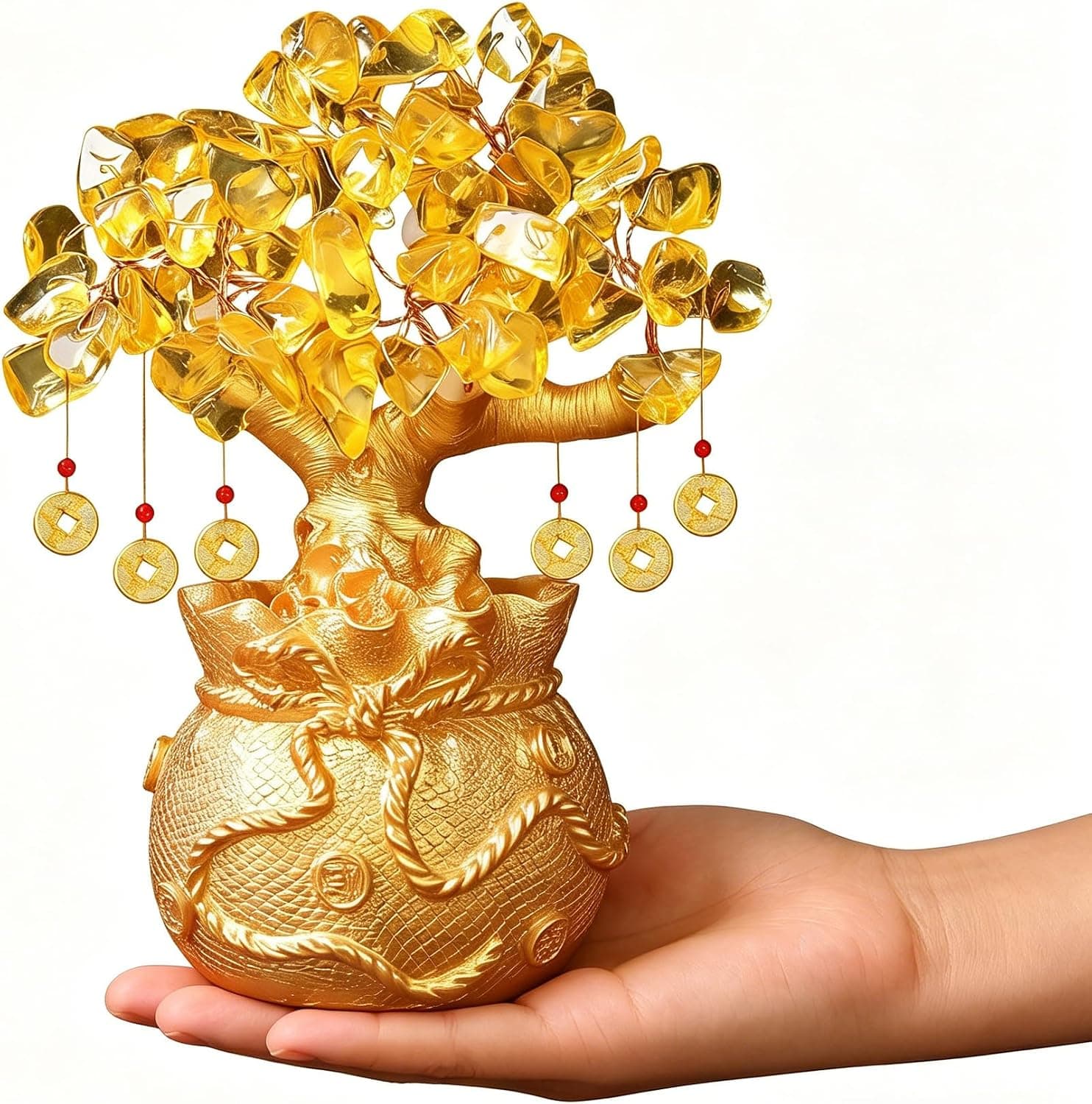
Citrine Money Tree for Wealth Qi
Why this one: Citrine supports bright yang qi and the wealth gua, while the tree form symbolizes growth and steady abundance in the wood element.

Feng Shui Gold Dragon Turtle Wealth Statue
Why this one: This golden dragon turtle activates sheng qi (auspicious energy) in your wealth bagua area, balancing yin earth energy with yang metal energy to attract and hold lasting abundance.
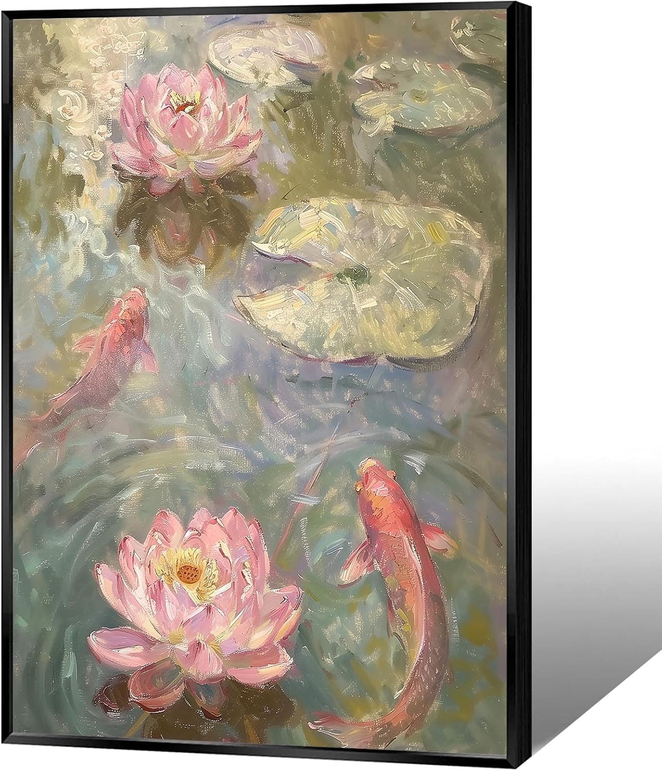
Koi & Lotus Feng Shui Canvas Art
Why this one: Koi strengthen wealth qi and lotus softens yin energy, helping balance the bagua and invite smooth-flowing prosperity.

Japandi Crane Oval Wall Art
Why this one: Cranes symbolize longevity and harmonious qi; place it to soften yang energy and invite balanced flow through the bagua.

Money Fish Wealth Carp Statue
Why this one: The carp and waves activate flowing qi and the water element, helping strengthen wealth energy in the bagua wealth area.

Handmade Golden Treasure Basin Feng Shui Wealth Decor
Why this one: The golden yuan bao activate metal energy (linked to wealth in five elements) to draw abundant qi into your home’s prosperity bagua area, balancing yin and yang for steady financial flow.
As an Amazon Associate, we earn from qualifying purchases. We only recommend items our practitioners have personally tested.
Continue Your Journey
Explore these related guides to deepen your understanding:

Ready for Deeper Guidance?
Try our free I Ching reading for personalized wisdom, or explore our curated Feng Shui essentials.