The wrong wall color can make a room feel tense, tired, or strangely flat—even when everything else looks right.
When a room looks finished but feels wrong
I walked into a nurse’s apartment in Seattle and knew the problem before she said a word. The walls were a soft gray-blue, the sofa was charcoal, and a deep red rug sat under a glass coffee table like a warning sign. She told me she slept badly, worked late, and felt irritated for no clear reason. That is the kind of mismatch I see all the time: a room that photographs beautifully, then wears people down in real life.
Color is never just decoration. It changes how a room receives light, how large it feels, and how the body responds after a long day. That is why feng shui colors are less about matching trends and more about reading a space honestly. If you have been repainting, adding accessories, and still feeling stuck, the issue may not be the furniture at all.
People often think they need bolder paint or more “energy.” Usually, they need less noise.
The method I use before choosing a color
I start with the room’s job, then I look at its light, its shape, and the people using it. A bedroom needs a different emotional temperature than a kitchen. A north-facing office in winter can handle a very different palette than a bright living room flooded with afternoon sun. This sounds obvious until you see how many homes ignore it.
The practical framework is simple. First, identify what the room is already doing too much of: too cold, too hot, too dark, too active, too flat. Then choose colors that correct the imbalance instead of amplifying it. In feng shui terms, you are not decorating for appearance alone; you are balancing the five elements through color, texture, and light. A room can have plenty of red and still feel lifeless if the rest of the energy is stale. It can also have plenty of white and still feel calm if the undertones and materials are right.
That is where the bagua map becomes useful, but not in the rigid, paint-by-numbers way people expect. I use it as a reference, not a cage. If a room in the South area of a home needs recognition and confidence, warmer accents may help. If the East side is meant to support health and growth, you may want gentler greens or wood tones. The point is to support the room’s function, not force a symbol onto the wall.
One of the biggest surprises for Western clients is that color works best when it is subtle. A full red room is rarely the answer. A red lampshade, a rust throw, or a coral art print often does more good because it stimulates without overwhelming. I have seen bedrooms calm down within days after replacing a dark black duvet with a warm sand-colored one and moving a bright orange chair out of the corner. Small changes matter because color behaves like atmosphere, not wallpaper.
How to choose colors room by room
Start with the room that troubles you most. If you wake up tired, begin with the bedroom. If you feel scattered all day, start with the place where you work or plan. If the whole home feels heavy, the living areas usually reveal the pattern first. This is why I often send people to bedroom energy basics before they spend money on paint. Sleep changes everything.
For bedrooms, choose colors that slow the nervous system. Soft earth tones, muted blush, pale sand, dusty rose, warm white, and gentle blue all have their place when they are not icy or over-saturated. The mistake is assuming “neutral” means any gray will do. Cool gray can feel elegant, but in a low-light bedroom it often turns stern. If your room already feels cold at night, you do not need more steel in it.
For kitchens and dining areas, color should support appetite, warmth, and conversation. This does not mean covering everything in red. Terracotta, warm cream, amber, olive, and wood tones are often more effective because they feel nourishing instead of frantic. I once worked with a chef in Portland whose kitchen was painted a pale blue-white and looked spotless, but nobody wanted to linger there. We added warm wood stools, a clay-colored runner, and a muted gold pendant shade. Within a week he said meals felt less rushed, and family dinners lasted longer.
For living rooms, balance matters more than intensity. If the space is used for conversation, choose colors that hold people without pushing them apart. A good living room palette usually blends one grounding base, one supportive accent, and one lively detail. Think oatmeal, moss, and a small note of rust; or creamy white, walnut, and muted teal. The room should feel composed, not staged.
For offices, the goal is focus without mental friction. I often favor green, blue-green, soft earth, or restrained white with natural materials. Too much red in a work area can make people impatient. Too much black can make work feel heavier than it is. If the desk already faces a bright screen and a busy wall, the color choice has to soften the visual load rather than add more stress. A small brass object or a framed print with balanced color can often do more than repainting the whole room.
And do not forget the entry. The doorway is where a home takes its first breath. If you are trying to improve overall flow, start by reading front door energy and color before you repaint half the house. A strong entry color can anchor the entire home, especially when the rest of the palette is understated.
Here is the part many people resist: not every room needs more color. Sometimes the fix is removing one loud object, one harsh wall tone, or one piece of art that shouts in a room built for rest. I have seen a turquoise accent wall turn an otherwise peaceful bedroom into a room people avoided after sunset. The color itself was not “bad.” It was simply the wrong volume for the space.
How to use color without fighting your house
Begin with what is already there. Flooring, upholstery, cabinets, and natural light all set the stage. If you ignore those elements, any new color will look isolated and slightly desperate. The best results come when paint, fabric, and objects repeat the same mood in different strengths. That repetition creates coherence, which is what most homes lack.
Next, limit your palette. Three main tones are usually enough in one room: a base, a support color, and a small accent. When people ask me how to use feng shui colors without making a room feel themed, this is the answer. Keep the accents purposeful. A blue cushion, a green ceramic bowl, a warm wood frame. That is enough to shift the atmosphere.
Temperature matters too. Warm colors pull a space inward and make it feel closer. Cool colors open a room and can calm the mind, but they can also make a space feel distant if the light is weak. If your room faces north and receives little sun, paint samples that look creamy in the store may turn flat and gray at home. Always test them at different times of day. Morning light tells one story. Evening light tells another.
Texture changes color, too. Matte paint absorbs light and softens strong hues. Gloss reflects and intensifies them. Linen, wood, clay, stone, and wool all make a palette feel more human. This is why a beige room with natural texture often feels richer than a glossy room full of expensive items. The eye relaxes when color has something to hold onto.
I also tell clients to respect the body’s reaction. If a color makes you feel alert when you need sleep, or sleepy when you need focus, believe the signal. You do not need to justify it with design language. Homes are lived in, not graded by a panel. The best palette is the one that supports how you actually move through the day.
Two mistakes that keep showing up
The first mistake is copying a palette from a magazine without checking the room’s light. A warm beige in a sunlit studio can look elegant; in a dim hallway it can turn muddy and tired. That is one reason people say a color “didn’t work” when the real issue was placement.
The second mistake is overusing one element because it seems spiritually correct. More red does not automatically create more success. More green does not automatically create more growth. Balance matters more than symbolism, and that is where many color choices go sideways. If you want to avoid the most common traps, I recommend reading about common home office layout errors as well, because color and placement usually fail together.
FAQ
How do I know which color my room needs most?
Start with the feeling you want after spending time there. If the room feels harsh, lean softer and warmer. If it feels sleepy or stagnant, add clearer contrast, brighter natural accents, or a livelier supporting tone.
Can I use black or white in feng shui design?
Absolutely, but both need context. White can feel fresh and clean, yet too much of it can become sterile. Black can add depth and grounding, though in excess it can make a room feel closed or heavy.
Do feng shui colors have to match the bagua perfectly?
Surprisingly, no. A room’s function, light, and existing materials matter more than strict color symbolism. I use the map as a guide, then adjust for how the space actually behaves.
What if my partner hates my color choices?
Then start with the least controversial places: pillows, art, a throw, a vase, a lamp shade. Shared spaces work best when the palette feels livable to both people, not spiritually correct but emotionally irritating. If the change is subtle and the room feels better, most resistance disappears fast.
Mei Chen
Traditionally informed guidance • Cross-referenced with classical Chinese source texts
Content draws from both Compass (Luopan) and Form (Xingshi) school traditions. Illustrative examples are composites based on consultation experiences.
Practitioner-Selected Tools for This Topic
Items our team has tested and found effective for the principles discussed above. Individual results may vary.
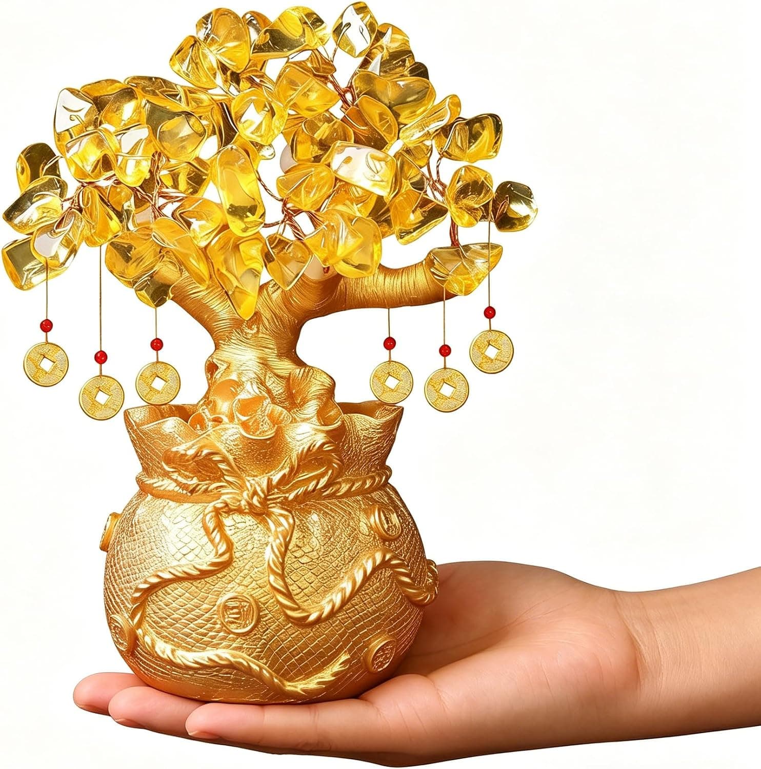
Citrine Money Tree for Wealth Qi
Why this one: Citrine supports bright yang qi and the wealth gua, while the tree form symbolizes growth and steady abundance in the wood element.
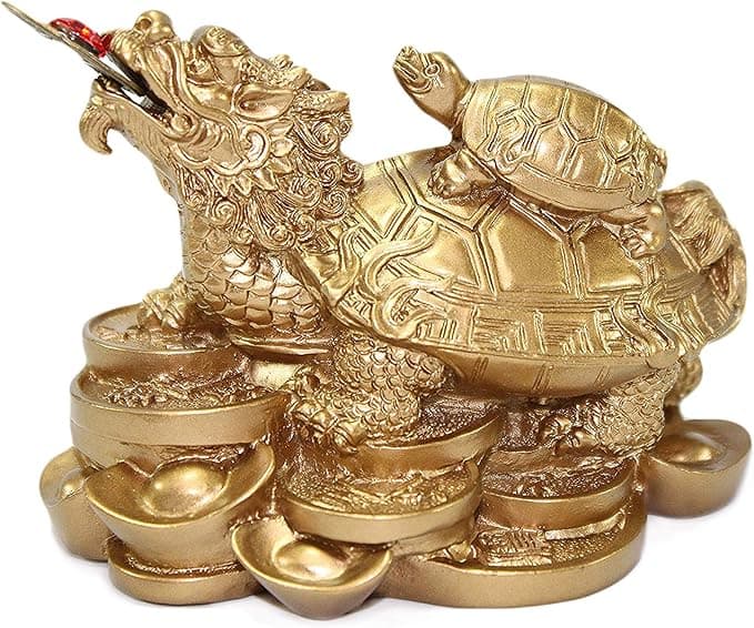
Feng Shui Gold Dragon Turtle Wealth Statue
Why this one: This golden dragon turtle activates sheng qi (auspicious energy) in your wealth bagua area, balancing yin earth energy with yang metal energy to attract and hold lasting abundance.
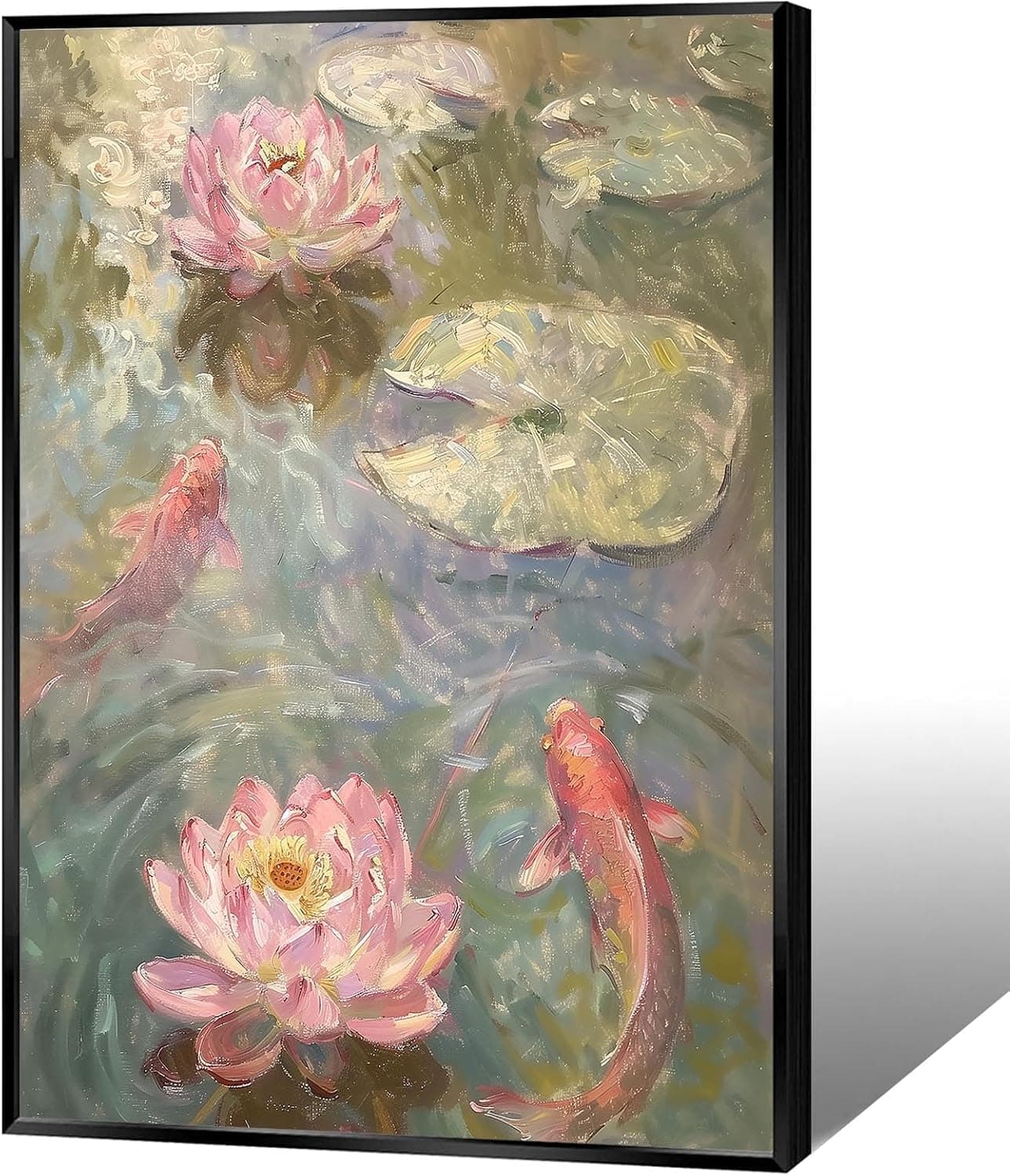
Koi & Lotus Feng Shui Canvas Art
Why this one: Koi strengthen wealth qi and lotus softens yin energy, helping balance the bagua and invite smooth-flowing prosperity.

Japandi Crane Oval Wall Art
Why this one: Cranes symbolize longevity and harmonious qi; place it to soften yang energy and invite balanced flow through the bagua.

Money Fish Wealth Carp Statue
Why this one: The carp and waves activate flowing qi and the water element, helping strengthen wealth energy in the bagua wealth area.
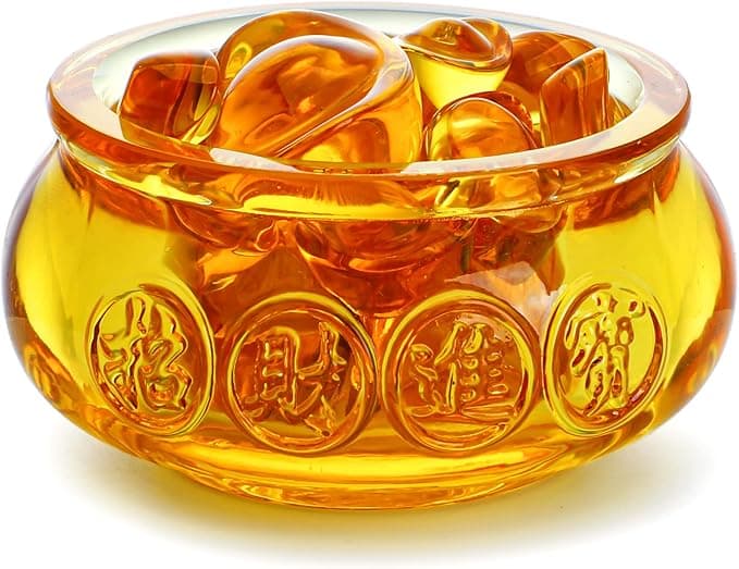
Handmade Golden Treasure Basin Feng Shui Wealth Decor
Why this one: The golden yuan bao activate metal energy (linked to wealth in five elements) to draw abundant qi into your home’s prosperity bagua area, balancing yin and yang for steady financial flow.
As an Amazon Associate, we earn from qualifying purchases. We only recommend items our practitioners have personally tested.
Continue Your Journey
Explore these related guides to deepen your understanding:

Ready for Deeper Guidance?
Try our free I Ching reading for personalized wisdom, or explore our curated Feng Shui essentials.