The wrong wall color can keep a bedroom wired long after the lights go out.
You can have the right bed and still sleep badly
I once walked into a small guest bedroom painted a glossy red, with white bedding, chrome lamps, and a black headboard pushed directly under a window. The owner swore the room felt “fine” during the day, yet she woke at 3:17 a.m. almost every night and blamed stress, coffee, even the moon. The room was not subtle. It was shouting.
That is the part people miss: color in a bedroom does not just decorate the space, it changes the temperature of the nervous system. If your evenings feel restless, if you can’t quite land in sleep, or if you wake with that tight, unfinished feeling, the problem may be right in front of you. Not your mattress. Not your meditation app. The walls.
Good bedroom feng shui starts with the body, not the trend forecast.
The method: choose colors by the job the room must do
Bedrooms need to do one thing well: downshift energy. That means the best palette is usually softer, quieter, and less reflective than what people choose for kitchens, offices, or social spaces. Think of color as a signal. Warm, saturated, high-contrast tones tell the body to stay alert. Muted, earthy, and low-gloss tones tell it to soften its grip.
I do not tell every client to paint a bedroom beige and call it wisdom. That would be lazy advice. The right approach is to match the color family to the kind of rest the room needs to support. A couple recovering from conflict may need different tones than a solo renter with a job that keeps their mind racing at 11 p.m. The room must respond to the occupants, not a magazine spread.
This is where the bagua map can help without turning the room into a spreadsheet. If a bedroom sits in a sector associated with relationships, support, or stability, the color choices should reinforce that feeling rather than fight it. In practice, that usually means grounded neutrals, softened pinks, dusty rose, creamy sand, warm taupe, muted sage, or gentle blue-gray. The exact hue matters less than the effect: calm, warm, and low-drama.
One mistake I see often is people treating “calm” as “cold.” A stark pale gray with blue undertones can feel elegant in daylight and oddly lonely at night. A bedroom can be quiet without feeling like a doctor’s waiting room. If you want rest, aim for softness, not sterility.
Color also works with texture. Matte paint absorbs light in a forgiving way. Silkier finishes bounce light around and can keep a room mentally active. That is why a sleepy color on a glossy wall can still feel awake. The finish has a voice too.
What actually works in real bedrooms
If you are choosing from scratch, start with the feeling you want before you choose the shade. For deep rest, I like muted earth tones: mushroom, oatmeal, pale clay, tea-stain, warm gray, and soft camel. For emotional ease, dusted rose, blush with gray in it, or a faded peach can work beautifully. For a cooler, calmer feel, use misty blue, pale sea glass, or blue-gray with a touch of warmth.
In one master bedroom I worked on in Portland, the walls were a strong teal and the bedding was emerald velvet. Beautiful on Instagram. Terrible at midnight. The owners, both teachers, said they felt “strangely busy” in the room even when they were exhausted. We changed the walls to a muted sand color, kept one deep-blue throw for contrast, and swapped the black curtains for linen. Within two weeks, they reported fewer wake-ups and no more late-night pacing. The room stopped arguing back.
That kind of result is not magic. It is coherence. When the walls, bedding, and lighting all pull in the same calming direction, the body stops getting mixed messages. A bedroom should not ask you to perform.
Some readers want a rule they can follow in five seconds. Here it is: if the room already has strong shapes, dark furniture, or heavy textiles, choose lighter, gentler walls. If the room is sparse, cool, or emotionally flat, you may need a little more warmth in the color to bring human comfort back into it. Do not chase “neutral” as a moral ideal. Neutral can be elegant, but it can also be dead.
For readers who like symbolic correspondence, I often point them to the five elements. Earth tones steady. Water tones soothe. Wood tones refresh. Fire tones energize. Metal tones clarify. In a bedroom, you usually want Earth and Water to lead, with Wood as a soft accent. Fire belongs in very small doses, if at all. A little coral pillow is one thing. A red accent wall is another.
If you are tempted to make the room all white because it feels clean, pause. Bright white can be too exposed at night, especially if you use overhead lighting. It reflects every shadow and makes the room feel more awake than restful. A softer cream or bone often works better. That small shift matters more than people expect.
How to choose your palette without guessing
Start with the largest surface: the walls. They set the tone faster than the bedding, and faster than art. If you want restful bedroom color choices, decide whether the room needs warmth or coolness before you even look at swatches. A north-facing room usually tolerates warmer tones better because it receives cooler light. A south-facing room may already feel hot and bright, so a softer cool-neutral can balance it.
Then look at the furniture. Dark wood, black metal, and oversized headboards create visual weight. If those are already present, you do not need more intensity on the walls. Keep the palette gentler and let the furniture anchor the room. If the furniture is pale and airy, you can afford a little more color in the walls or textiles without making the room feel heavy.
After that, layer in textiles. Bedding is where many people overcompensate. They paint the walls a soothing color, then add bright white sheets, neon throw pillows, and a patterned duvet that looks like it belongs in a beach resort. Choose one or two soft accents, not five competing statements. Cotton, linen, washed silk, and quilted cotton all support a more settled mood than shiny synthetics.
Lighting must agree with the palette. A warm wall color under harsh blue-white bulbs will still feel wrong. Use lamps, not just overhead light, and keep bulbs in a warmer temperature range at night. Color, light, and material should speak the same language. If one is shouting, the room never rests.
Paint samples matter more than online photos ever will. I have seen a color that looked “sage” in a showroom turn into a tired hospital green at home because of the window direction. Put samples on more than one wall and watch them morning, afternoon, and evening. Bedroom color is a time-based decision, not a static one.
If you want to go deeper into the room as a whole, the full bedroom layout approach helps you see why color is only one part of the equation. The bed position, mirror placement, and clutter all affect whether the palette can actually do its job.
One small surprise: a room does not always need “soft” colors to feel restful. Sometimes a single darker, grounded tone behind the bed can create a feeling of support that pale walls cannot. The trick is containment. Use depth in one place, not everywhere.
Common mistakes that quietly drain the room
The first mistake is choosing colors for daytime style instead of nighttime function. A bedroom that looks chic in sunlight can become mentally noisy after dark. The second is copying a palette from social media without considering light, furniture, or your own sleep patterns. Those two errors account for a lot of bad rooms.
If you want the practical fixes that keep showing up in real homes, the front door energy flow issues and bedroom problems often mirror each other: too much stimulation, too many hard edges, too little pause. Houses repeat themselves. What happens at the entry often echoes in the back rooms.
What to do if you cannot repaint
Renters ask me this all the time, and the answer is simpler than they expect. You can shift the room without touching the walls. Use larger bedding in a grounded color, remove bright art above the bed, and choose curtains that soften the window instead of spotlighting it. Even a muted rug can change the emotional tone of the floor.
If the room contains a reflective dresser mirror, cover it at night or move it so it does not catch the bed. Reflection can keep a room mentally active, especially when the wall color is already strong. People blame the color, but often the real problem is the color plus the bounce.
You can also introduce a single calming object with weight and presence. A ceramic lamp, a woven bench, or a wooden stool near the bed can ground a room more effectively than three decorative pillows. For those drawn to symbolic support, a quietly placed stone or object can help, though it should never replace the basics of good color and layout. If you want to compare approaches, I’ve written about the right way to use crystals without turning the bedroom into a display shelf.
And if the room still feels thin, look beyond color entirely. Sometimes the issue is not the palette but the clutter, the room’s purpose, or the energy entering from elsewhere in the home. A bedroom can be painted perfectly and still feel restless if the rest of the house is loud. That is not a contradiction. That is how homes work.
FAQ
Which colors are best for sleep?
Muted earth tones, soft blue-gray, dusty rose, warm cream, and gentle sage are dependable choices. They reduce visual urgency and help the room feel less demanding at night. The best color is the one that looks calm in evening light, not just in the store.
Can I use dark colors in a bedroom?
Absolutely, if you use them with restraint. A deep accent wall or dark headboard can create support and intimacy, especially in a large room. What usually causes problems is dark color everywhere, combined with heavy furniture and poor lighting.
Is white paint bad for a bedroom?
Not automatically, but bright white is often too sharp for a room meant for rest. A softer cream or bone tends to feel more forgiving, especially when the lights go on at night. The difference is subtle on a swatch and obvious at 1 a.m.
Do bedroom colors need to match the rest of the house?
They should relate, but they do not need to copy the same palette room by room. A bedroom can be calmer and more enclosed than a hallway or living space because it serves a different function. Think harmony, not repetition.
Mei Chen
Traditionally informed guidance • Cross-referenced with classical Chinese source texts
Content draws from both Compass (Luopan) and Form (Xingshi) school traditions. Illustrative examples are composites based on consultation experiences.
Practitioner-Selected Tools for This Topic
Items our team has tested and found effective for the principles discussed above. Individual results may vary.

Citrine Money Tree for Wealth Qi
Why this one: Citrine supports bright yang qi and the wealth gua, while the tree form symbolizes growth and steady abundance in the wood element.

Feng Shui Gold Dragon Turtle Wealth Statue
Why this one: This golden dragon turtle activates sheng qi (auspicious energy) in your wealth bagua area, balancing yin earth energy with yang metal energy to attract and hold lasting abundance.
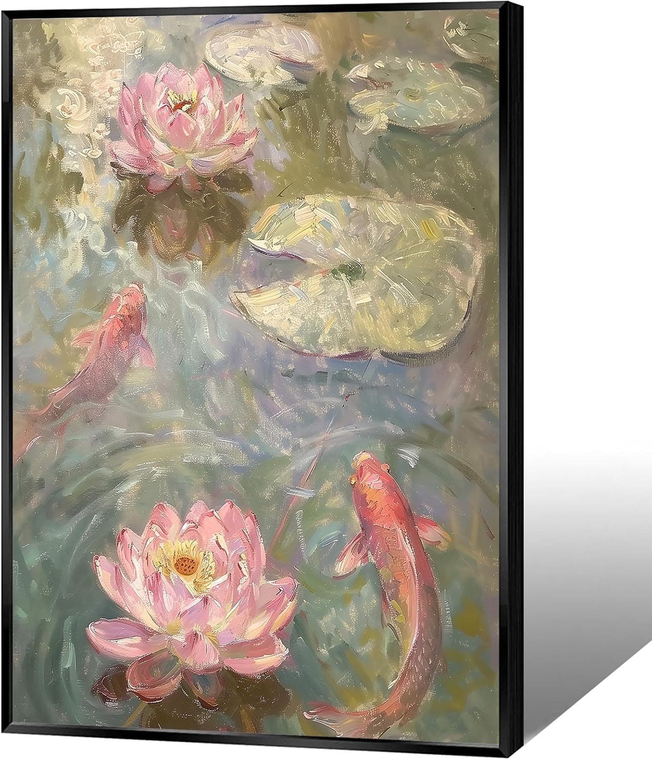
Koi & Lotus Feng Shui Canvas Art
Why this one: Koi strengthen wealth qi and lotus softens yin energy, helping balance the bagua and invite smooth-flowing prosperity.

Japandi Crane Oval Wall Art
Why this one: Cranes symbolize longevity and harmonious qi; place it to soften yang energy and invite balanced flow through the bagua.

Money Fish Wealth Carp Statue
Why this one: The carp and waves activate flowing qi and the water element, helping strengthen wealth energy in the bagua wealth area.

Handmade Golden Treasure Basin Feng Shui Wealth Decor
Why this one: The golden yuan bao activate metal energy (linked to wealth in five elements) to draw abundant qi into your home’s prosperity bagua area, balancing yin and yang for steady financial flow.
As an Amazon Associate, we earn from qualifying purchases. We only recommend items our practitioners have personally tested.
Continue Your Journey
Explore these related guides to deepen your understanding:

Ready for Deeper Guidance?
Try our free I Ching reading for personalized wisdom, or explore our curated Feng Shui essentials.