The standard approach to feng shui animal crossing has serious gaps. What works in practice tells a different story.
The Bedroom That Looked Finished But Felt Wrong
It's 8:40 p.m. in Animal Crossing. Moonlight pushes through a single west window. The bed sits centered on the east wall, two potted plants flank a wardrobe, a desk fills the corner. Seven items placed. The room looks, by any reasonable measure, done.
And yet.
Every time I walk my avatar toward the bed, she clips the dresser corner. Not dramatically — just enough to break the line, redirect the path, add a half-step sideways before she can settle. The room bends the player twice in four tiles. Four tiles. That's not a design problem you can fix with a color-matched lamp or a luckier rug placement. The furniture is fine. The path is broken.
I stood at the foot of that bed for longer than I want to admit, trying to understand why a room with only seven objects could feel this cramped. The desk was in the right quadrant. The wardrobe was against the south wall. The plants were symmetrical. On a screenshot, it looked composed. In motion, every route to the door required squeezing past something, pivoting around something else, and making a small unconscious decision about which side to take. That's not rest. That's negotiation.
This is the thing about feng shui in Animal Crossing that color charts and lucky placement grids miss entirely: a room doesn't feel calm because its items match a directional scheme. It feels calm because your body — or in this case, your avatar — can move through it without friction.
When Your Avatar Keeps Bumping the Same Corner
Feng shui, in its practical form, has always been partly about movement. The idea that energy flows through a space the way water moves through a landscape isn't metaphor for decoration — it's a description of how people actually traverse rooms. Doors, pathways, clearances. Where you hesitate. Where you stop.
In Animal Crossing, this becomes almost literal. Your avatar has a fixed movement grid. She walks, she turns, she occasionally clips furniture at corners. And each time she does, the game registers it as a small interruption. You don't consciously notice the first time. By the fourth time crossing the same room, you've learned to dread that corner. The brain, even in a game, builds a map of friction.
I've watched this happen in a studio-style room at night: one chair parked in the southeast corner near the window, crafting table on the opposite side. To reach the table, the avatar turns right, then left, then right again. Three pivots in a small room. The furniture was color-matched. The items were "lucky" by ACNH feng shui logic. The room felt mentally busy in a way that had nothing to do with aesthetics and everything to do with the path it forced.
This is what I mean by spatial choreography. The question isn't "does this item carry good energy?" The question is: where does my avatar naturally walk, where does she pause, and how many times does she have to reorient before reaching her destination? Those near-collisions shape the room's mood more reliably than any placement chart.
A clear route from door to bed reduces micro-decision load. When the path is readable in one glance, the nervous system — yours, not just your character's — reads the room as safer. Less demanding. The room doesn't need to be sparse to achieve this. It needs to be legible.
Why One Empty Edge Can Calm the Whole Floor
Here's the layout that changed how I think about this: a small island bedroom at dawn. Bed against the north wall. Low table against the south wall. A two-tile-wide empty strip running from the southwest door to the northeast bed — one clean diagonal line with nothing in it.
The room felt immediately calmer than anything I'd built with more furniture. Not because of what was in it. Because of what wasn't.
That empty strip is doing real work. It gives the eye a resting point — a place to land before scanning the rest of the floor. Visual clutter at every perimeter forces constant scanning, which keeps attention elevated rather than letting it settle. One bare edge interrupts that cycle. The mind uses negative space to estimate available movement, so a single open quadrant can make the whole floor feel less crowded, even if the total furniture count hasn't changed.
I now leave the northwest corner — roughly 3×3 tiles — intentionally empty in most rooms I build. Not because I've run out of ideas for that corner. Because the player's first visual stop being blank floor, rather than a tall wardrobe or a shelf, lowers the room's perceived density before a single step is taken.
This directly contradicts the advice to fill every corner so the room feels "complete." Occupied corners increase visual density and remove the resting points the eye uses to stop scanning. A room where every corner holds something is a room where the eye never stops working. That's the opposite of calm.
A Table Can Be Lucky and Still Ruin the Vibe
There's a guest room I keep returning to as an example. Midday light. One round table placed dead center under the ceiling lamp, two stools tight against it. In screenshots, it looks balanced — almost editorial. In play, the avatar snags the table edge every time she moves from the door toward the window. The table is in the primary transit zone. The center of any room is where movement concentrates, and anchoring it with furniture turns navigation into obstacle negotiation.
The table isn't wrong symbolically. It might satisfy every color and direction requirement in the ACNH feng shui system. It looks right. It just makes the room worse to be in.
The same problem appears with aquariums. I placed one directly between the west-wall entrance and the east-wall sofa in a compact living room. At 3 p.m., the light catches the tank beautifully — it genuinely looks like a design decision. But it forces a detour. The route that should take four tiles takes seven. The aquarium is decorative. The friction is real.
Rugs create a subtler version of this. A rug that covers most of the floor can hide route cues entirely, making the room feel like one fixed block rather than a navigable path. The eye loses its ability to read where movement is intended to go. A round rug centered three tiles from the west door and three tiles from the east wall — leaving clear space at both the entry and the far wall — defines the middle of the room without creating sharp corners in the movement path. That's the difference between a rug that grounds the space and a rug that flattens it.
Plants are perhaps the most forgiving offenders. Two potted plants flanking a wardrobe look intentional. Two potted plants placed where the avatar needs to pass look like obstacles. The plant doesn't know it's in the way. You just keep stepping around it, and eventually the room teaches you to approach it with tension.
The Quiet Route from Door to Bed
When I rebuild a room now, I start with the path before I place a single piece of furniture.
Door on the west wall. Bed four tiles east of the door, two tiles north of the south wall. That leaves a two-tile circulation path along the south edge — enough for the avatar to move without pivoting, narrow enough that the room doesn't feel like a corridor. I place that clearance first and treat it as load-bearing. Nothing goes in it. Not a plant. Not a side table. Not a rug that overlaps it by one tile.
The wardrobe goes against the north wall, offset two tiles from the northwest corner. This matters because a wardrobe flush with the corner blocks the visual line from the entrance to the center of the room. Offset slightly, it lets the eye travel inward before landing on the largest object. The room reads as deeper than it is.
The desk goes below the north window with one tile of clearance on each side. Not because symmetry is the goal — because those clearance tiles mean the avatar can approach the desk from either side without turning. The desk becomes a destination rather than a dead end.
After placing each item, I walk the room. Door to bed. Bed to window. Window to door. I'm not checking whether it looks good. I'm checking whether the avatar bumps anything, whether any turn is forced, whether the path bends more than once. If it bends twice, something moves. Usually the thing I was most attached to.
The mirror goes on the south wall, one tile left of the bed, not facing the door. Facing the entry, a mirror sharpens the sense of movement — makes the exit line too active. Angled toward the north window instead, it reflects light without confronting the player at the threshold. The first impression becomes passive. That lowers tension in a way that's hard to name but immediately felt.
One Surprising Thing: the Best Room Is the One You Cross Quickly
A room that can be crossed in one clean line feels calmer than a room that requires three turns to navigate — even if the three-turn room has better furniture, more matched colors, and higher feng shui scores by every in-game metric.
Short, direct movement creates a sense of control. Fewer turns mean fewer moments of reorientation, fewer micro-decisions, fewer collision checks. The room doesn't demand anything from you. You pass through it, and it lets you pass.
That small island bedroom at dawn — bed north, table south, two-tile lane from southwest to northeast — is the calmest room I've built in this game. It has five items. It would fail a "richness" test. It would look sparse in a design showcase. But the avatar crosses it in one breath, and that single uninterrupted crossing is worth more than any lucky color placement I've ever tried.
If the Room Feels Smaller After the Makeover, It May Be Working
Removing furniture to improve a room feels counterintuitive. The instinct is always to add — another accent piece, another plant, another item that fills the gap that suddenly looks too bare. Resist this.
A bedroom with a cat-themed bed in the northwest quadrant, wardrobe on the south wall, and a single empty corner near the door kept deliberately bare feels more restful than the same room with that corner filled. The open corner gives the eye a landing place. Without it, the eye keeps moving, keeps scanning, keeps finding the next object. That's not rest. That's vigilance.
Tighter boundaries, paradoxically, can reduce wandering options in a way that feels calmer. Less choice means less scanning. A room that is intentionally navigable — where the path is clear, the clearances are real, and at least one edge is left underfilled — creates visual order through spatial restraint rather than through density.
The goal of feng shui in Animal Crossing, if it has a goal that translates from the actual practice, isn't to pack a room with correctly-colored lucky items. It's to make the room feel like it wants to be moved through. Like it was designed for a body — or an avatar — rather than for a screenshot.
When you walk from the door to the bed in five tiles without a single pivot, without clipping a corner, without having to decide which side of a table to take — that's when the room is finished. Not when the last corner is filled.
Mei Chen
Traditionally informed guidance • Cross-referenced with classical Chinese source texts
Content draws from both Compass (Luopan) and Form (Xingshi) school traditions. Illustrative examples are composites based on consultation experiences.
Practitioner-Selected Tools for This Topic
Items our team has tested and found effective for the principles discussed above. Individual results may vary.
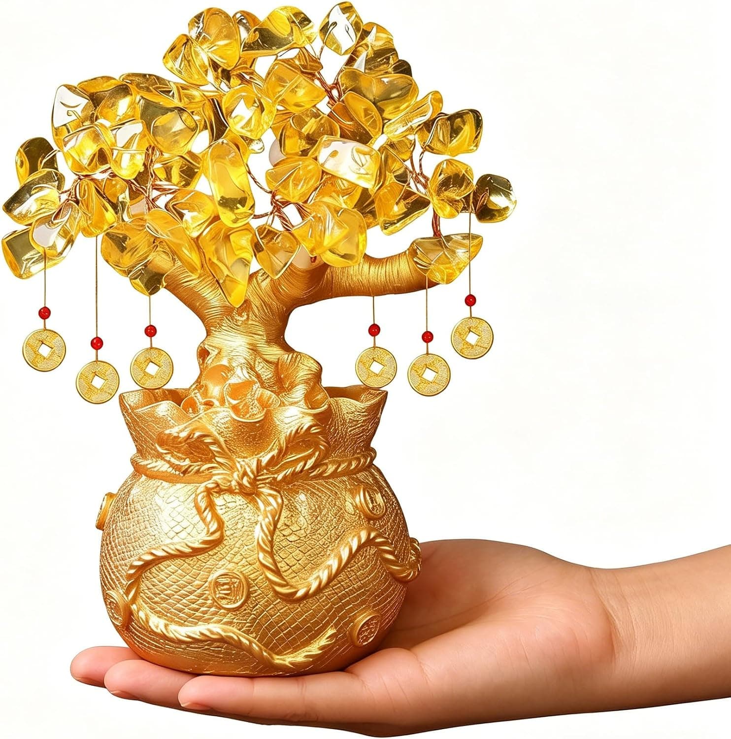
Citrine Money Tree for Wealth Qi
Why this one: Citrine supports bright yang qi and the wealth gua, while the tree form symbolizes growth and steady abundance in the wood element.
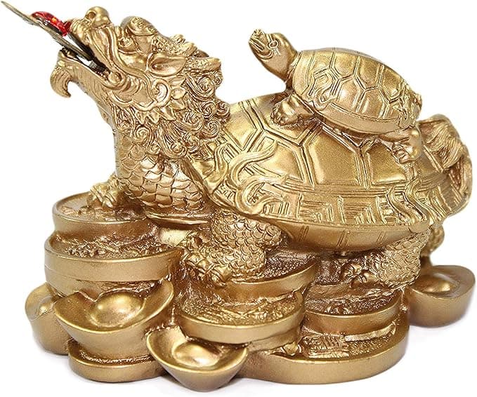
Feng Shui Gold Dragon Turtle Wealth Statue
Why this one: This golden dragon turtle activates sheng qi (auspicious energy) in your wealth bagua area, balancing yin earth energy with yang metal energy to attract and hold lasting abundance.
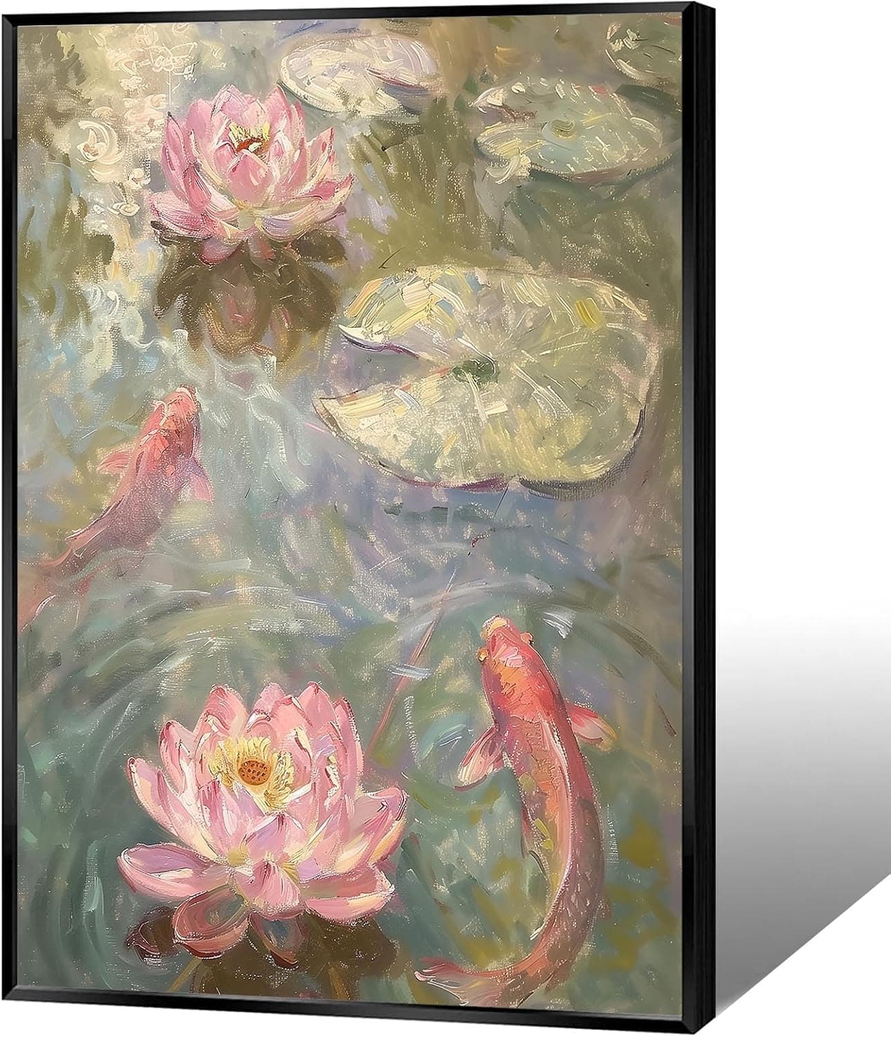
Koi & Lotus Feng Shui Canvas Art
Why this one: Koi strengthen wealth qi and lotus softens yin energy, helping balance the bagua and invite smooth-flowing prosperity.

Japandi Crane Oval Wall Art
Why this one: Cranes symbolize longevity and harmonious qi; place it to soften yang energy and invite balanced flow through the bagua.
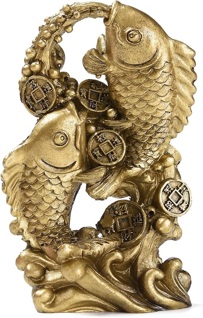
Money Fish Wealth Carp Statue
Why this one: The carp and waves activate flowing qi and the water element, helping strengthen wealth energy in the bagua wealth area.

Handmade Golden Treasure Basin Feng Shui Wealth Decor
Why this one: The golden yuan bao activate metal energy (linked to wealth in five elements) to draw abundant qi into your home’s prosperity bagua area, balancing yin and yang for steady financial flow.
As an Amazon Associate, we earn from qualifying purchases. We only recommend items our practitioners have personally tested.
Continue Your Journey
Explore these related guides to deepen your understanding:

Ready for Deeper Guidance?
Try our free I Ching reading for personalized wisdom, or explore our curated Feng Shui essentials.