Open plans can look elegant and still scramble a home’s rhythm the moment boundaries disappear.
The Hidden Truth About ai feng shui
People knock out a wall, open the kitchen to the living room, and expect the whole home to breathe easier; then the couch gets used less, conversations get shorter, and sleep starts slipping after midnight. The space looks cleaner. The household feels noisier.
I've seen this in a long rectangle of a condo where the dining table sat only six feet from the stove, a charcoal sofa faced a blank media wall, and a brass pendant threw hard light across the center of the room. The owners had followed every modern recommendation they found online: remove barriers, widen sightlines, keep circulation open. They got circulation, yes. They also got a house that never seemed to settle.
The mechanism is simple once you watch it closely. Walls do more than divide rooms; they slow movement, hold attention, and give each activity a container. Take them away and qi does not magically become better behaved. It spreads, collides, and leaks into whatever comes next. That matters because the eye keeps wandering, the body stays alert, and the nervous system never gets the signal that one task has ended.
That is why the usual advice fails in open plan homes. It treats openness as a virtue by default, but feng shui reads function first. A sofa floating in the middle of a great room may look stylish, yet if it leaves your back exposed to the entry and your dinner chair facing the dishwasher, the room keeps telling you to stay on guard. Small wonder people start avoiding the very zones they spent money to create.
Take the living area as an engineer would. First comes input: light, sound, and foot traffic enter from the front door or kitchen. Then comes dispersion: without a wall, those inputs travel farther and faster. Next comes dilution: the room loses distinct centers, so no single activity feels fully held. Output follows immediately—restlessness, shorter attention spans, more clutter migrating to the nearest flat surface. That sequence is why a big open plan can feel less spacious than a smaller room with a clear edge.
And yes, this is where mapping the house by activity zones matters more than fantasy. If you cannot tell where eating ends and resting begins, the bagua becomes a poster on the internet instead of a working tool in your home. The fix is not to re-build every wall. It is to restore hierarchy. A rug with a defined boundary, a lamp that pools light over one chair, a shelf set perpendicular to the room’s long axis—these are not decorative afterthoughts. They are cues.
One more thing. Open plans often invite the wrong kind of sameness. A white wall, pale oak floor, and matching stools can flatten the room into one continuous visual field, which sounds peaceful until you realize the brain has no landmarks. In practice, people misplace objects, forget where they put mail, and end up stacking bags beside the fridge because there is no obvious landing point. The room has motion, but no memory.
That is also why a tidy open home can still feel wrong at night. After dark, the kitchen gleam becomes the loudest thing in the space, especially if the island faces the sofa and the sink reflects ceiling spots. The eye goes there first. The mind follows. If the dining zone has no pendant to anchor it, the whole layout starts behaving like a waiting room instead of a home.
How the failure starts, step by step
Remove the wall and the first thing you lose is pause. A doorway creates a half-step of transition; a room opening into another room gives the body time to shift gears. Once that buffer disappears, cooking, working, scrolling, eating, and resting all spill into one another. That is not freedom. It is cross-contamination.
Then the sound changes. Pots clang farther, television audio carries, and the conversation at the island keeps interrupting the person trying to read on the sofa. Sound should help a home breathe. In an over-open layout, it bounces around like a pinball. You may not notice the pressure at first, but your shoulders do.
After that comes visual overexposure. The mind wants edges, and when it cannot find them it starts scanning. That scanning is tiring. A hallway with framed thresholds calms the eye because each frame tells you where you are. A giant room with no interruption can do the opposite, especially when the kitchen mess stays visible from every seat.
Then there is the social effect nobody likes admitting. Open plans can make every task feel public. Someone washing dishes sees the laptop. Someone on a call hears the blender. Nobody quite relaxes because everything is always on display. People call that connection. Often, it is just lack of shelter.
One sentence: privacy is not the enemy of good flow.
For homes that already lost their walls, the correction has to be architectural in feeling, even if not in construction. A tall plant in a ceramic pot can mark the edge of a sitting zone. A console behind the sofa can create a back. A screen, bookcase, or even two chairs angled inward can slow the room enough to give it shape. The goal is not to close the plan. The goal is to make it legible.
That brings us to the practical point people skip when they jump straight to cures. The room must tell different stories in different places. Meal prep should not visually dominate the place where you speak with guests. Sleeping should not borrow energy from the kitchen. And if your desk sits in the same visual corridor as the front door, the front entry will keep stealing your attention before you even notice it happening. A room can be open and still have boundaries. Without them, everything competes.
What works in an open plan, and what backfires
Start with the strongest current in the space: the main axis from entry to far wall. In many open homes, qi shoots straight through this line and exits too quickly. A rug placed across that path slows the movement. So does a low table, a bench, or a pair of chairs that interrupt the runway without blocking circulation. The point is not obstruction. The point is deceleration.
Color matters more than trend here. A single gray palette can make a large room feel like an airport lounge after closing time. Add a warm wood lamp base, a deep green plant, or a rust throw, and the eye gets small rests. Those rests are not cosmetic. They help the mind register zones, which is exactly what a wall used to do for free.
Kitchen placement inside the open layout deserves blunt treatment. If the stove, sink, and refrigerator sit in one long exposed line, cooking never feels contained. Cover visual clutter with cabinet doors. Keep knives out of sight; yes, the sharp edge matters energetically, but the greater issue is what the eye reads first when it enters the room. A row of blades on a magnetic strip can make the whole social area feel tense, even before dinner starts. For a deeper look at that effect, see why knife placement alters the mood of a kitchen.
There is also the mistake of adding too many cures at once. People buy crystals, fountains, plants, and metallic ornaments because the room feels off, then wonder why it feels busier instead of better. Open plans already amplify everything. Piling symbols into them can create a visual argument. If you want a better starting point for money flow in a shared space, coin placements that make money feel managed, not chaotic usually teach more than another decorative object ever will.
One-sentence paragraph: Anchor first, decorate second.
In one apartment I walked through, the owners had demolished the wall between the kitchen and lounge, then placed a white boucle sofa under a bright skylight and hung three slim shelves on the opposite wall. Beautiful, yes. But the room had no center. After they added a darker rug under the coffee table, moved the sofa back eight inches to create a narrow passage behind it, and replaced the sharp overhead bulb with two shaded lamps, the whole place changed. Meals lasted longer. The television went off earlier. Even the cat stopped sleeping under the dining chair and returned to the window perch.
That kind of change is not mystical theater. It is the result of giving the body a readable map. Once the room has a front, a middle, and an edge, people stop drifting through it as if they were in a showroom. They use it. And use is what gives a home stable qi, not architectural fashion.
Where the common advice goes wrong
“Open it up” has become lazy shorthand for improvement. Sometimes it works, especially in cramped apartments where a single dark partition blocks light and air. Often it does the opposite in larger homes, because the problem was never size. It was lack of definition. A cramped room may need release. A broad room may need discipline.
The belief that more visibility equals more harmony is another trap. In practice, too much visibility can make people self-conscious. I have seen parents in open homes whisper because the child’s table was only a few feet away, and couples avoid direct discussion because every sound carried into the kitchen. The layout itself created social performance.
There is a special kind of mistake people make with the wealth area in open homes. They place a plant, a bowl, or a money charm in the far corner of a combined living-dining-kitchen zone and expect the whole corner to lift their finances. But if that corner doubles as a corridor to the pantry, the energy keeps getting cut by movement. For money zones, boundary matters more than token objects. See the threshold problem behind wealth corner mistakes if you want the anatomy of that failure.
Another myth: open plans suit everyone because they look modern. Nonsense. Some households need quieter edges, especially families with children, people who work from home, or anyone already carrying too much sensory load. A home should not demand constant adaptation from the people living in it. That is the hidden cost of design enthusiasm.
What actually works is selective enclosure. Sometimes it means keeping a half-wall between kitchen and living area. Sometimes it means replacing a full wall with a narrow opening instead of a wide one. Sometimes it means using a bookcase as a filter so the room can still see through itself without acting like one giant chamber. The right answer depends on where the room leaks attention, not on a trend report.
And because people ask, yes, there are situations where the open layout is exactly right. If the home has good daylight, strong perimeter seating, and one clearly grounded focal point, the layout can feel generous rather than exposed. But that is a specific condition, not a universal rule. Treat it like a test, not a creed.
Practical adjustments that restore order
Begin at the entry line. Stand where the front door opens and scan the room. Can you see the sink, the stove, the desk, and the television in one sweep? If so, the home is broadcasting too much at once. Break that line with a console, a plant cluster, or a chair back angled into the room so the eye has to choose a path instead of taking every path.
Next, define one activity zone with texture. A wool rug under the seating area changes the acoustic feel immediately. Linen drapes soften the hard edge of glass. A table lamp at shoulder height can make a reading corner feel private even without a wall. These changes are not minor. They tell the body, here is rest; here is work; here is conversation.
Then clean the long sightlines. The farther you can see in one glance, the more carefully the room must be edited. Leave blank surfaces where possible. Keep the island clear. Store mail in one tray instead of scattering it across the counter, because scattered paper reads as unfinished business. Open plan homes reveal unfinished business fast, and they do not forgive it.
One fragment: boundaries calm.
In the bedroom, if you can glimpse the kitchen from the pillow or hear cutlery from the bed, that problem deserves attention before any decorative purchase. The sleep system does not want to share a visual corridor with dinner prep. For a more detailed framework, this bedroom approach shows how to build a real sanctuary even when the rest of the house stays open.
Do not ignore the ceiling. Open plans often have one huge overhead surface that unifies everything in the least helpful way. A pair of pendant lights over the dining table, a shaded lamp by the sofa, and a different bulb temperature in the kitchen can create invisible ceilings within the larger room. Warmth at the seating zone, clarity at the work zone, brightness at the prep zone—that mix gives each activity a distinct temperature.
And if you keep looking for a single item to fix the whole thing, stop there. The room is telling you the issue is structural, not ornamental. You can support structure with small objects, but you cannot pretend objects are a structure. That mistake shows up constantly in photos online.
FAQ
Is conventional ai feng shui advice reliable? Not without context. The standard advice usually assumes a room has clear edges, but open homes behave differently because movement, sightlines, and sound all travel farther. I would trust the advice only after checking whether the room has a strong center and enough visual pause points.
Do I have to rebuild walls to fix an open plan? No, and that is the part people miss. A rug, a console, a shelf, a lamp, or a change in seating angle can create enough separation for the room to function better. Rebuilding is one option; readable boundaries are the real need.
Can a large open kitchen and living room support wealth and sleep at the same time? Yes, but only if the active zones are contained. The kitchen should not dominate the seating area, and the bed should not share a sightline with cooking or cleaning. When those lines stay clear, the house stops asking every person to stay alert all day.
Why does my open layout feel worse at night? Because darkness erases the small cues that organize the room. The kitchen glow, TV light, and reflective surfaces start to compete, and the space feels louder even when nobody is speaking. Add lower, warmer light and the room usually softens fast.
One last observation: the problem usually shows up first in the smallest habits. Mail lands on the nearest counter. Shoes drift into the walkway. The same chair gets pulled a little farther away from the room’s center each week. By then the architecture has already spoken—quietly, but clearly—and the house has begun arranging your life around its missing wall.
How the failure starts, step by step
Remove the wall and the first thing you lose is pause. A doorway creates a half-step of transition; a room opening into another room gives the body time to shift gears. Once that buffer disappears, cooking, working, scrolling, eating, and resting all spill into one another. That is not freedom. It is cross-contamination.
Then the sound changes. Pots clang farther, television audio carries, and the conversation at the island keeps interrupting the person trying to read on the sofa. Sound should help a home breathe. In an over-open layout, it bounces around like a pinball. You may not notice the pressure at first, but your shoulders do.
After that comes visual overexposure. The mind wants edges, and when it cannot find them it starts scanning. That scanning is tiring. A hallway with framed thresholds calms the eye because each frame tells you where you are. A giant room with no interruption can do the opposite, especially when the kitchen mess stays visible from every seat.
Then there is the social effect nobody likes admitting. Open plans can make every task feel public. Someone washing dishes sees the laptop. Someone on a call hears the blender. Nobody quite relaxes because everything is always on display. People call that connection. Often, it is just lack of shelter.
One sentence: privacy is not the enemy of good flow.
For homes that already lost their walls, the correction has to be architectural in feeling, even if not in construction. A tall plant in a ceramic pot can mark the edge of a sitting zone. A console behind the sofa can create a back. A screen, bookcase, or even two chairs angled inward can slow the room enough to give it shape. The goal is not to close the plan. The goal is to make it legible.
That brings us to the practical point people skip when they jump straight to cures. The room must tell different stories in different places. Meal prep should not visually dominate the place where you speak with guests. Sleeping should not borrow energy from the kitchen. And if your desk sits in the same visual corridor as the front door, the front entry will keep stealing your attention before you even notice it happening. A room can be open and still have boundaries. Without them, everything competes.
How the failure starts, step by step
Remove the wall and the first thing you lose is pause. A doorway creates a half-step of transition; a room opening into another room gives the body time to shift gears. Once that buffer disappears, cooking, working, scrolling, eating, and resting all spill into one another. That is not freedom. It is cross-contamination.
Then the sound changes. Pots clang farther, television audio carries, and the conversation at the island keeps interrupting the person trying to read on the sofa. Sound should help a home breathe. In an over-open layout, it bounces around like a pinball. You may not notice the pressure at first, but your shoulders do.
After that comes visual overexposure. The mind wants edges, and when it cannot find them it starts scanning. That scanning is tiring. A hallway with framed thresholds calms the eye because each frame tells you where you are. A giant room with no interruption can do the opposite, especially when the kitchen mess stays visible from every seat.
Then there is the social effect nobody likes admitting. Open plans can make every task feel public. Someone washing dishes sees the laptop. Someone on a call hears the blender. Nobody quite relaxes because everything is always on display. People call that connection. Often, it is just lack of shelter.
One sentence: privacy is not the enemy of good flow.
For homes that already lost their walls, the correction has to be architectural in feeling, even if not in construction. A tall plant in a ceramic pot can mark the edge of a sitting zone. A console behind the sofa can create a back. A screen, bookcase, or even two chairs angled inward can slow the room enough to give it shape. The goal is not to close the plan. The goal is to make it legible.
That brings us to the practical point people skip when they jump straight to cures. The room must tell different stories in different places. Meal prep should not visually dominate the place where you speak with guests. Sleeping should not borrow energy from the kitchen. And if your desk sits in the same visual corridor as the front door, the front entry will keep stealing your attention before you even notice it happening. A room can be open and still have boundaries. Without them, everything competes.
Mei Chen
Traditionally informed guidance • Cross-referenced with classical Chinese source texts
Content draws from both Compass (Luopan) and Form (Xingshi) school traditions. Illustrative examples are composites based on consultation experiences.
Practitioner-Selected Tools for This Topic
Items our team has tested and found effective for the principles discussed above. Individual results may vary.
 -19%
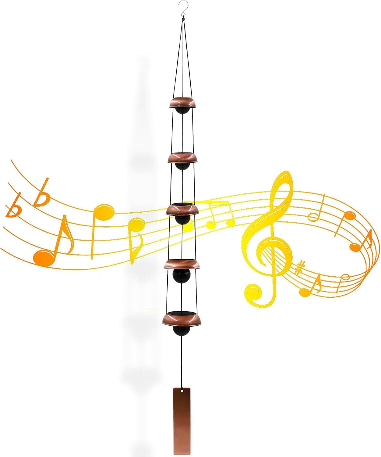
-19%Wind Chimes for Outside with 5 Bell Unique Copper Musical Chimes Feng Shui Wi...
 -5%
-5%YU FENG Evil Eye Money Tree, Blue Feng Shui Decor with Golden Buddha
 -29%
-29%Karma and Luck March Birthstone Crystal Tree of Life, Aquamarine Gemstone Fen...
 -29%
-29%Karma and Luck July Birthstone Crystal Tree of Life, Ruby Gemstone Feng Shui ...
As an Amazon Associate, we earn from qualifying purchases. We only recommend items our practitioners have personally tested.
Continue Your Journey
Explore these related guides to deepen your understanding:


Ready for Deeper Guidance?
Try our free I Ching reading for personalized wisdom, or explore our curated Feng Shui essentials.