The right 2027 palette can steady a home fast, but only when you stop treating lucky color like wallpaper.
That swatch in the entryway is asking the right question
A lucky color in 2027 should usually start at the threshold, not spread through the whole house like a costume. I keep thinking of a renter standing in a narrow entry, paint sample in one hand and a swatch card in the other, trying to decide whether the right move is the front door, the hallway wall, or just a ceramic bowl on the console. The answer is rarely “paint everything.” It is usually “shape the transition.”
The old Chinese use of color was never random decoration. It sat inside a larger environmental art: materials, light, openings, and the way a person moved from one zone to another. That is why bagua mapping and annual color advice only make sense when the room’s purpose is clear.
In 2027, the useful question is not whether a color is lucky in the abstract. It is where that color should live, how much of it the eye can hold, and whether it supports the room’s daily job. Color changes attention first. Symbolism comes second.
I have seen a pale doorway become calmer after one red lacquer bowl was moved onto a dark console, and I have seen a bright kitchen feel more chaotic when the same shade covered every visible surface. The color was not the problem. Its territory was.
How the old Chinese context made color practical, not magical
In classical feng shui, color was tied to the movement of qi through built space, not to a superstition that one shade could fix every problem. Chinese interiors historically responded to climate, orientation, ceremony, and social rank. A courtyard house with strong sun did not need the same visual treatment as a shaded room facing north, and a guest hall carried different expectations than a sleeping chamber.
That practical approach came from the fact that color was doing multiple jobs at once. It could cool a harsh south-facing room by reducing visual glare, make a dim passage feel more welcoming by lifting contrast, or reinforce hierarchy by giving ceremonial spaces a stronger visual signal. In other words, the color choice mattered because it changed how the body read the room.
That is the part modern “lucky color” lists often miss. They flatten a living system into a calendar cue. But a home is not a poster. It is circulation, proportion, threshold, and repeated use. A color that looks auspicious in isolation may still fail if it fights the room’s light, scale, or daily traffic.
So when people ask about feng shui 2027 lucky colors, I start with the year’s tone but I do not stop there. The annual layer matters because it colors the atmosphere of the moment, yet the room’s existing light and function decide whether that hue should be bold, muted, or barely visible. That is especially true if you are using the five elements framework in a real home, where one element can support another or smother it depending on scale.
Here is the part that surprises many Western readers: a lucky color can work even when nobody names it lucky. If you see it every day at the edge of a doorway, on a lampshade, or in the textile on a chair, it starts training attention. People slow down. They feel the transition. They notice the room differently. That repetition matters more than a dramatic splash on one wall.
Why 2027 color advice is not a trend forecast
People love to turn feng shui into a yearly palette chart, as if the whole house should change costumes every January. That is too thin. Annual color advice makes more sense when it is understood as a temporary overlay, a way to respond to the year’s energetic climate without fighting the architecture already in place.
It is also not a forecast in the design-trend sense. Trend forecasting tries to predict what will look current. Feng shui asks what will help a space function better under present conditions. Those are different jobs. One is about novelty and social taste; the other is about fit, timing, and the way a room shapes daily behavior.
By 2027, the most useful palette will be the one that respects balance, not the one that shouts the loudest. A bedroom may want deeper, cocooning tones. A hallway may want a light accent that clears the eye. A kitchen may need very little intervention at all if the finishes already carry enough visual heat. In each case, the decision is less about “what is in” and more about what corrects the room’s actual tension.
In practice, the year’s lucky colors should be used like strong seasoning. Too much, and the whole dish tastes forced. Too little, and the effect disappears. In a home, the same rule applies to saturation, finish, and proportion. Glossy surfaces increase visual intensity; matte finishes soften it. A narrow corridor can make a rich color feel heavier than it looks on a paint chip.
That is why the architecture matters. Color is never floating in space. It hits walls, reflects off floors, and changes under warm bulbs or cool daylight. A blue-gray that feels serene at noon can look icy at night. A warm gold that feels inviting in morning light can turn loud under a yellow lamp. The room is doing part of the work, which is why the same color can be calming in one house and overstimulating in another.
What the 2027 framework looks like inside an actual home
If you want to use feng shui 2027 lucky colors well, begin with the house’s circulation paths. Where do people enter, pause, and move through? Where does the eye land first? Where does the room need a reset, and where does it need softness? Those questions tell you where color belongs.
At the front door and entry axis, a crisp accent usually does more good than a large saturated field. A lacquer-red vase, a deep terracotta mat, or a warm metallic bowl can signal transition without flooding the passage. That is why front door energy needs clear threshold language; the entry is where the home decides whether to receive or resist movement.
In a family living room, the job changes. I remember a small room with one west-facing window, a cream sofa, and a bright emerald cushion that one person loved while another said it made the space feel jumpy. The sofa sat too close to the door, so the room already had visual tension. We reduced the green to two smaller pillows, added a muted rust throw on the armchair, and kept the walking path open from entry to seating. The room felt larger immediately. More importantly, it stopped arguing with itself.
That is sociology as much as feng shui. Shared rooms are negotiated spaces. One person wants stimulation. Another wants calm. The color plan has to honor both roles, because the household is not a single taste profile. A common area that works well is one where the boldness is contained and the circulation stays legible. If you need more room-specific nuance, living room balance comes down to use, not theory.
Bedrooms ask for a different register. The denser, cocooning feel of deeper hues can help at night, but only in proportion. A dark plum accent wall behind the bed may feel enveloping in a room with high ceilings and soft linen, yet oppressive in a low room with one small window. The goal is rest, not theatrical gloom. A little richness on bedding, a lamp base, or artwork often does the job better than painting every surface.
Home offices are where people make the worst color mistakes because they confuse “energizing” with “stimulating.” In a narrow corner office with poor natural light, a saturated red wall can be too much. A restrained accent is better: a warm wood tone, a rust notebook, a brass lamp, or a muted coral file box. Those choices support focus without swallowing the proportions of the room. If you want to go deeper, office layout and color should serve concentration first.
Kitchens usually need less help than people think. If the room already has reflective tile, stainless surfaces, and bright daylight, adding another strong lucky color can create visual noise. A small bowl, a tea towel, or a fruit-toned chair cushion can be enough. The same logic applies in bathrooms, where color should usually be restrained rather than amplified; too much saturation there can make the room feel restless instead of clean.
When to reduce, redirect, or skip the lucky color
There are two common mistakes I keep seeing. First, people apply one lucky color everywhere, as if consistency alone creates harmony. It does not. Repetition without judgment becomes monotony, and in a home monotony can feel stale or even pressurized.
Second, they use a strong hue in a room whose light already works against it. A north-facing room with cool daylight, white trim, and glossy floorboards can make some colors look harsher than expected. In that setting, smaller doses are usually wiser than a full wall treatment. Sometimes the color belongs in a textile, not on paint.
There is also the human factor. A household with shared routines needs negotiation, not purity. If one partner works nights and another wants a bright entry, the answer may be a warmer lamp shade rather than a red wall. If a rental forbids paint, a rug, vessel, or framed textile can carry the same symbolic weight without the conflict. That is not a compromise of principle. It is good practice.
And yes, some rooms should receive almost none of the annual color at all. If the architecture already has strong contrast, heavy pattern, or dramatic wood tone, the added color may distort the visual balance. A quiet room can hold more symbolism through texture, material, and placement than through saturation.
The strongest homes are not overloaded with lucky signs. They are legible. You know where to enter, where to pause, where to rest, and where to work. Color helps mark those transitions. That is its real power.
How I would apply 2027 lucky colors without making a home noisy
Start at the threshold and work inward. Put the boldest note where the room changes function: a door pull, a mat, a bowl, a cushion, a lamp. Keep the largest color fields quiet unless the room has generous light, strong proportion, and a clear need for activation. If the room is small, let color behave like punctuation.
Then check the light at two times of day. Morning light can wash pale colors toward coolness, while evening bulbs can warm them dramatically. The same shade can support one room and unsettle another depending on exposure and reflectance. That is why a paint chip alone never tells the whole story.
Finally, ask who uses the room and how. Shared rooms should feel negotiable. Private rooms can follow comfort more closely. The best feng shui color choice is rarely the most impressive one. It is the one that helps the house move better.
If you remember only one thing, remember this: lucky color is a tool for orientation, not a badge of devotion. Put it where the home needs a cue. Leave it out where the room is already speaking clearly.
FAQ
Do I need to repaint my whole home for feng shui 2027 lucky colors?
No. In most homes, repainting every wall creates more disruption than benefit. A few well-placed accents near the threshold, seating area, or desk usually do the job with less visual noise.
Can I use one lucky color in every room if I like it?
You can, but that does not mean it will work well everywhere. A color that feels calm in a bedroom may feel heavy in a narrow hall or too stimulating in a study. Let each room’s light and purpose decide the scale.
What if my landlord limits what I can change?
That restriction is not a dead end. Textiles, tableware, lamps, artwork, and small objects can carry the seasonal tone without altering the building. In rentals, restraint often produces the cleanest result.
Do the 2027 colors override my personal preferences?
Surprisingly, no. Personal comfort matters because you live with the result every day. When a color feels wrong to the people who use the room, the symbolic benefit usually collapses under daily irritation.
Mei Chen
Traditionally informed guidance • Cross-referenced with classical Chinese source texts
Content draws from both Compass (Luopan) and Form (Xingshi) school traditions. Illustrative examples are composites based on consultation experiences.
Practitioner-Selected Tools for This Topic
Items our team has tested and found effective for the principles discussed above. Individual results may vary.
 -19%
-19%Wind Chimes for Outside with 5 Bell Unique Copper Musical Chimes Feng Shui Wi...
 -5%
-5%YU FENG Evil Eye Money Tree, Blue Feng Shui Decor with Golden Buddha
 -29%
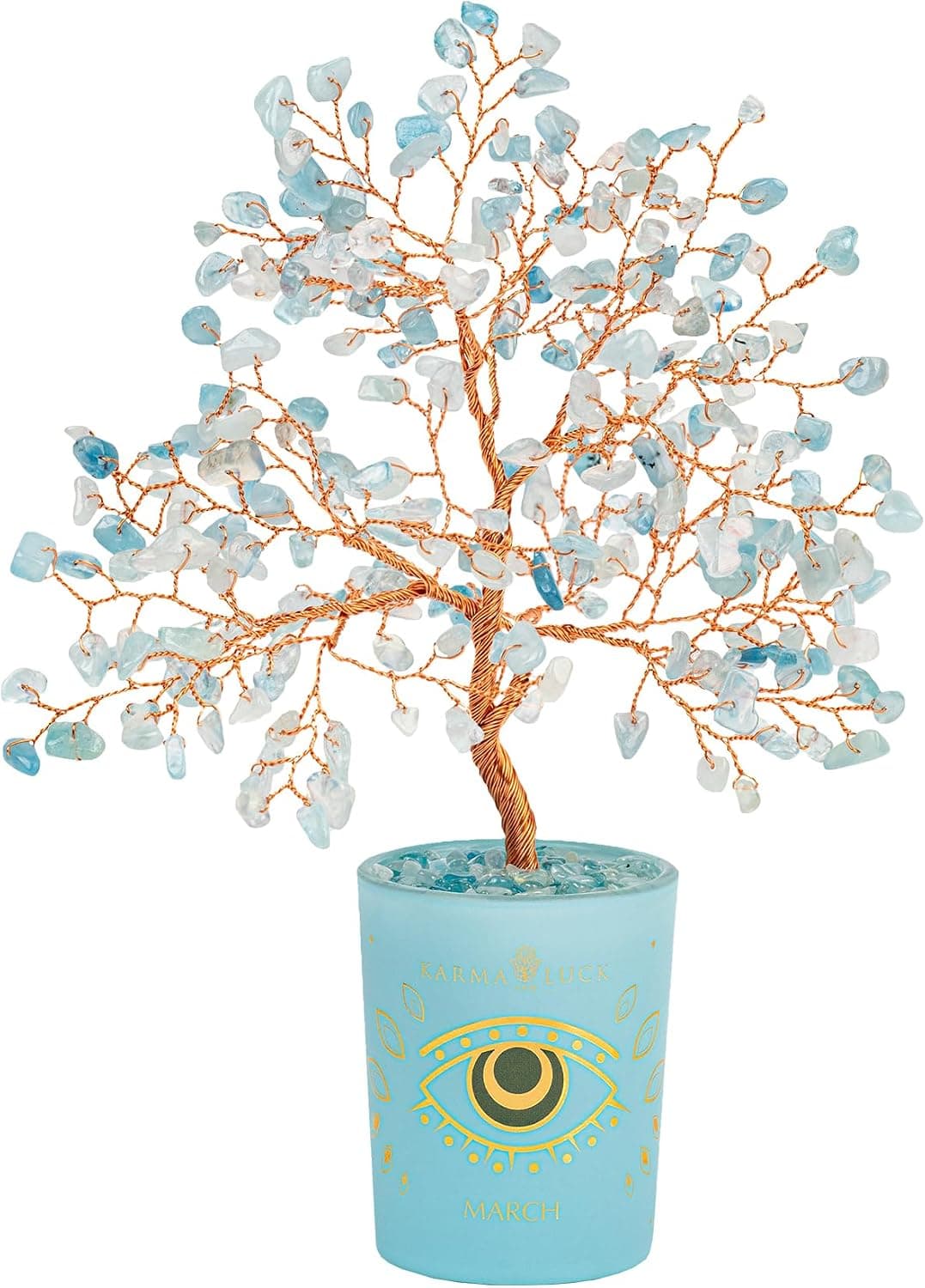
-29%Karma and Luck March Birthstone Crystal Tree of Life, Aquamarine Gemstone Fen...
 -29%
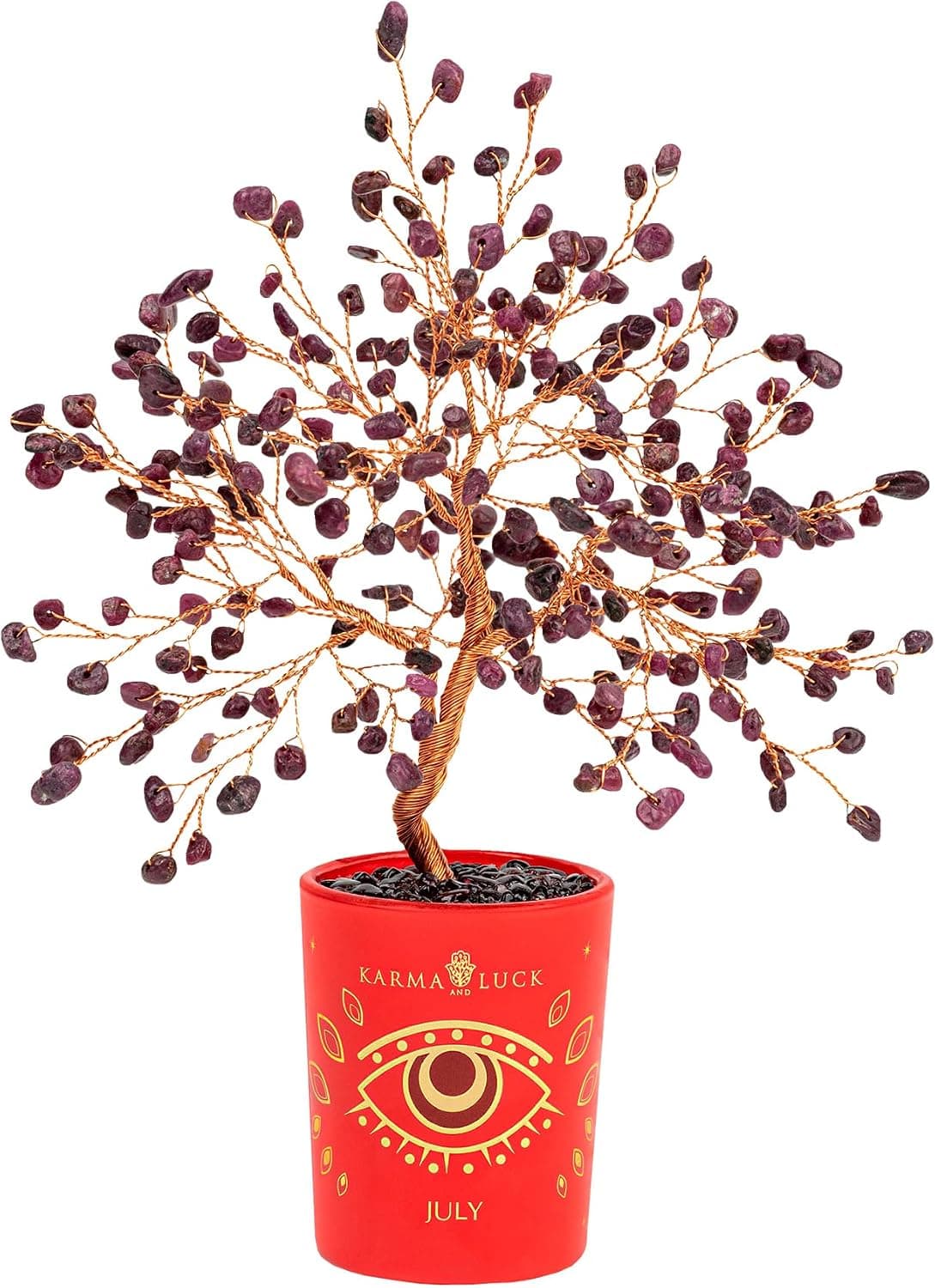
-29%Karma and Luck July Birthstone Crystal Tree of Life, Ruby Gemstone Feng Shui ...
As an Amazon Associate, we earn from qualifying purchases. We only recommend items our practitioners have personally tested.
Continue Your Journey
Explore these related guides to deepen your understanding:


Ready for Deeper Guidance?
Try our free I Ching reading for personalized wisdom, or explore our curated Feng Shui essentials.