The ratio of windows to walls can make every dining cure fall flat, even when the table, chairs, and decor look perfect.
Beyond the Surface of dining-room-mistakes feng shui
What's widely believed about dining-room-mistakes feng shui isn't the whole picture. I first noticed it in a narrow townhouse in Seattle, where the owner had done everything by the book: a round oak table, six woven chairs, a bowl of oranges, even a red runner for “good fortune.” The room looked polite. It also felt strangely restless, like nobody wanted to stay for dessert.
Then I looked at the south wall. Two tall windows took up nearly half of it, and the back door had a strip of glass beside the frame. The room was being pulled outward every time light shifted across the floorboards. That matters more than most advice admits. A dining room with too much exposed glass can’t hold qi long enough for people to settle, talk slowly, or finish a meal without checking their phone.
The common fix is to add symbols and hope for the best. Not even close. If the window-to-wall ratio is off, the room behaves like a funnel instead of a container. I’ve seen clients map a room by the Bagua, place a lucky object in the right sector, and still wonder why dinner felt clipped and forgettable. The proportions were working against them from the start.
That’s the part people miss: a cure cannot overrule geometry. A bright east-facing dining room with one modest window can feel generous and calm; a similar room with glass on three sides can feel exposed no matter how expensive the table is. The eye reads openness as invitation, but the body often reads it as instability.
When the Room Leaks Light, It Leaks Attention
I walked into a farmhouse dining room in Portland last spring and found a cobalt-blue sideboard under a bay window, a pale linen tablecloth, and a hanging pendant that looked beautiful at noon. By 6:30 p.m., the room had lost its center. The family ate quickly, argued about nothing, and drifted into the kitchen before the soup was finished. The space had too much outward pull and too little visual weight on the interior walls.
Window-to-wall ratio sounds technical, but the effect is easy to feel. More wall usually means more containment. More glass usually means more dispersion. That doesn’t mean “fewer windows is always better.” It means the room needs enough solid surface to anchor the meal, especially where the table sits in relation to the openings. A long table shoved directly between two large windows can feel like it is floating in a draft, even when the HVAC is off.
Try this simple check instead of decorating by instinct: sit in the chair where the host usually sits and look around. Do your eyes land on a solid wall, a cabinet, or a window? If every sightline exits the room, the room is already too porous. Many people assume more daylight solves everything. Wrong. Too much brightness with too little containment creates alertness, not ease.
If you want a deeper framework for proportion, the logic behind the center rules of a room applies here too. The dining area needs a place where attention can gather and stay put. That is why a single heavy artwork, a buffet with closed doors, or a taller centerpiece can do more than a table full of crystals. Those objects give the eye a stopping point.
What Actually Works in a Dining Room
The best dining rooms I’ve seen were not the prettiest in the magazine sense. They had balance. One in an older brick home in Boston had only one window, but it sat beside a deep walnut hutch and a cream-painted wall that reflected just enough light. The table was placed slightly off-center, with the long side parallel to the solid wall, and meals there always seemed to run longer. People leaned back. Conversation got less hurried.
That’s the practical test. Measure the room by feeling, then by sight. If the windows occupy more than about a third of the perimeter walls, the room often needs visual grounding: a substantial sideboard, heavier curtains that can be drawn at dusk, or a piece of furniture with depth rather than a row of fragile objects. The point is not to block light indiscriminately. It’s to give the room a spine.
Choose your table shape with the openings in mind. Round and oval tables soften a highly glazed room because they keep the energy moving without sharp directional pushes. Rectangular tables can work beautifully in a more enclosed space, especially when one end faces a solid wall or a built-in. Put a mirror opposite a huge window and you may double the sense of exposure. That sounds clever until guests start glancing around instead of relaxing.
The same principle shows up in bedroom rules that protect rest and relationships: the room has to hold you, not display you. Dining rooms are no different. If the proportions are wrong, people eat fast, leave early, or keep one foot mentally in the next room.
Why the Standard Advice Backfires
There is a popular belief that any dining room can be “fixed” with a lucky color and a fruit bowl. That belief survives because it is easy. It also misses the point. A room with oversized windows and thin walls needs structural compensation, not decoration theater. Otherwise you get the appearance of intention without the experience of it.
Here’s where the story gets interesting. The Seattle homeowner I mentioned had followed every online recommendation she could find. She added red napkins, a wood tray, and a bamboo plant near the window. The meals got worse for a week. Why? The plant thinned out the already weak wall line, the red kept the room visually active, and the glass was still doing its dispersing job. She had added motion to a room that needed containment.
That kind of mistake shows up in money areas too. A dining room that cannot settle often becomes a place where bills are opened, decisions get rushed, and people say yes before they are ready. If that sounds familiar, compare your setup with money corner mistakes that quietly undo the setup. The pattern is similar: a symbolic cure cannot rescue a weak spatial frame.
People also overestimate color. Darker tones can help, but only if they are used where the room needs visual weight. Painting every wall charcoal in a glassy dining space can create the opposite problem: it absorbs too much and makes dinner feel gloomy. The better move is often selective. One grounded wall. One substantial cabinet. One textile with texture. Enough to keep the room from dissolving after sunset.
Big mistake. Treating the dining room like a stage set instead of a container.
How I Adjust a Room Without Fighting Its Architecture
Start with the walls that are doing the least work. If one side of the room is mostly glass, give the opposite side more density. A wood buffet, framed art with a matte surface, or a pair of upholstered dining chairs near the solid wall can rebalance the eye. Curtains should feel like they belong to the room, not like emergency equipment. Heavy enough to soften glare at dusk. Light enough to keep the space from feeling sealed off.
In a narrow apartment dining nook, I often move the table six to twelve inches away from the window line. That small shift can change everything. It creates a little breathing room between the meal and the outside world, which matters more than people expect. The body notices when chairs no longer scrape directly under a bright pane of glass. Guests stay seated longer. The meal has a slower rhythm.
Light source placement matters too. A pendant centered over the table helps, but in a room with high glass exposure, a second softer lamp on a sideboard can keep evening from becoming a tunnel of overhead glare. The goal is layered light, not flooding. And if the room already has a large opening on one side, don’t add another reflective surface just because it looks crisp in photos. Crisp is not the same as settled.
For readers who want a broader baseline, the right field guide on feng shui principles can help you see which fixes are structural and which are just ornament. That distinction saves money. More important, it saves evenings.
One 1920s bungalow I visited had a dining room with a full-height window on the east wall and almost no furniture against the west wall. The owner complained that family dinners ended in fifteen minutes. We added a low oak cabinet, swapped sheer panels for lined linen, and shifted the table so the host seat faced the solid wall instead of the window. A month later, the same household was still at the table after the dishes were cleared, talking about a school project and a vacation plan they had been postponing for years.
FAQ
Is conventional dining-room-mistakes feng shui advice reliable?
Often no, because it usually focuses on objects before proportions. A bowl of citrus can be pleasant, but it won’t fix a room that has more glass than wall. Start with how the room holds attention, then layer in decorative choices.
How much window area is too much?
There isn’t a single magic number, but once windows start dominating multiple sightlines, the room usually feels less anchored. You can feel the threshold before you can measure it. If guests keep turning toward the openings instead of toward each other, that’s the signal.
Can I use mirrors in a bright dining room?
Sometimes, but use them carefully. A mirror opposite a large window can multiply the sense of exposure and keep the room visually active long after people want calm. If you already have too much light, a matte surface usually works better.
What if my dining area is just a corner of the kitchen?
Then the walls around it matter even more. A rug, a pendant, and a narrow sideboard can create a pocket of containment where none existed. The corner should feel claimed, not borrowed.
In some homes the answer is obvious the moment you stand in the doorway. The table looks fine, the chairs match, and yet the room keeps pulling your eye outward toward the glass. That’s the moment I ask a simpler question: when dinner ends, does the room feel like it held the night, or did it let it slip through the windows?
Mei Chen
Traditionally informed guidance • Cross-referenced with classical Chinese source texts
Content draws from both Compass (Luopan) and Form (Xingshi) school traditions. Illustrative examples are composites based on consultation experiences.
Practitioner-Selected Tools for This Topic
Items our team has tested and found effective for the principles discussed above. Individual results may vary.
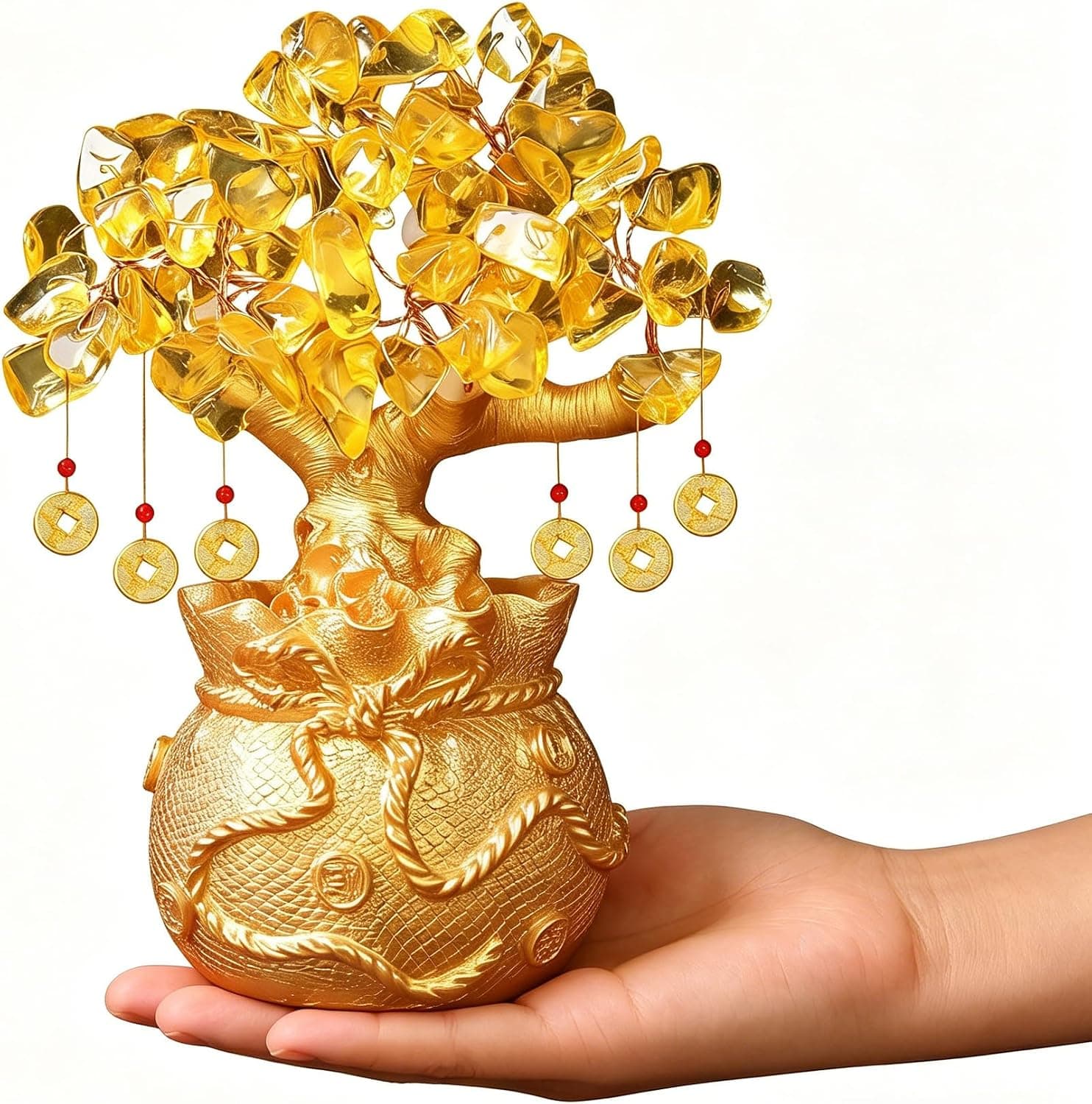
Citrine Money Tree for Wealth Qi
Why this one: Citrine supports bright yang qi and the wealth gua, while the tree form symbolizes growth and steady abundance in the wood element.

Feng Shui Gold Dragon Turtle Wealth Statue
Why this one: This golden dragon turtle activates sheng qi (auspicious energy) in your wealth bagua area, balancing yin earth energy with yang metal energy to attract and hold lasting abundance.
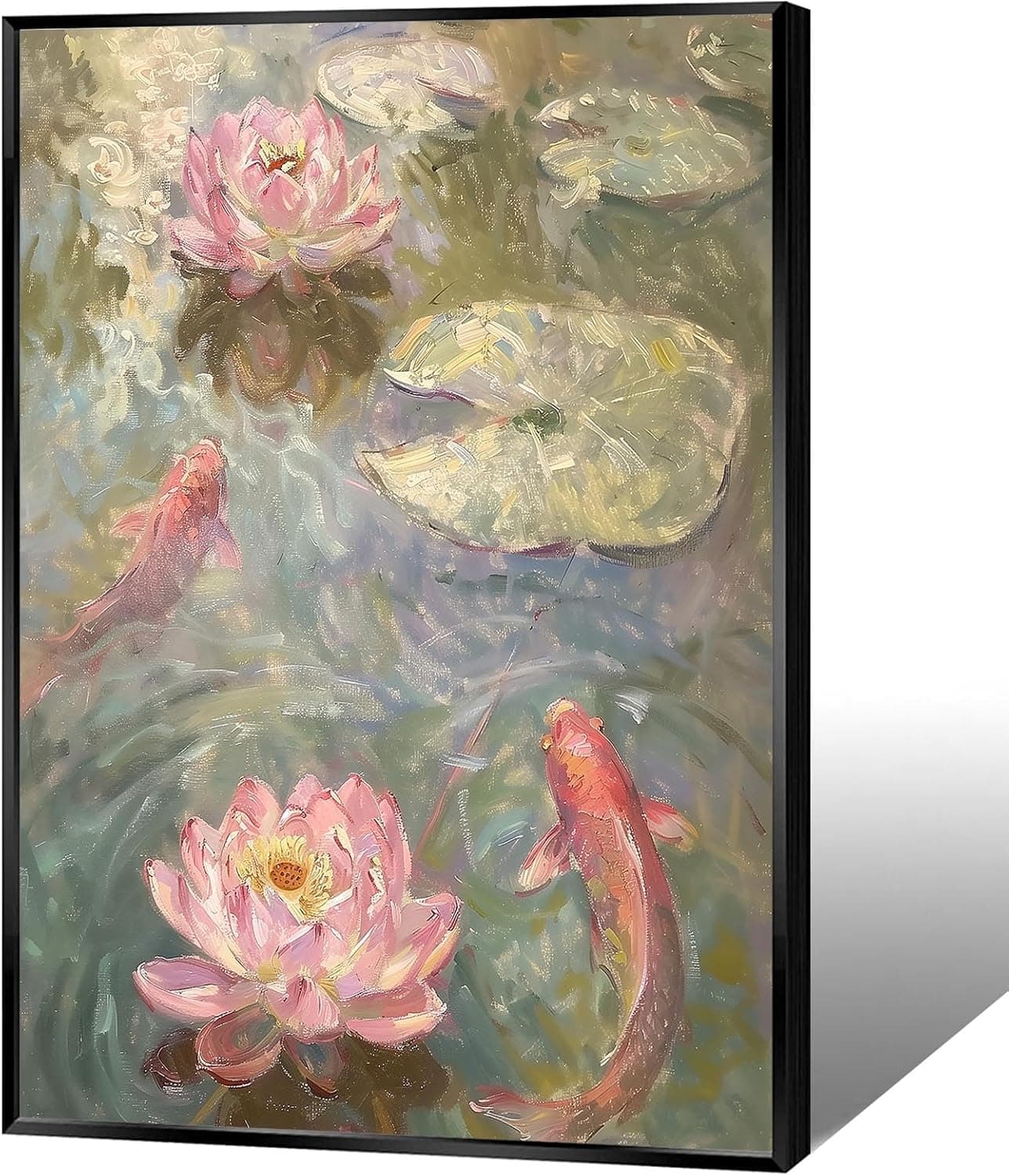
Koi & Lotus Feng Shui Canvas Art
Why this one: Koi strengthen wealth qi and lotus softens yin energy, helping balance the bagua and invite smooth-flowing prosperity.

Japandi Crane Oval Wall Art
Why this one: Cranes symbolize longevity and harmonious qi; place it to soften yang energy and invite balanced flow through the bagua.

Money Fish Wealth Carp Statue
Why this one: The carp and waves activate flowing qi and the water element, helping strengthen wealth energy in the bagua wealth area.
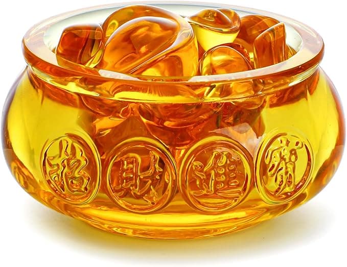
Handmade Golden Treasure Basin Feng Shui Wealth Decor
Why this one: The golden yuan bao activate metal energy (linked to wealth in five elements) to draw abundant qi into your home’s prosperity bagua area, balancing yin and yang for steady financial flow.
As an Amazon Associate, we earn from qualifying purchases. We only recommend items our practitioners have personally tested.
Continue Your Journey
Explore these related guides to deepen your understanding:

Ready for Deeper Guidance?
Try our free I Ching reading for personalized wisdom, or explore our curated Feng Shui essentials.