Your colors may be fine. The route through the room may be ruining everything.
The Hidden Truth About 2026-lucky colors all signs feng shui
I saw it in a narrow condo living room in Seattle: jade cushions on a gray sofa, a red ceramic lamp near the east wall, and a client who had followed every color chart she could find. Two weeks later she was sleeping worse, arguing more, and staring at a dining table nobody actually used. The problem wasn't the palette. It was the path. Every morning she cut diagonally from the front door to the kitchen, dragged a black tote bag across the sofa corner, and stepped straight through the same line of movement that should have been feeding the room, not slicing it open. That diagonal kept the space restless. Not even close.
People love color rules because they feel neat. Paint the wall. Add the cloth. Set the object down. Done. Yet a room does not live like a catalog page; it lives like a body, and the traffic pattern tells you where the qi keeps getting bruised. A bright shade in the wrong corridor can feel loud, while a quieter tone at the correct turning point can settle the whole room. I've seen beige rooms that buzzed and red rooms that felt calm, because the people moving through them weren't fighting the layout.
mapping the house with the bagua matters, but only after you notice where shoes land, where shoulders turn, and where the eye keeps snagging on a lamp base or chair leg. That is the first correction most advice misses: lucky color is rarely the first thing the home asks for. Flow comes earlier. Color supports it afterward.
How the Route Through a Room Changes the Result
Walk through your home slowly and watch your own habits. Do you cut across the center of the living room to reach the hallway? Do you hover near the kitchen island and then stall? Do you always skirt one corner because a plant, mirror, or tall cabinet makes you feel boxed in? Those movements are not decoration-level details. They are the skeleton of the room.
A room with a straight-through traffic line behaves differently from one with a soft curve. Straight lines push, speed up, and sometimes fragment attention. Curves slow the nervous system just enough for a person to notice what they are doing. That is why a corridor painted in the year's favored shade can still feel harsh if it acts like a runway. The color gets blamed. The layout did the damage.
For people following the 2026 color recommendations, this is where the backfire begins. They add the approved tones to the wrong side of the room, then keep using the same shortcut from the sofa to the kitchen, and the space never gets a chance to gather itself. The result shows up in ordinary ways: unfinished emails, a sink full of dishes, a habit of dropping keys on the nearest chair instead of the entry tray. Small friction. Repeated daily.
the front door's threshold pattern matters for the same reason. The first steps into a room train everything that follows. If the entry forces a zigzag past clutter, the home announces confusion before you even hang your coat.
bedroom movement rules make this even more obvious. I have watched a bed with decent placement fail because the owner crossed the room between midnight bathroom trips and kept waking at the same point every night. The route was teaching the body to stay alert.
Why the Right Color Still Falls Flat
Color works through association, balance, and placement. Red near a dead corner can wake a space up. Deep green beside a busy passage can make a room feel crowded. Soft earth tones near a dining chair can create a sense of steadiness, but only if the chair is where people naturally sit and stay. Put the same tone beside a thoroughfare and it becomes wallpaper for rushing.
The old habit of picking colors by sign alone misses the fact that homes are crossed by different kinds of motion. A child racing through a hallway leaves a different mark than a retiree pacing from kitchen to porch. A studio apartment with one central lane needs a gentler palette than a long house with multiple turns. The movement dictates the emotional climate more than the calendar does.
And here's the surprise: the room may ask for less color, not more. I once worked in a pale yellow guest room in Portland where the owner had added blue bedding, a teal rug, and gold curtains because every source promised harmony. None of it helped. She kept walking through that room to reach a closet at the far end, and each pass split the space into visual noise. We removed the rug, shifted the chest of drawers six inches away from the foot path, and left the walls nearly bare. Two nights later she said the room finally felt like it could exhale.
Wrong order.
Before you change another pillow, stand in the doorway and trace your path with your eyes. Notice where you speed up, where you hesitate, and where your body turns its shoulder to avoid a corner. Those are the pressure points. Color belongs there only after the movement is calm enough to hold it.
Applying the 2026 Colors Without Letting Traffic Undo Them
Start with one room, not the whole house. The living room is usually the clearest test because it shows how people actually behave, not how they wish they behaved. Sit in the main chair for a minute and watch where your feet point. Then stand, cross to the far side, and notice whether you are forced to cut between furniture edges or whether you can move in one clean line with a slight bend. That bend matters. It keeps the room from feeling like a hallway pretending to be a lounge.
Use the year's tones where motion slows. A calmer hue near a reading chair can help attention gather. A livelier accent behind a sofa can energize a dead wall without shouting at the person who walks past it. But if a color sits on the path itself, especially near the front door, it gets chopped up by footsteps, bags, and quick glances. The room never gets to settle on one message.
I often tell people to treat traffic like water. Where does it pour fast? Where does it pool? A blue accent beside a sliding door may feel cool and appropriate, yet if that same doorway is the shortcut everyone uses from mudroom to den, the color will be activated every minute and then broken apart by movement. In a quieter alcove, the exact same shade can feel beautiful, even restorative. Context changes everything.
One couple in Austin had a burnt orange runner in the hall outside their bedroom and thought it was helping the area feel warm. It didn't. Their dog barked at every person passing the room, they both woke at 3:10 a.m. for no clear reason, and the hallway felt like a checkpoint. We moved the runner to the guest room, painted the hall a softer clay tone, and kept the brighter color on a cabinet face that nobody crossed. The barking eased. Sleep improved. The house stopped bracing itself.
That is where the popular advice starts to wobble. People are told to use lucky colors everywhere, as if more exposure must equal more benefit. It doesn't. Repetition on a high-traffic line can turn support into irritation. The eye gets tired. The body does too.
front door color choices work best when they answer the shape of the approach, not just the birth chart. A deep color on a recessed entry can feel protective. A bright one on an exposed, constantly used threshold can feel like too much noise before you even set down the groceries.
Common Mistakes That Make the Room Feel Worse
One of the biggest errors is matching the color chart before clearing the passage. People buy cushions, throws, and art prints, then leave a basket in the walk line and wonder why the room still feels off. They are decorating around a traffic problem. The basket wins every time.
Another trap is filling every corner with a separate accent. That feels clever in the store. At home it creates visual interruptions that split movement into fragments, and the room starts to feel busy even when nobody is there. Busy is expensive. Not in money, but in attention.
A third mistake shows up in open-plan homes. People use the year's recommended colors to mark zones, but they forget that a dining area and a TV area may share one main path. If the path runs through both, the colors begin arguing with each other. The result can be a strange restlessness at dinner and a habit of lingering too long on the couch afterward, avoiding the sink, the bills, and the next task.
Mirrors cause trouble when they sit on the route and double the movement of the room. Cabinets do it too. So do oversized floor lamps with heavy bases. I have seen a mirror across from a hallway turn every passing body into a visual flash, and the occupants complained of headaches before they ever mentioned the decor.
wealth corner mistakes often begin this way: not with the wrong symbol, but with the wrong path through the symbol. A beautiful plant beside a constantly crossed corridor gets ignored, knocked, or watered late. Then people blame the plant instead of the traffic.
Kitchen tools create the same kind of problem. knife placement in the kitchen can turn a simple corner into a small source of tension when sharp edges sit beside the main walking line. The room keeps reminding your nervous system that something is pointed at you.
Think about the last time you entered a room and felt instantly irritated without knowing why. Maybe your shoulder brushed a chair. Maybe your bag snagged on a hook. Maybe the color was fine, but the route made you feel hunted by furniture. That is the hidden cost. The space begins to train impatience.
What Actually Holds the 2026 Palette Together
There is a cleaner way to use the year's colors: treat them as punctuation, not the sentence. Put them where a movement naturally pauses, where the eye rests, where the hand reaches after the body has already slowed down. A tray table. A cushion at the end of a sofa. A vase on a sideboard that sits outside the main line of travel. Those placements let the color be felt instead of chased.
For a bedroom, that may mean a muted wall tone near the headboard and a brighter object across the room, away from the foot path. For a home office, it may mean a measured accent on the shelf behind the desk rather than on the desk surface itself, where papers and devices will keep breaking the visual field. In a dining room, color works better on the sideboard than on the chair backs that are constantly pulled in and out.
Notice how often the answer is to move the color off the road. That is not avoidance. It is respect. A color that survives contact with motion is doing more work than a color that only looks good in a still photograph.
the numbers behind a room can help you decide which sectors deserve emphasis, but the body still has to live there. A calculator cannot hear the squeak of a chair leg or see the pile of shoes by the doorway. You can.
coins arranged with intent belong where your hand reaches after slowing down, not where your heel lands every morning. Managed energy looks different from decorative clutter. It feels ordered, almost quiet, and that quiet is part of the medicine.
If you want one practical test, try this tonight: turn off the overhead light, stand in the doorway, and trace the most common path across the room. If your route cuts through the center of the strongest color, you've found the pressure point. Move the color or move the path. Usually, one of them can shift without much drama.
Quick Checks Before You Trust the Chart
Ask yourself where the room makes you turn your body. If you have to twist around a chair, step over a rug edge, or squeeze past a console, the traffic pattern is speaking louder than the color advice.
Then look at what gets touched most. Door handles, bag hooks, table corners, light switches, rug edges. Those are the places where movement leaves a mark. Put the season's color there only if you want it constantly activated.
One more thing: children and pets expose the truth fast. A cat chooses the stillest route. A child picks the shortest one. If the room can't handle either without chaos, the layout needs help before the palette does.
a plant placed with care can soften a harsh line, but it cannot rescue a path that keeps slicing through the entire room. That is the point many Western readers miss when they try to follow color advice like a shopping list. The room wants choreography, not just decoration.
So the next time you read about 2026 feng shui colors, picture your own feet first. Picture the hallway door opening, the tote bag swinging, the chair you keep bumping with your shin. Then ask whether the color belongs where the body keeps passing through, or where the room can finally hold still for a minute.
FAQ
Is conventional 2026-lucky colors all signs feng shui advice reliable?
Often not on its own. A color chart can point you toward useful tones, but it cannot see your furniture layout, your walking habits, or the way a doorway throws people across a room. If the traffic line is wrong, the color rarely rescues it.
How do I know whether the path is the real problem?
Watch your body, not the decor. If you keep cutting diagonally, brushing corners, or slowing down in the same spot, the room is already telling you where the friction lives. That friction usually shows up as distraction, poor sleep, or a sense that the room never quite settles.
Can I still use the year’s colors in a busy room?
Yes, but keep them off the main route. Try placing them on a side table, a shelf, or a cabinet face that people do not physically cross. The moment the color sits in the path, it starts competing with movement instead of supporting it.
What if I already bought everything in the recommended palette?
Move half of it before you buy anything else. A throw blanket can go from the sofa seat to the backrest, and a vase can move from the center of a passage to the edge of a sideboard. Small relocations often reveal whether the room wanted less repetition and more breathing room.
Does this matter more in apartments than houses?
Absolutely, because apartments usually compress movement into fewer lanes. One clogged route can affect sleep, meals, and work all at once. In a house, the problem can hide longer; in a smaller place, it announces itself quickly.
Should I follow the lucky colors or the room layout first?
Start with the layout. Once the traffic stops fighting the furniture, the colors have somewhere to land. Until then, the best shade in the world can feel strangely powerless beside a chair leg and a shortcut nobody can stop using.
Mei Chen
Traditionally informed guidance • Cross-referenced with classical Chinese source texts
Content draws from both Compass (Luopan) and Form (Xingshi) school traditions. Illustrative examples are composites based on consultation experiences.
Practitioner-Selected Tools for This Topic
Items our team has tested and found effective for the principles discussed above. Individual results may vary.
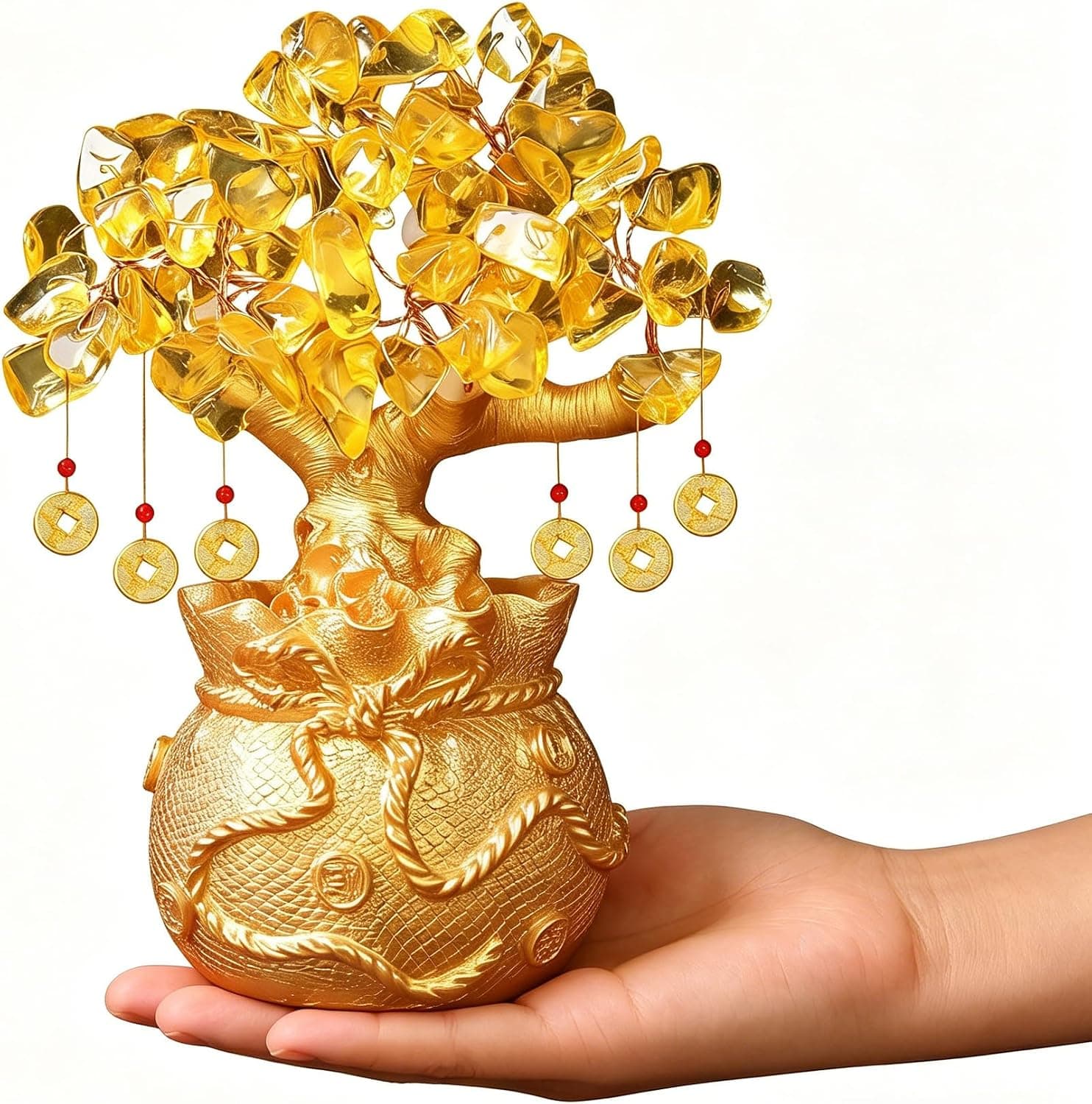
Citrine Money Tree for Wealth Qi
Why this one: Citrine supports bright yang qi and the wealth gua, while the tree form symbolizes growth and steady abundance in the wood element.
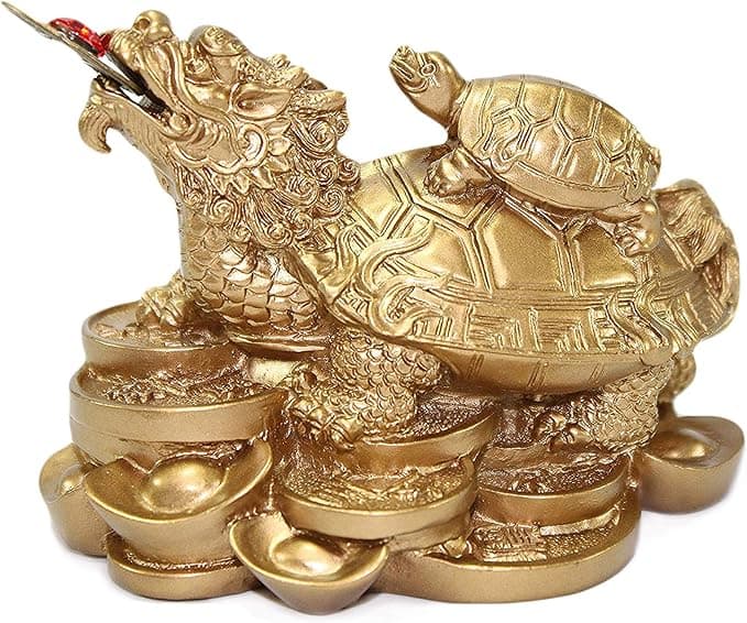
Feng Shui Gold Dragon Turtle Wealth Statue
Why this one: This golden dragon turtle activates sheng qi (auspicious energy) in your wealth bagua area, balancing yin earth energy with yang metal energy to attract and hold lasting abundance.
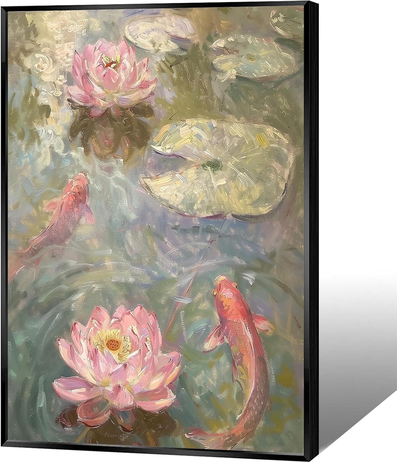
Koi & Lotus Feng Shui Canvas Art
Why this one: Koi strengthen wealth qi and lotus softens yin energy, helping balance the bagua and invite smooth-flowing prosperity.

Japandi Crane Oval Wall Art
Why this one: Cranes symbolize longevity and harmonious qi; place it to soften yang energy and invite balanced flow through the bagua.
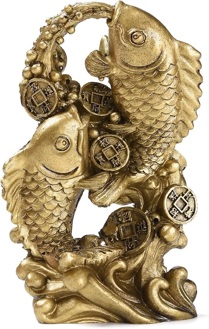
Money Fish Wealth Carp Statue
Why this one: The carp and waves activate flowing qi and the water element, helping strengthen wealth energy in the bagua wealth area.

Handmade Golden Treasure Basin Feng Shui Wealth Decor
Why this one: The golden yuan bao activate metal energy (linked to wealth in five elements) to draw abundant qi into your home’s prosperity bagua area, balancing yin and yang for steady financial flow.
As an Amazon Associate, we earn from qualifying purchases. We only recommend items our practitioners have personally tested.
Continue Your Journey
Explore these related guides to deepen your understanding:

Ready for Deeper Guidance?
Try our free I Ching reading for personalized wisdom, or explore our curated Feng Shui essentials.